



COM Digital
Component LibraryVariantsAuto LayoutColor StylesTypography StylesResponsive DesignDocumentationDesign Handoff
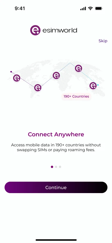
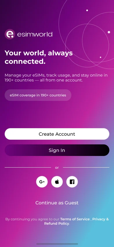
eSIMWorld is a travel eSIM app. Travellers pick a country, buy a data plan and get online abroad in minutes, without a physical SIM card.eSIMWorld bir seyahat eSIM uygulaması. Kullanıcı ülkesini seçiyor, paketini alıyor ve fiziksel SIM kart olmadan yurt dışında dakikalar içinde internete bağlanıyor.
I built the design system and designed the mobile app.Design system'i kurdum ve mobil uygulamayı tasarladım.
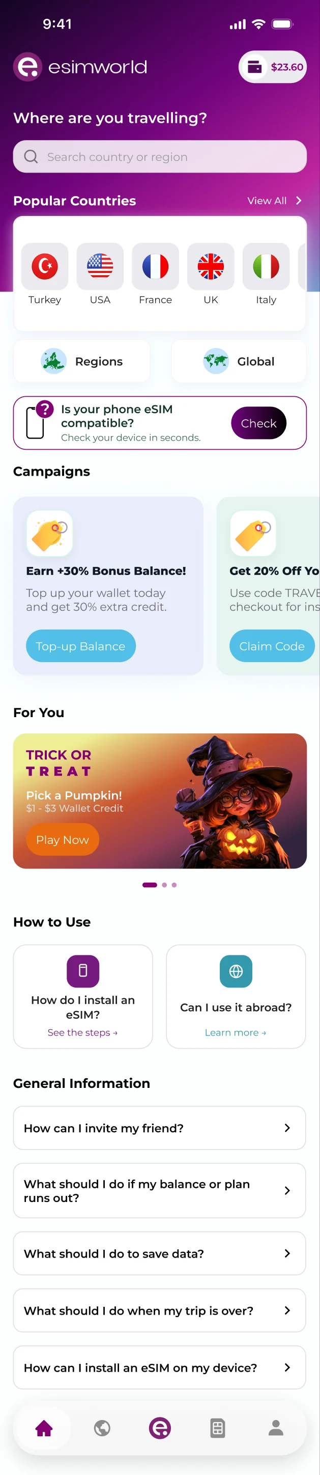
I designed every screen of the iOS and Android app, from home and plan selection to checkout, wallet and Event Hub, on top of a design system I created from scratch.iOS ve Android uygulamasının tüm ekranlarını, ana sayfadan paket seçimine, ödemeden cüzdana ve Event Hub'a kadar, sıfırdan oluşturduğum design system üzerine tasarladım.
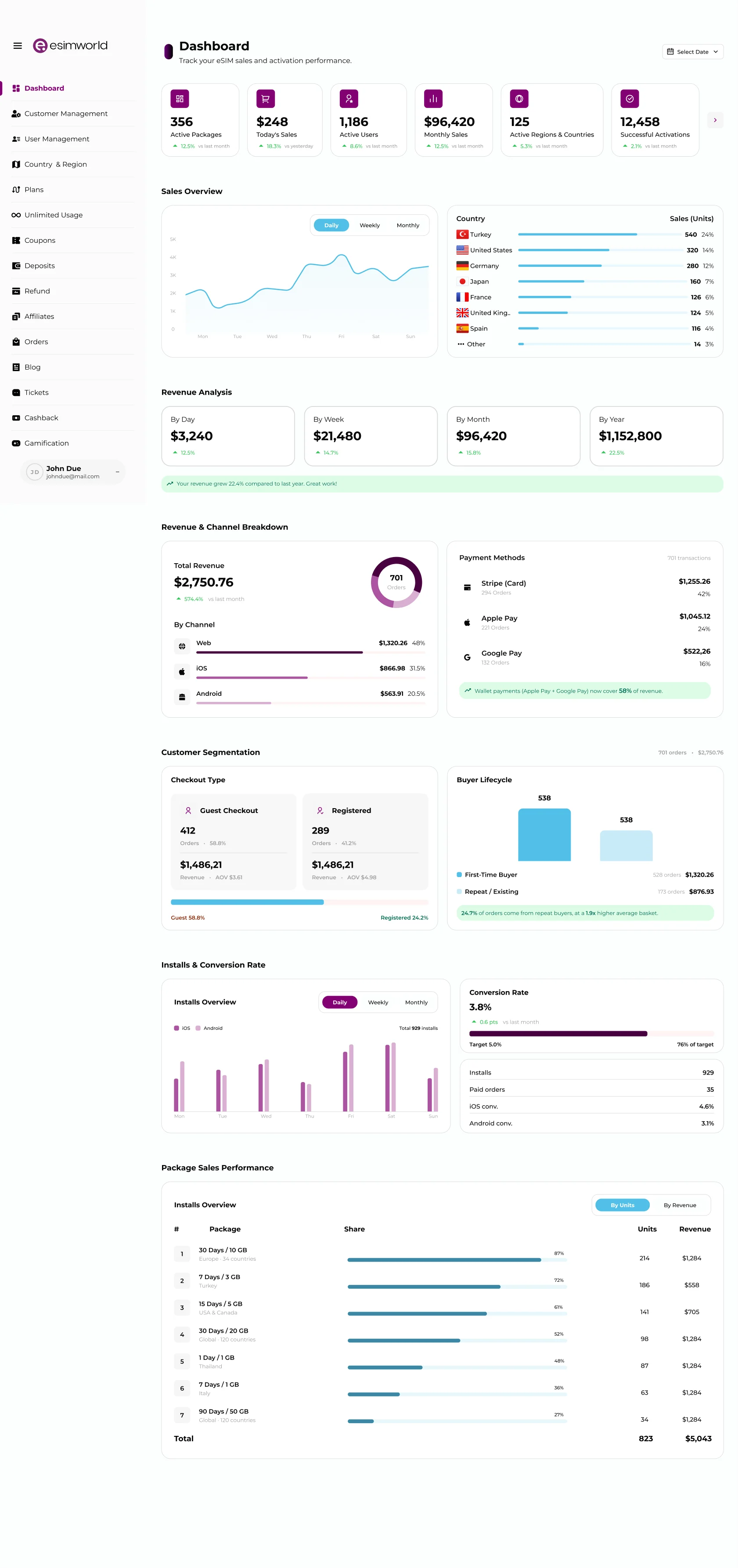
On the website I designed the plan listing page. In the ERP panel I add new features using the same design system, so every product speaks one visual language.Web sitesinde paket listeleme sayfasını tasarladım. ERP panelinde ise yeni özellikleri aynı design system ile ekliyorum; böylece tüm ürünler tek bir görsel dil konuşuyor.
What I worked onNeler yaptımOne question to start: where are you travelling? Search, popular countries and campaigns are all in the first view.Tek bir soruyla başlıyor: nereye gidiyorsun? Arama, popüler ülkeler ve kampanyalar ilk ekranda.
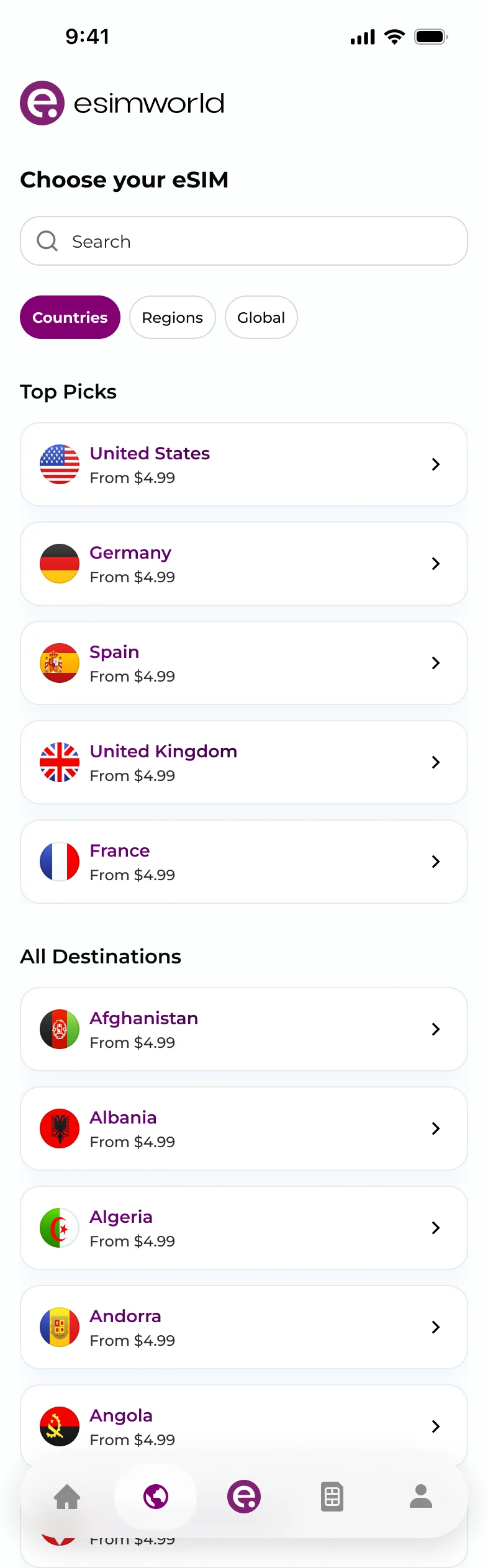
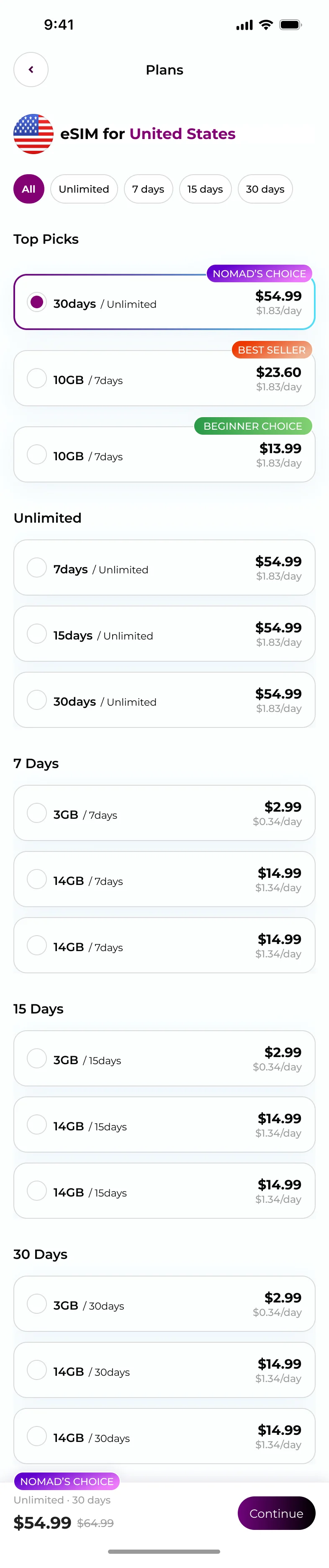
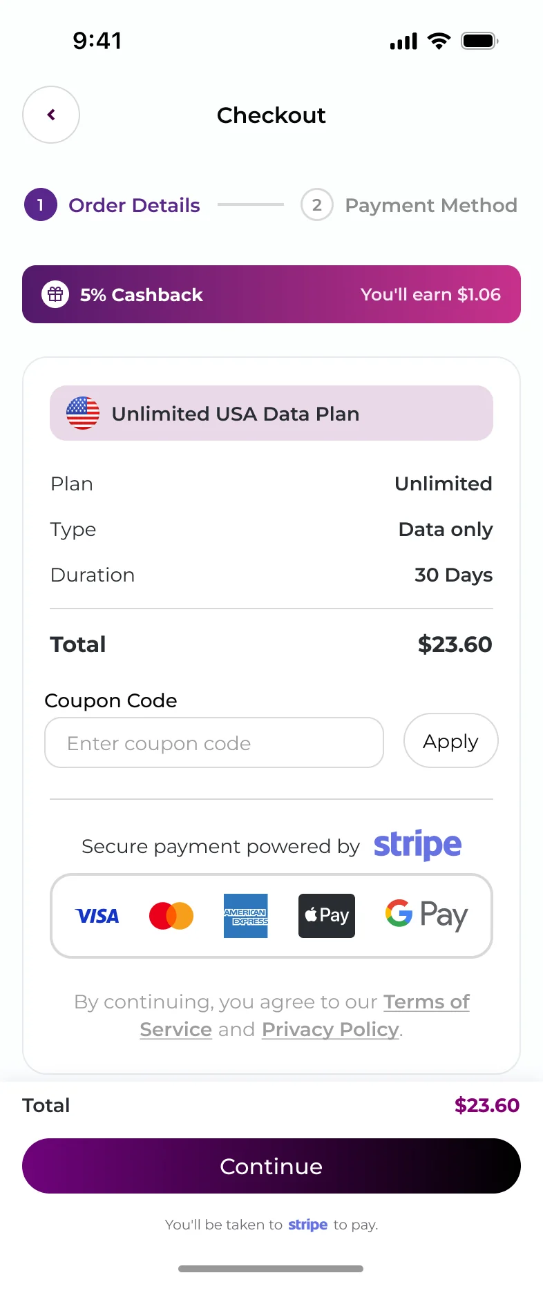
Plans are labelled and show a daily price. Checkout takes two steps, with cashback and the total visible before payment.Paketler etiketli ve günlük fiyatı gösteriyor. Ödeme iki adımda bitiyor; cashback ve toplam tutar ödemeden önce görünüyor.
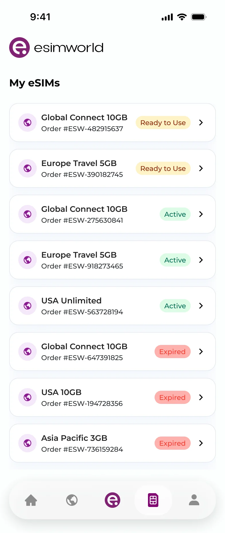
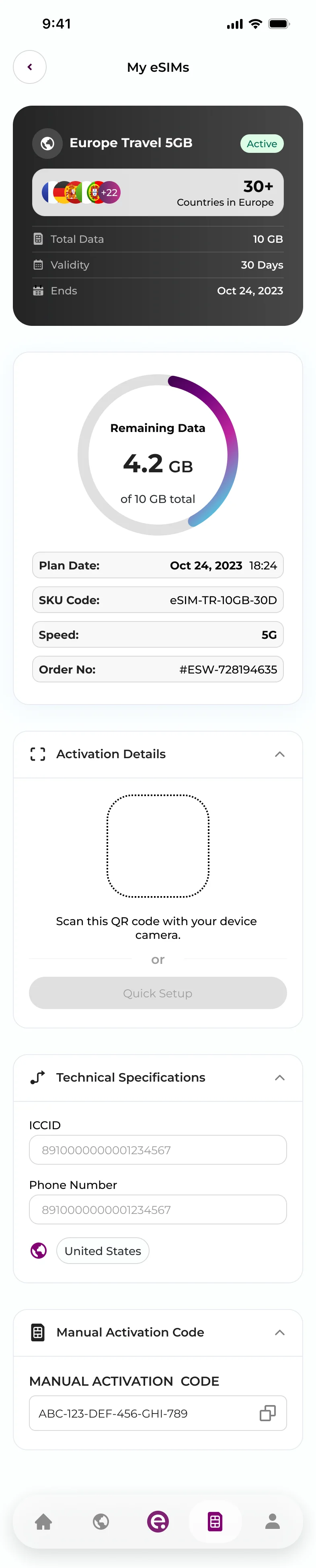
Every eSIM is listed with its status. Opening one shows the data left, the QR code and the setup steps.Tüm eSIM’ler durumlarıyla listeleniyor. Birine girince kalan veri, QR kod ve kurulum adımları görünüyor.
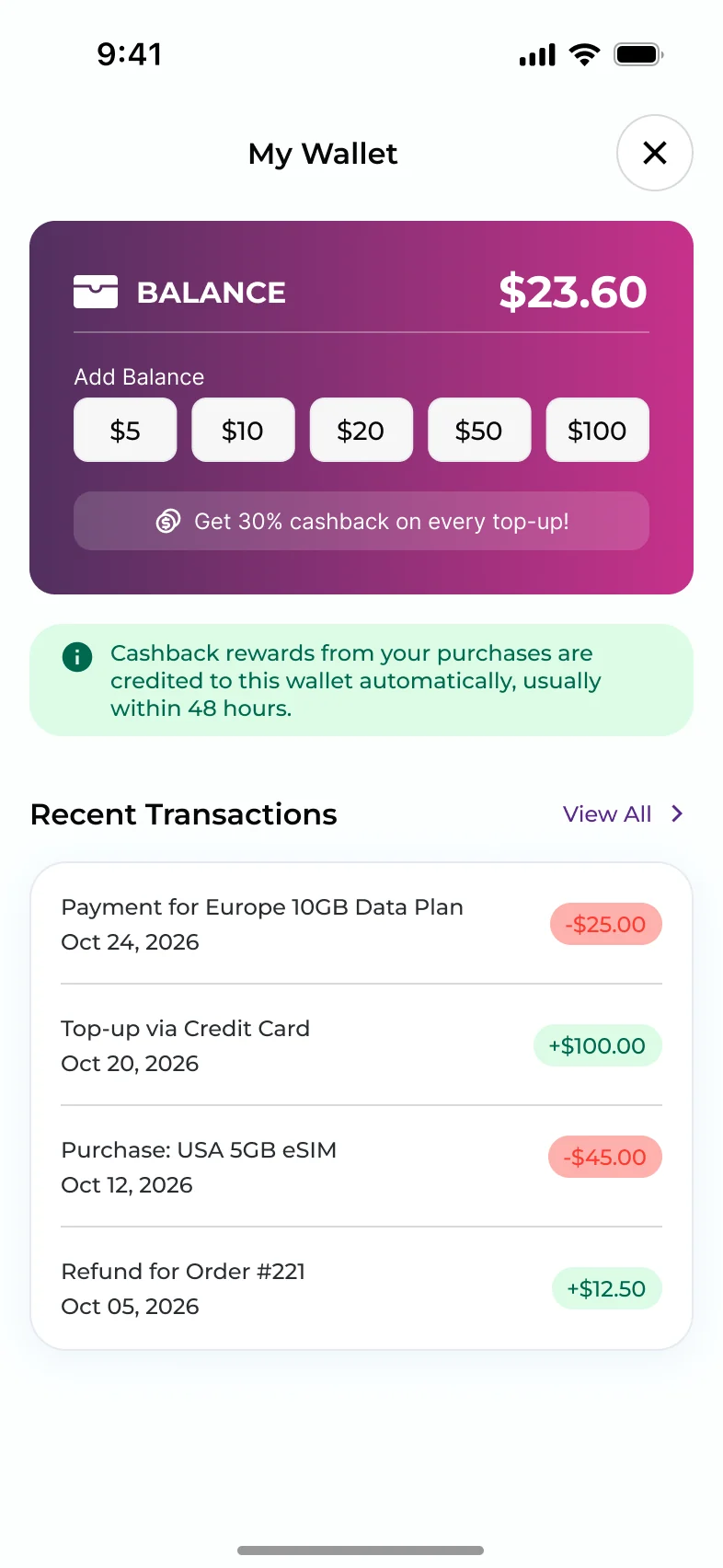
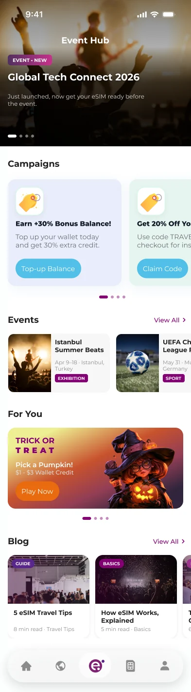
Top-ups with cashback, campaigns, events and small games give travellers a reason to come back.Cashback’li bakiye yükleme, kampanyalar, etkinlikler ve küçük oyunlar kullanıcıya geri dönmek için sebep veriyor.
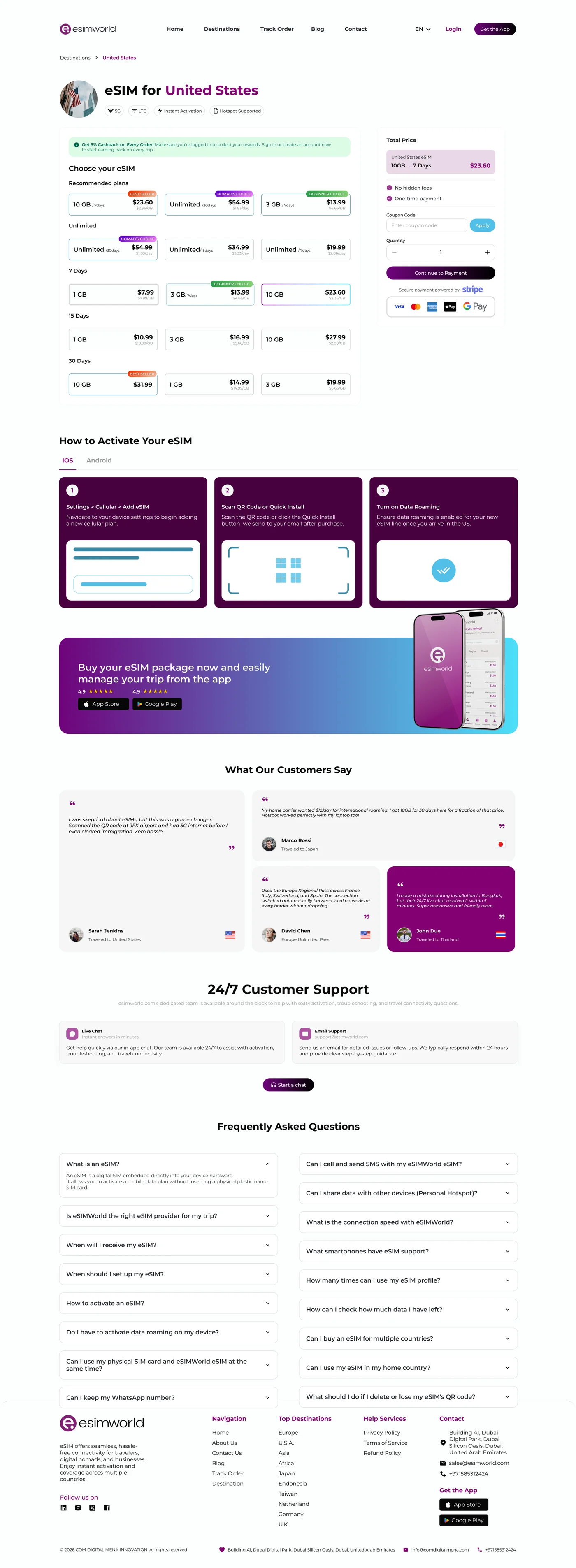
On the website I designed the plan listing page: plans grouped by duration on the left, the total price always in view on the right.Web sitesinde paket listeleme sayfasını tasarladım: paketler solda süreye göre gruplu, toplam fiyat sağda hep görünür.
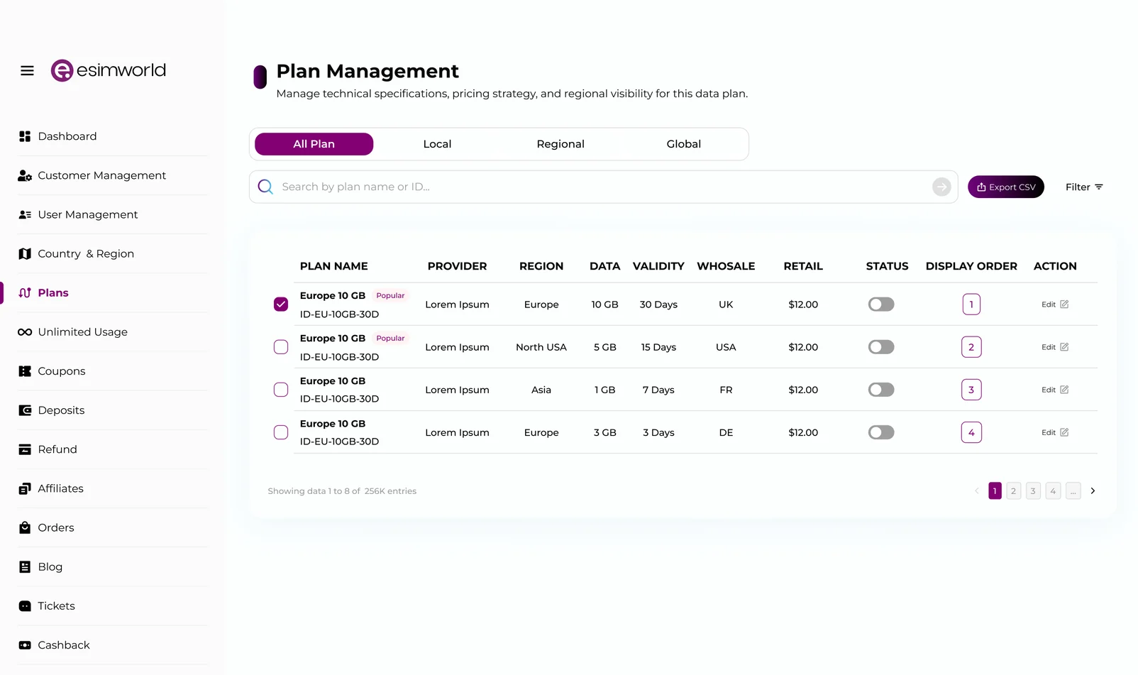
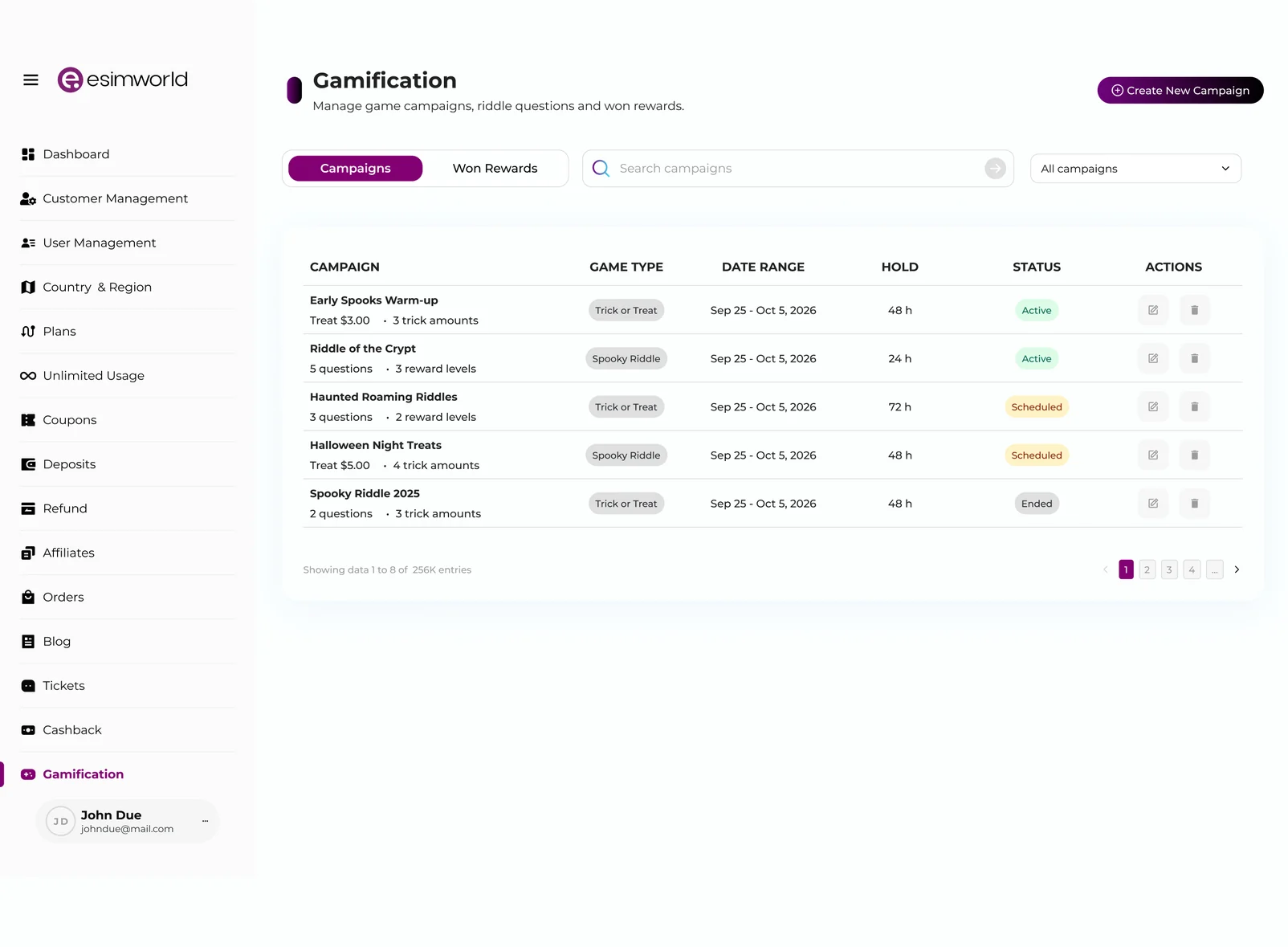
When the team needs a new feature in the ERP panel, I design it with the same design system, from the dashboard to plans and game campaigns.Ekibin ERP panelinde yeni bir özelliğe ihtiyacı olduğunda onu aynı design system ile tasarlıyorum: dashboard’dan paketlere ve oyun kampanyalarına kadar.
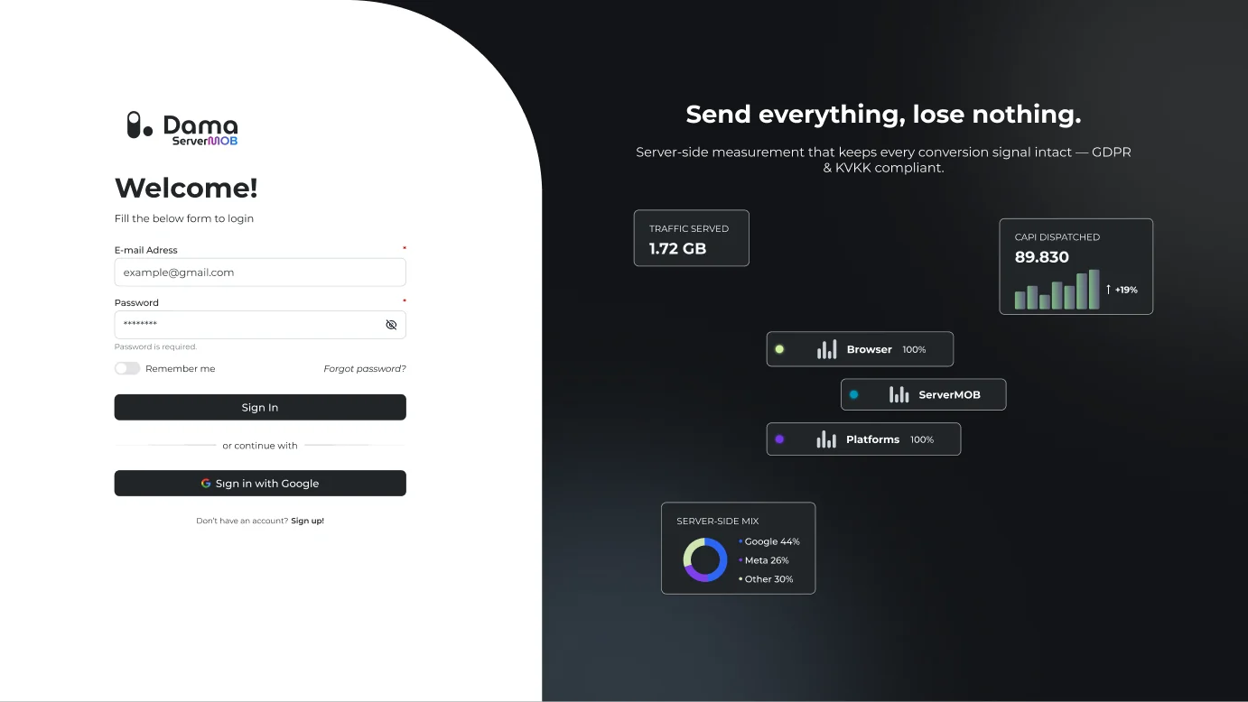
Dama is a customer analytics platform for brands that sell through a website and mobile apps. It brings user, session, event and revenue data from web, iOS and Android into one panel. Teams build reports without code, split customers into segments and turn them into audiences. Its ServerMOB module handles server-side tracking and sends the data to tools like Google and Meta.Dama, web sitesi ve mobil uygulamalar üzerinden satış yapan markalar için bir müşteri analitiği platformu. Web, iOS ve Android’den gelen kullanıcı, oturum, event ve gelir verisini tek panelde topluyor. Ekipler kod yazmadan rapor kuruyor, müşterileri segmentlere ayırıyor ve bunları hedef kitleye çeviriyor. ServerMOB modülü ise sunucu taraflı takibi kuruyor ve veriyi Google, Meta gibi araçlara iletiyor.
I designed the analytics web panel.Analitik web panelini tasarladım.
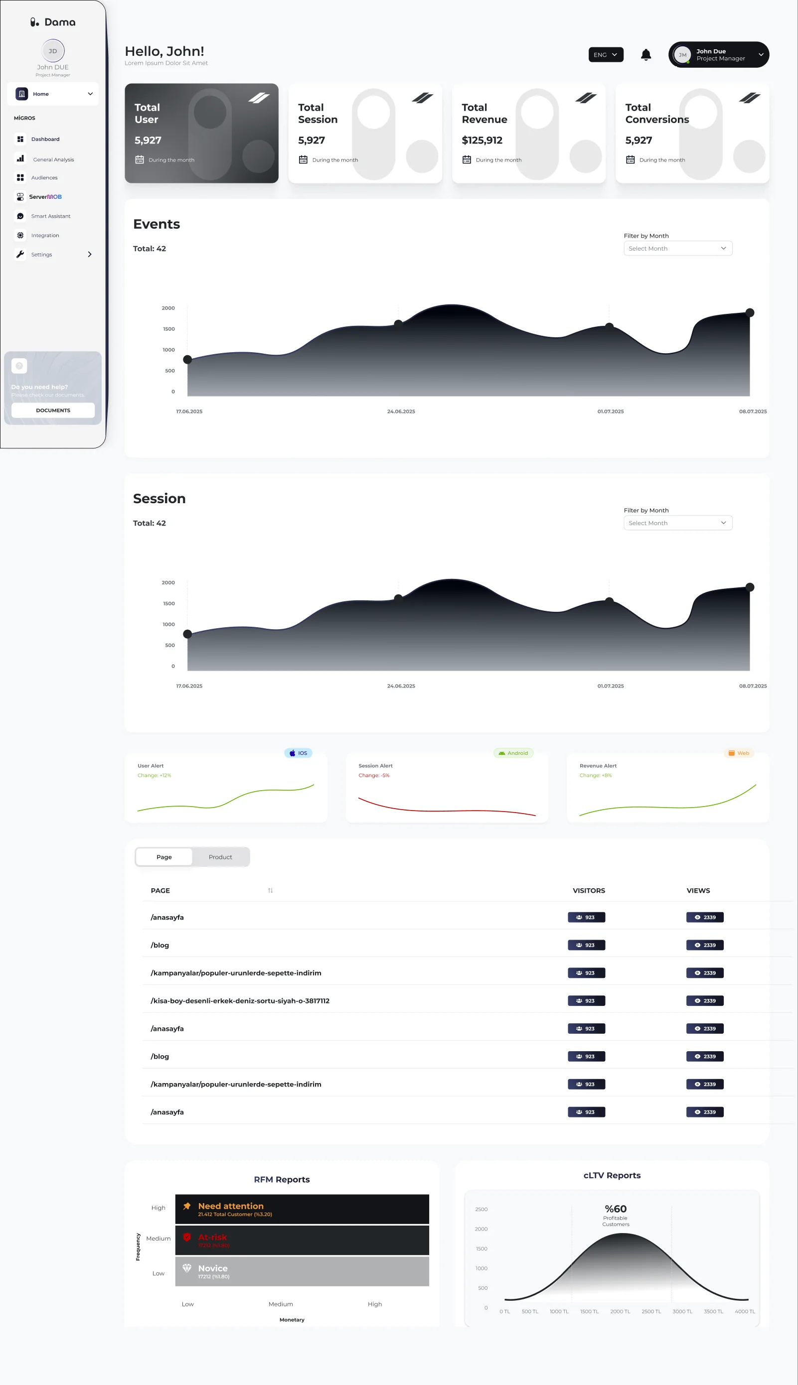
Dama holds a lot of data. My job was to make it readable: one layout for every report, clear charts and a short path from a number to an action.Dama çok fazla veri barındırıyor. Benim işim onu okunur yapmaktı: her rapor için aynı düzen, sade grafikler ve bir sayıdan aksiyona giden kısa bir yol.
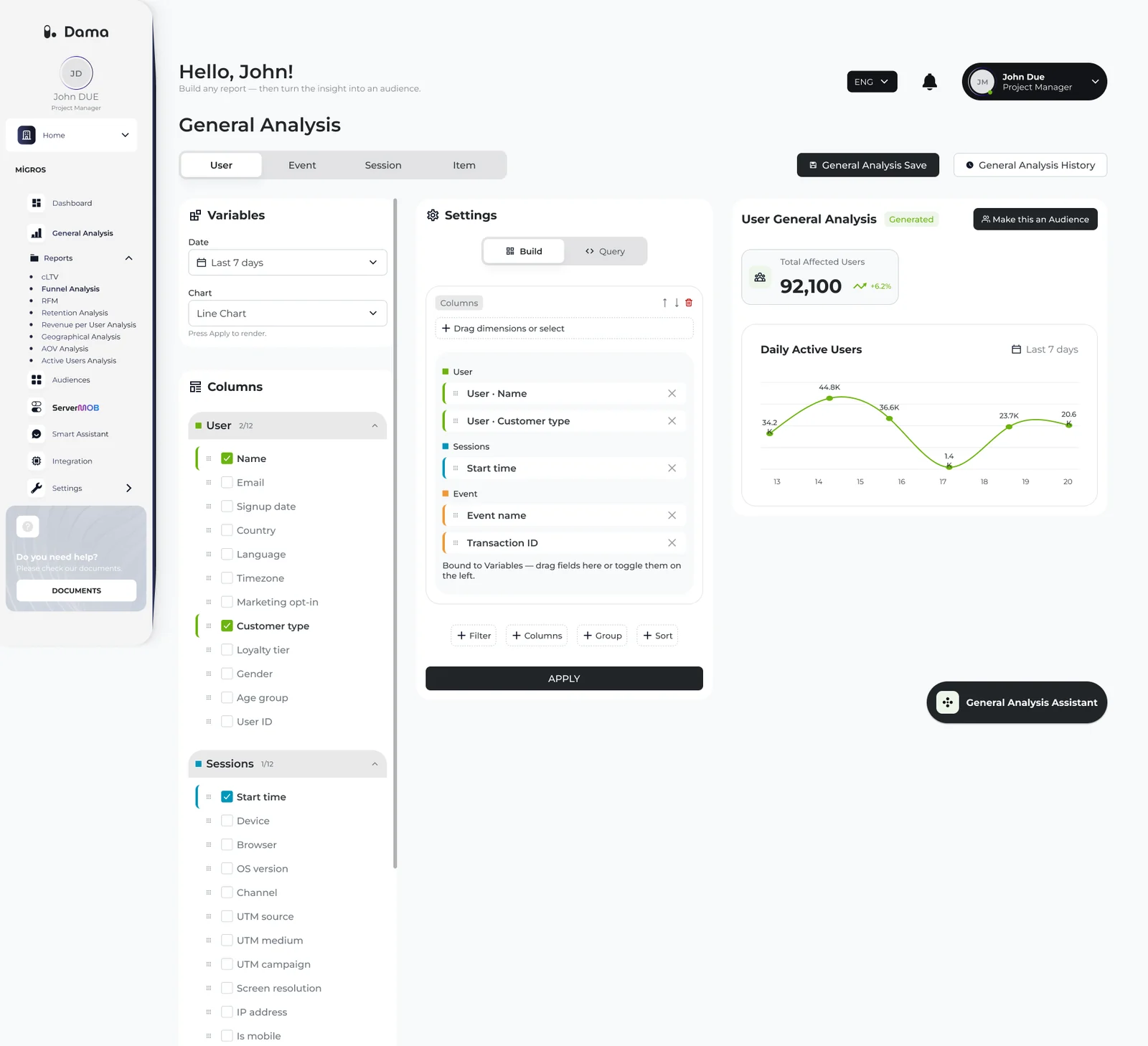
I designed the dashboard, the General Analysis report builder, reports like RFM and Funnel, the Smart Assistant and ServerMOB, including empty, error and loading states.Dashboard'u, General Analysis rapor oluşturucuyu, RFM ve Funnel gibi raporları, Smart Assistant'ı ve ServerMOB'u; boş, hata ve yükleniyor durumlarıyla birlikte tasarladım.
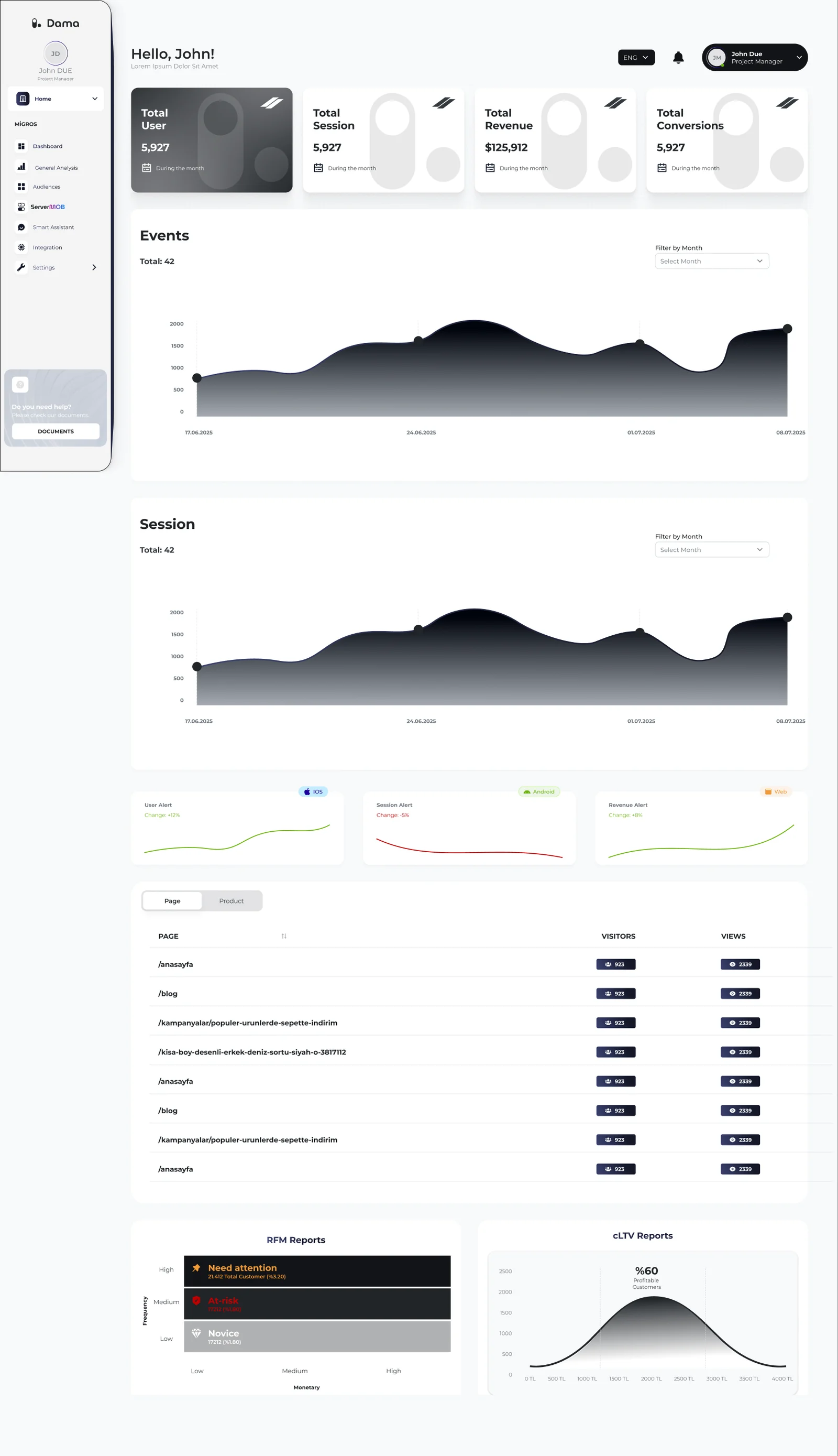
What I worked onNeler yaptımUsers, sessions, revenue and conversions on one page. Below them: event and session trends, alerts for iOS, Android and web, the most visited pages and products, and RFM and cLTV summaries.Kullanıcı, oturum, gelir ve dönüşüm tek sayfada. Altında event ve oturum trendleri, iOS, Android ve web için uyarılar, en çok ziyaret edilen sayfa ve ürünler, RFM ve cLTV özetleri.
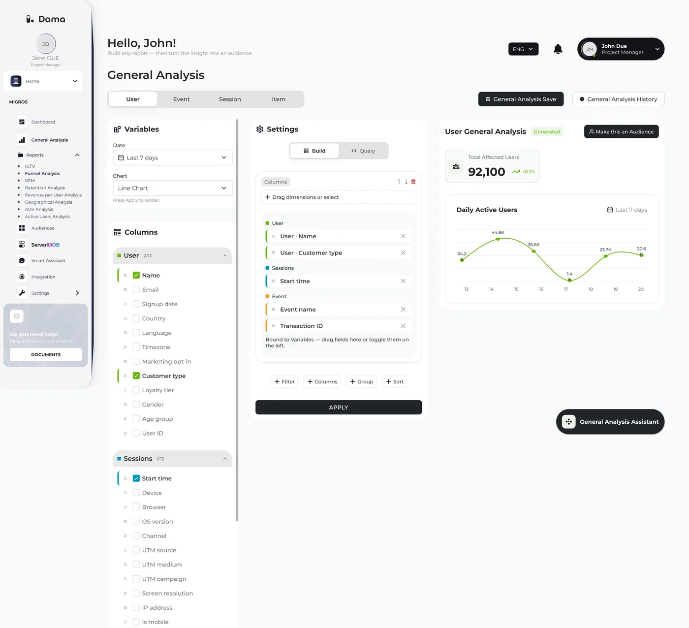
A report builder for people who don’t write SQL. Pick fields on the left, add filters, groups and sorting, then choose a chart. Analysts can switch to Query mode and edit the same report as code.SQL bilmeyenler için bir rapor oluşturucu. Soldan alanları seç, filtre, grup ve sıralama ekle, sonra grafiği seç. Analist isterse Query moduna geçip aynı raporu kod olarak düzenliyor.
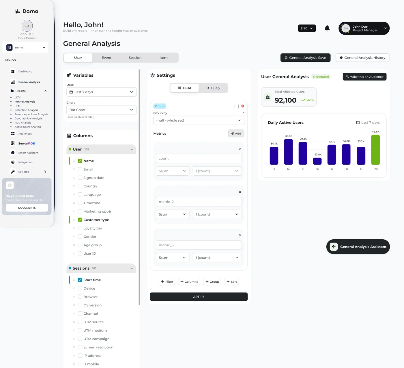
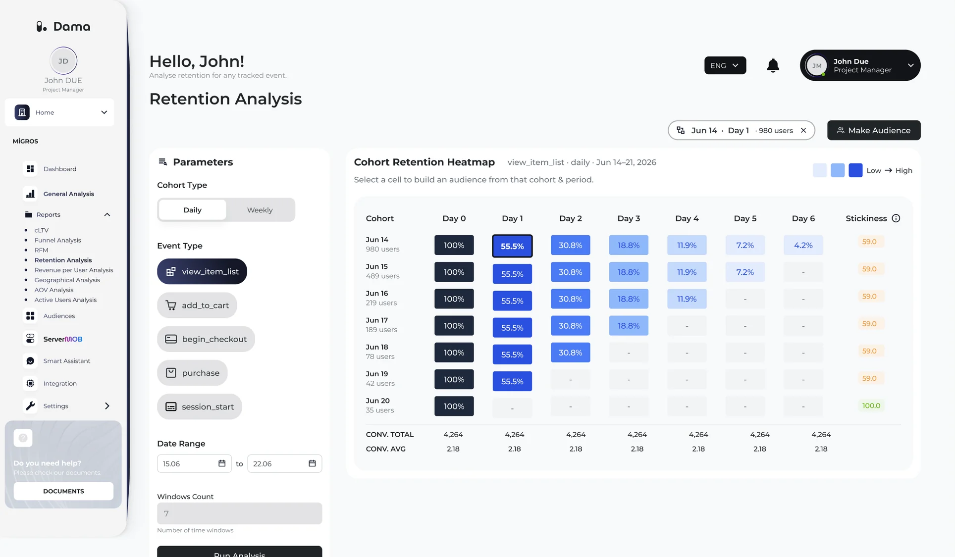
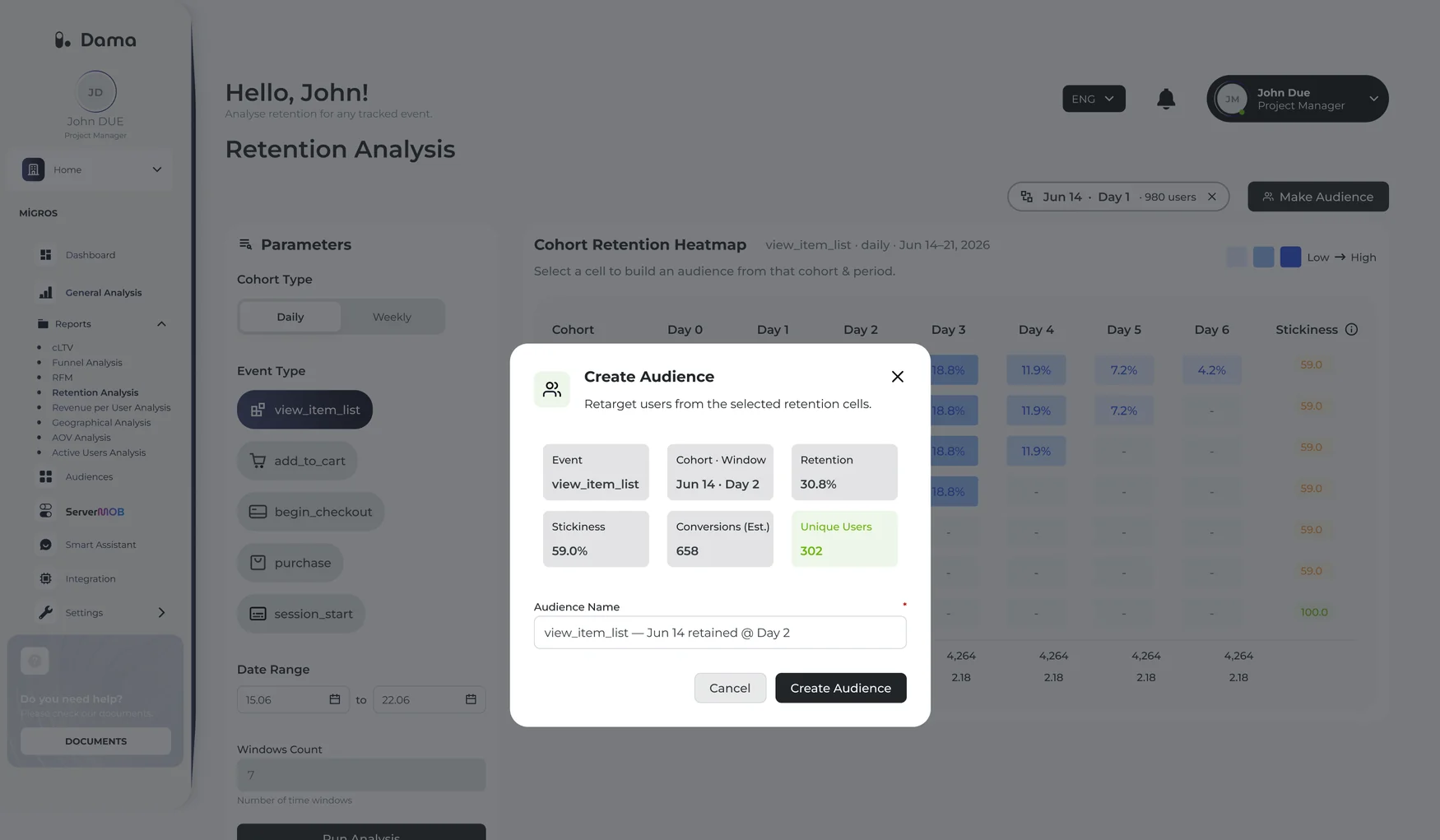
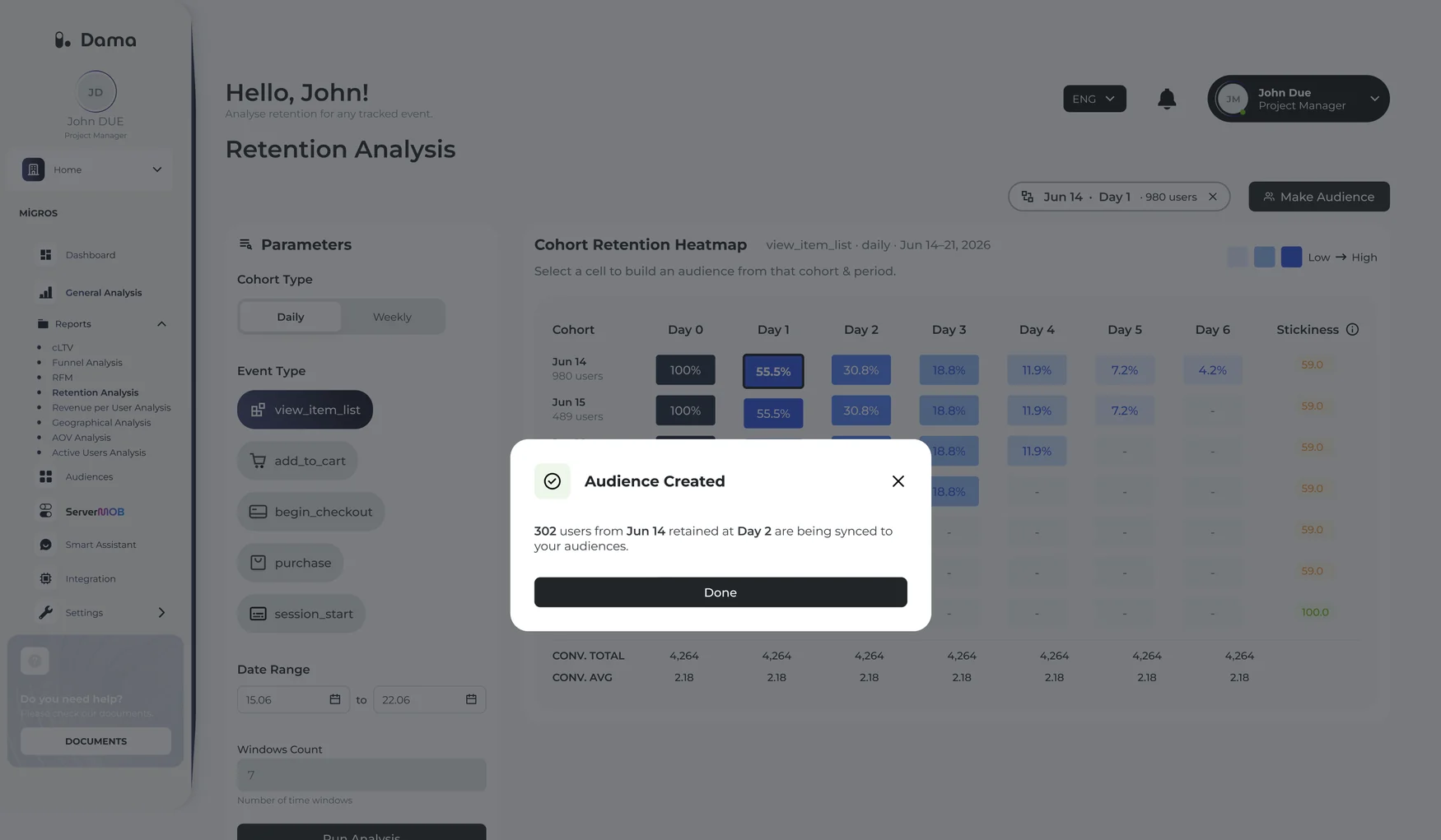
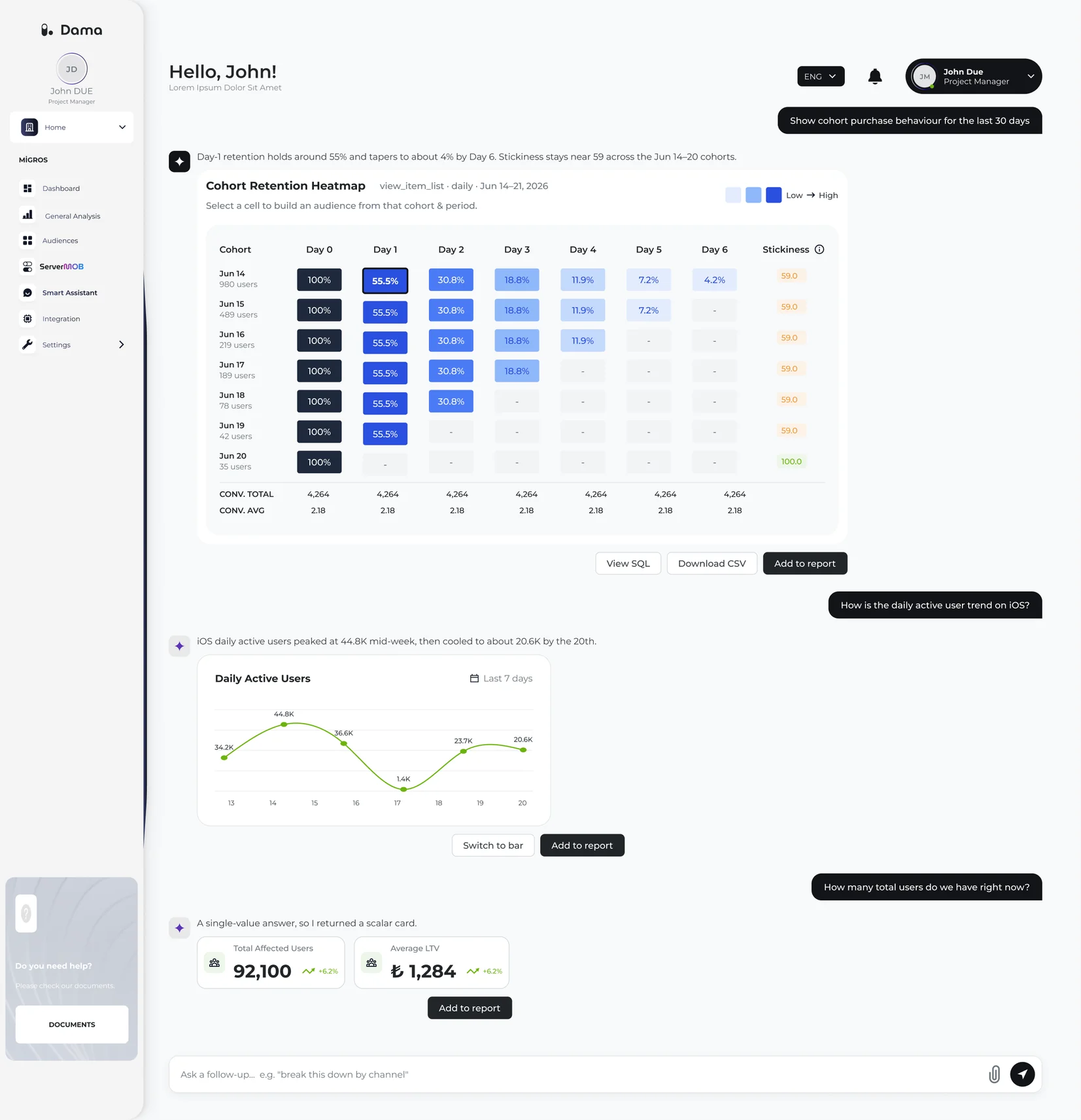
A cohort heatmap shows how many users come back day by day. Selecting a cell opens Create Audience with the event, cohort, retention and user count already filled in.Kohort ısı haritası kullanıcıların gün gün ne kadarının geri döndüğünü gösteriyor. Bir hücre seçilince Create Audience açılıyor; event, kohort, retention ve kullanıcı sayısı hazır geliyor.
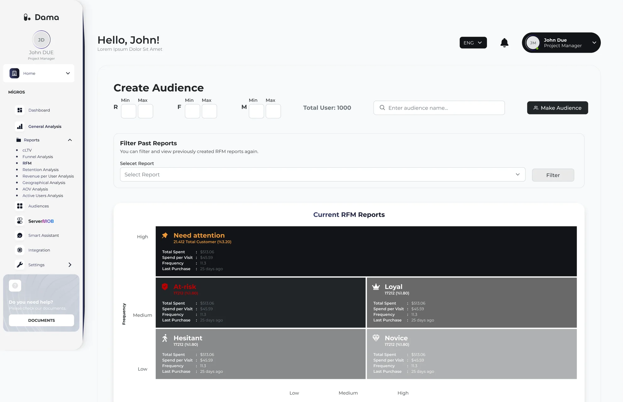
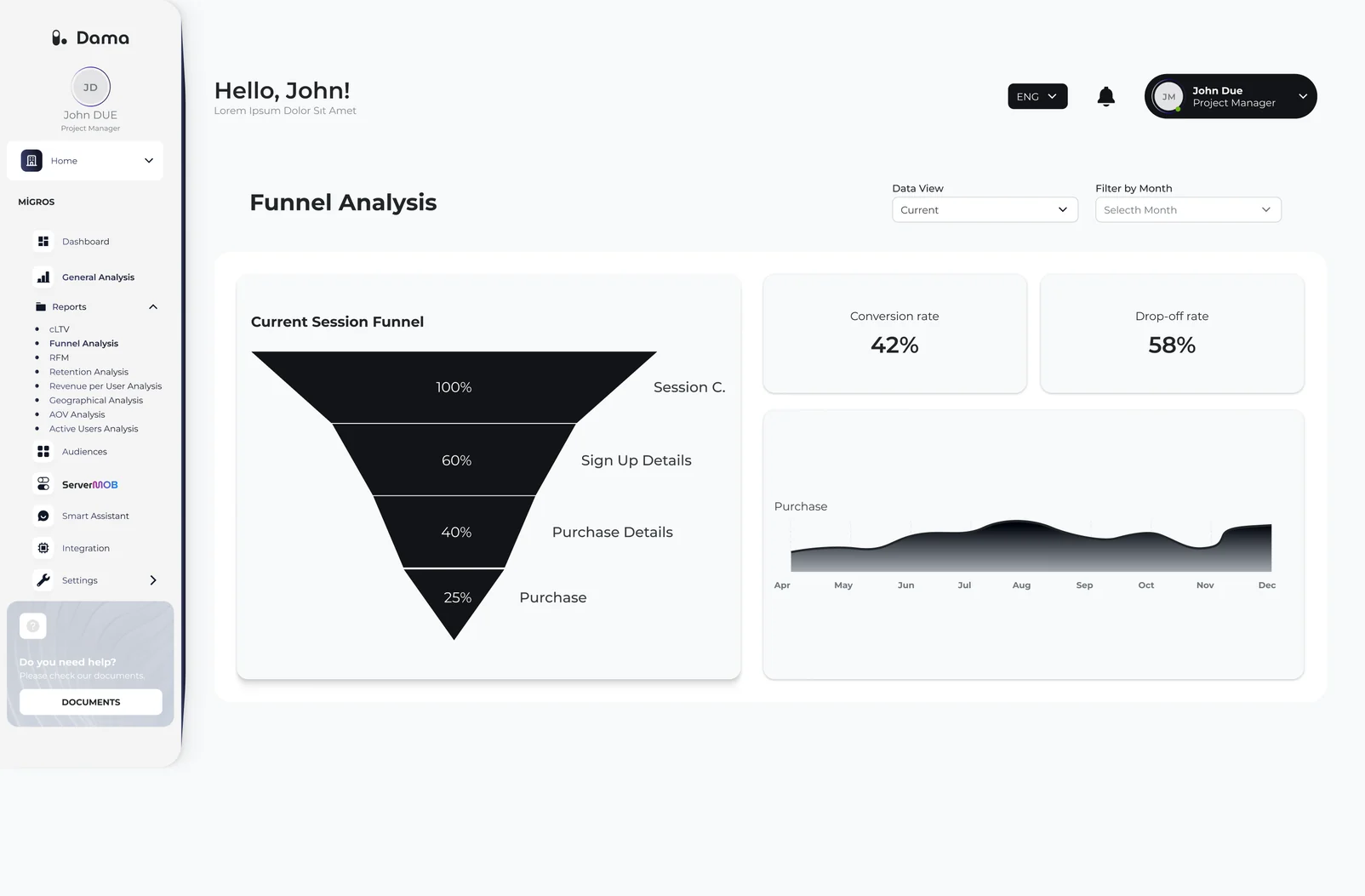
RFM groups customers by how recently, how often and how much they buy, into segments like Loyal or At-risk, and any segment can become an audience. Funnel shows where users drop off between session and purchase. Smart Assistant sits next to the reports.RFM müşterileri en son ne zaman, ne sıklıkla ve ne kadar alışveriş yaptıklarına göre Loyal veya At-risk gibi segmentlere ayırıyor; her segment hedef kitleye çevrilebiliyor. Funnel, oturumdan satın almaya kadar kullanıcının nerede düştüğünü gösteriyor. Raporların yanında Smart Assistant var.
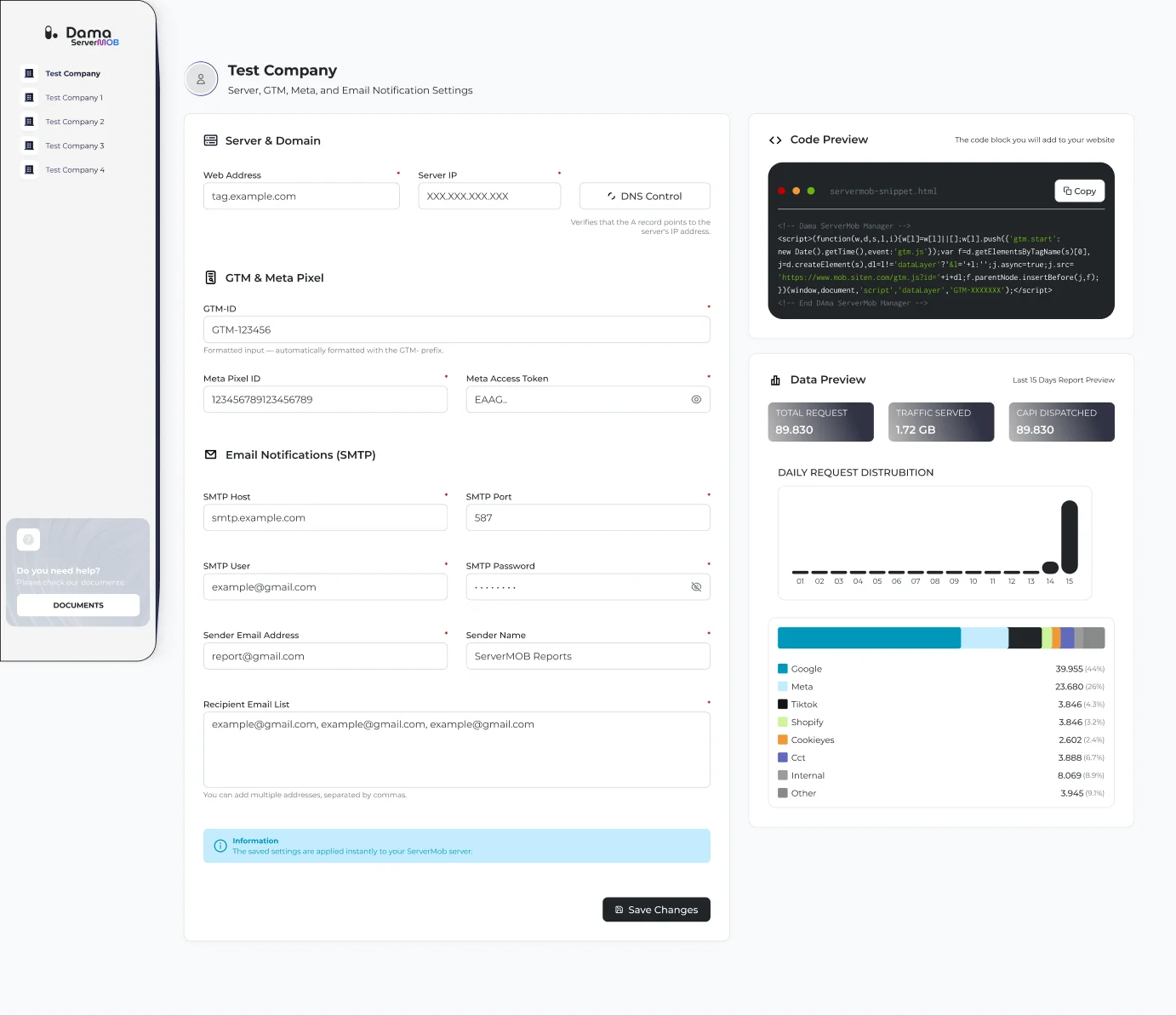
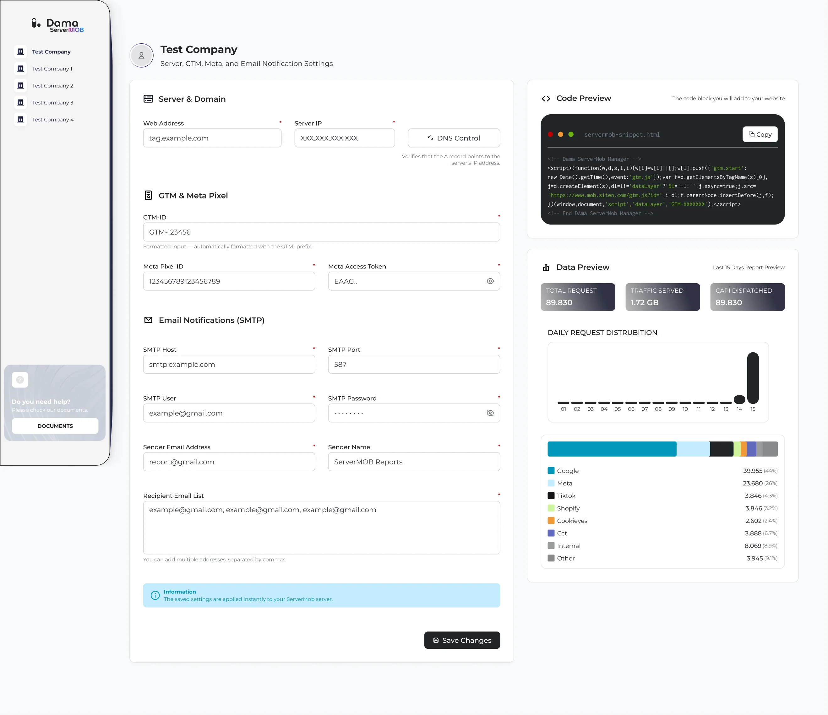
Server-side tracking for each brand: domain and server, GTM, Meta Pixel and email reports set up in one form. Next to it, the code to add to the site and a preview of requests sent to Google, Meta, TikTok and others.Her marka için sunucu taraflı takip: alan adı ve sunucu, GTM, Meta Pixel ve e-posta raporları tek formda kuruluyor. Yanında siteye eklenecek kod ve Google, Meta, TikTok gibi kanallara giden isteklerin önizlemesi var.
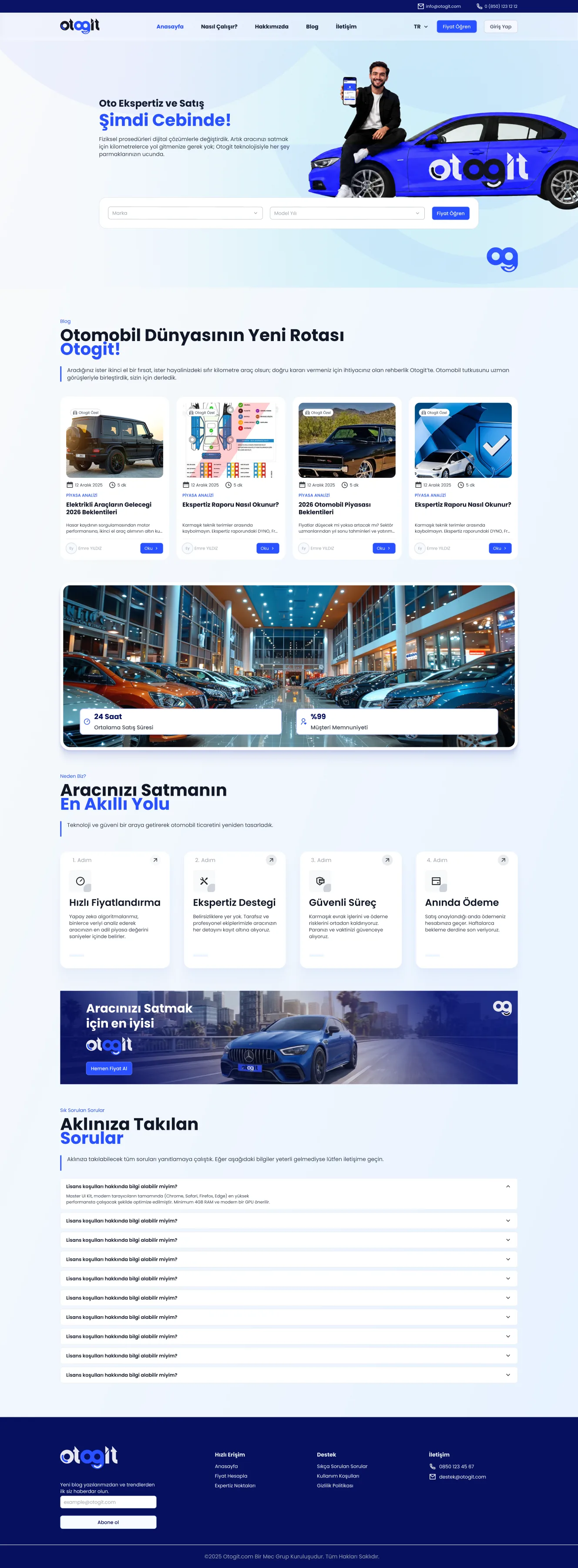
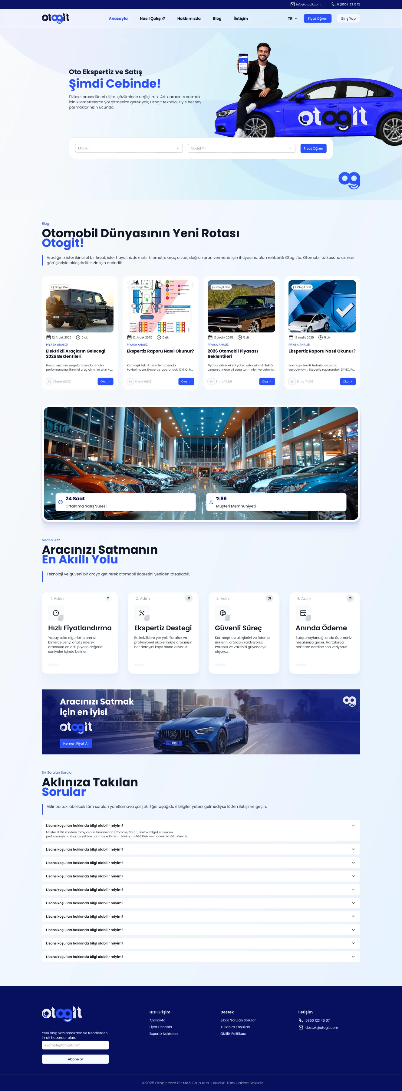
Otogit is a used car selling platform. Car owners get a price offer online and book a free inspection.Otogit bir ikinci el araç satış platformu. Araç sahibi online fiyat teklifi alıyor ve ücretsiz ekspertiz randevusu oluşturuyor.

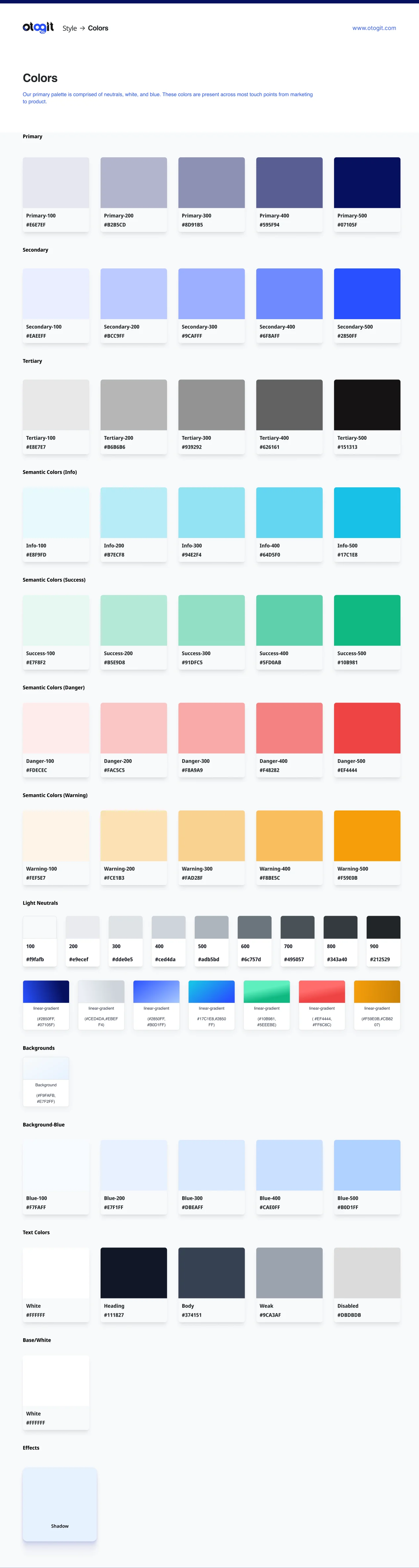
I organized the design system.Design system'i düzenledim.
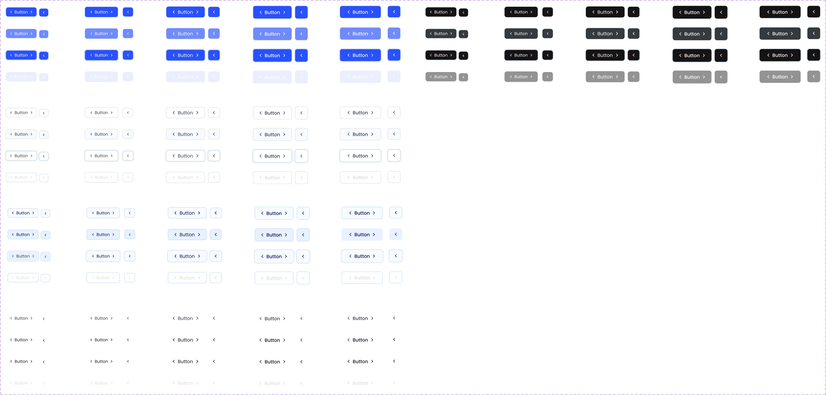
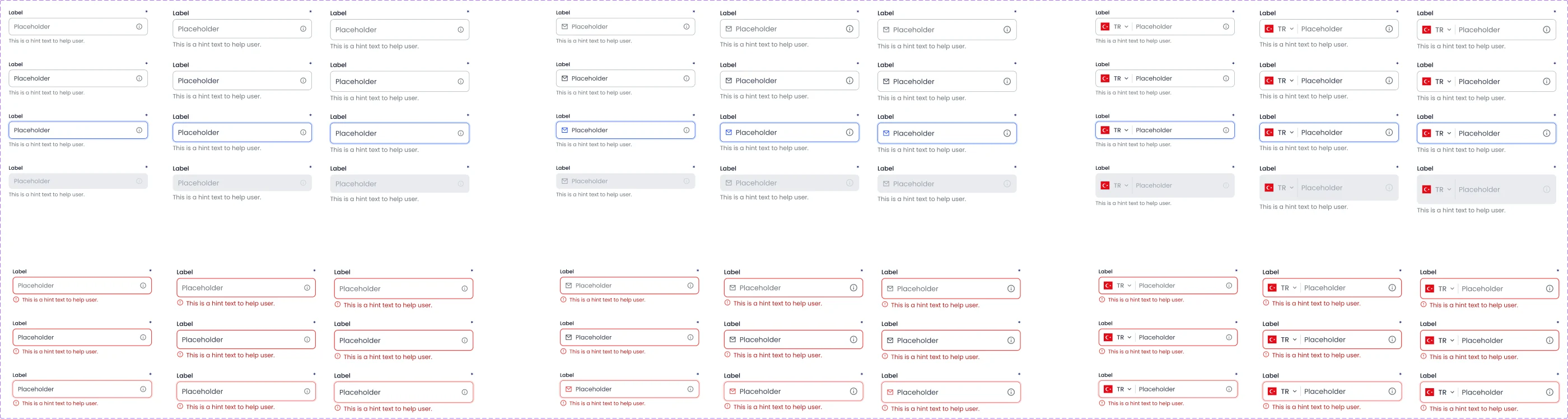
On Otogit my part was mostly the design system: colors, buttons and inputs, kept in order so pages are built from the same parts. I also designed the mobile responsive versions of the screens.Otogit'te benim payım çoğunlukla design system'di: renkler, butonlar ve input'lar; sayfalar aynı parçalarla kurulsun diye düzenli tutuldu. Ekranların mobil responsive hallerini de ben tasarladım.
What I worked onNeler yaptımColors, buttons and inputs.Renkler, butonlar ve input’lar.
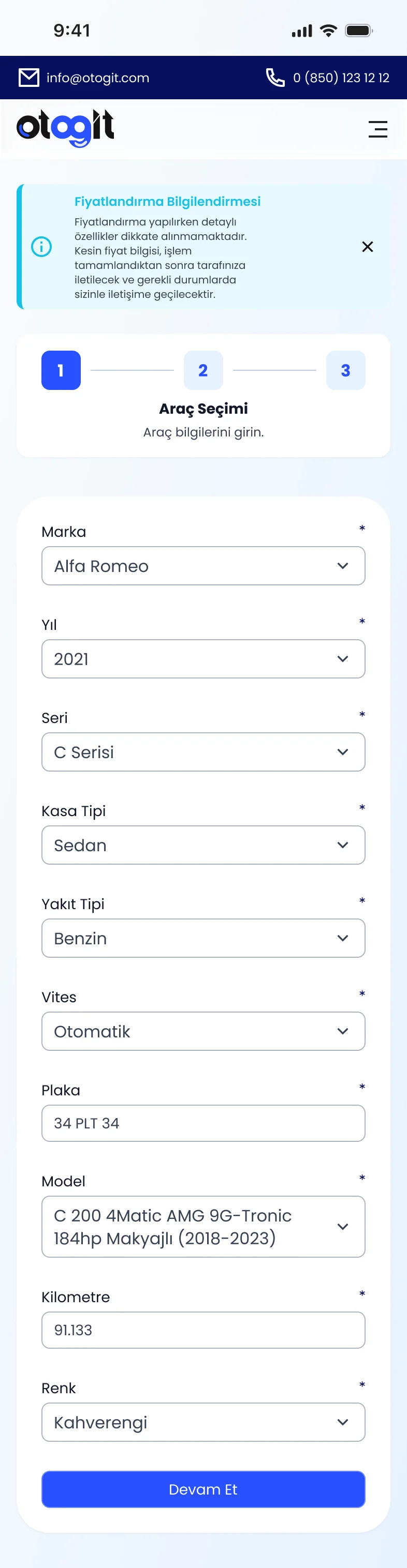
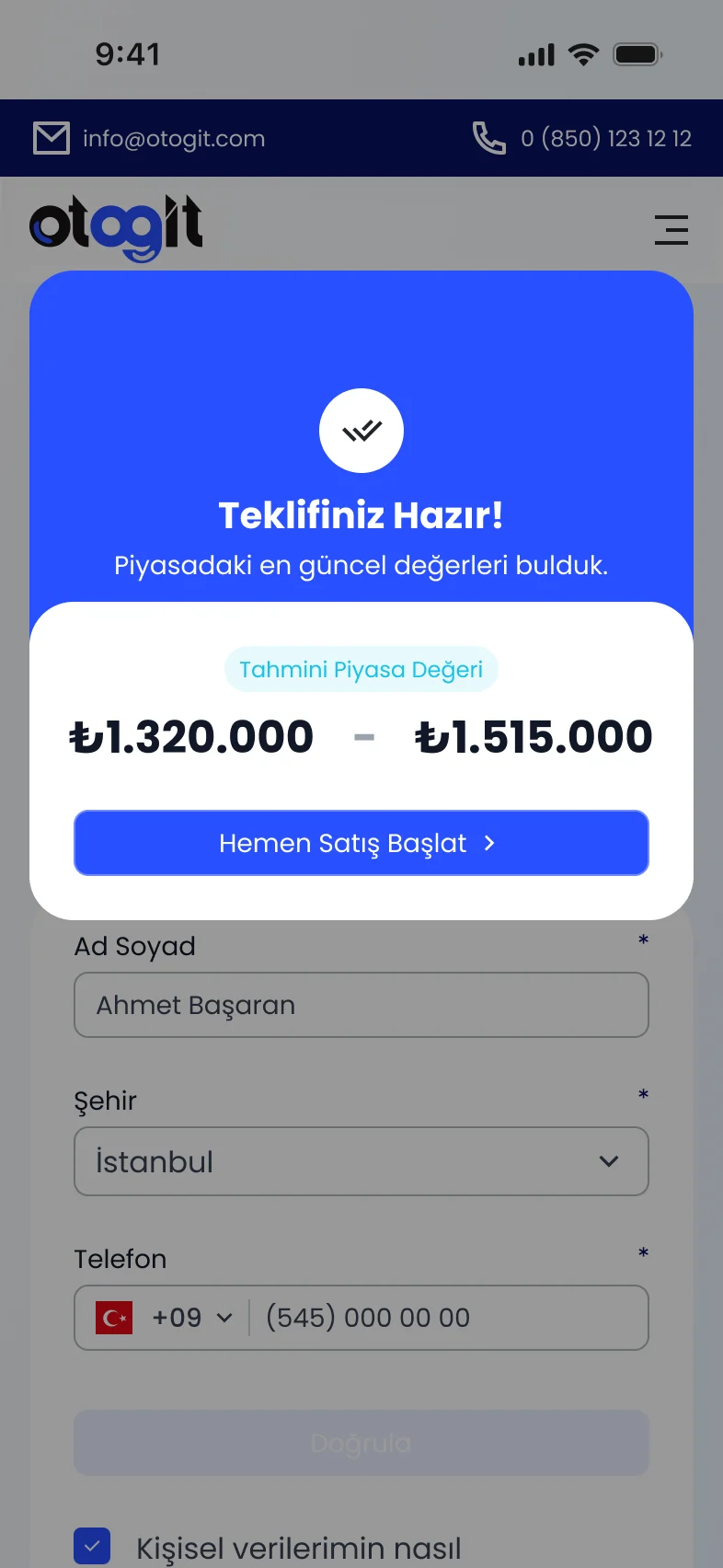
I designed the mobile versions of the screens: the home page, vehicle selection and the price offer.Ekranların mobil hallerini ben tasarladım: anasayfa, araç seçimi ve fiyat teklifi.
HekimBul is a platform for finding healthcare professionals by location, specialty and available time, and booking an appointment in one flow.HekimBul; konuma, uzmanlık alanına ve uygun saate göre sağlık profesyonellerini keşfetmeyi ve tek akışta randevu oluşturmayı sağlayan bir platform.
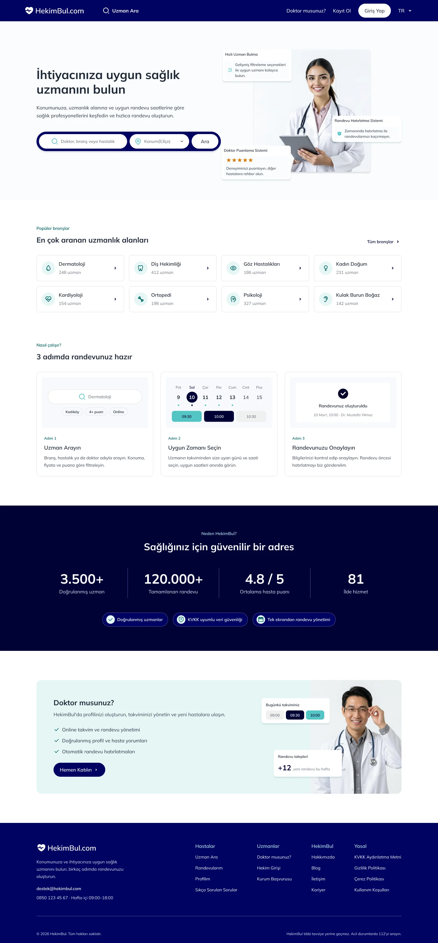

I designed the whole project, from research to the final screens.Projeyi araştırmadan son ekranlara kadar baştan sona ben tasarladım.
Benchmark, user flow, wireframes, UI design, design system and the responsive version. The product has 4 main flows: Find a Specialist, Specialist Detail & Booking, My Appointments and My Profile.Benchmark, user flow, wireframe, arayüz tasarımı, design system ve responsive uyarlama. Üründe 4 ana akış var: Uzman Ara, Uzman Detay ve Randevu, Randevularım ve Profilim.
Output: 32 desktop and 33 mobile screens, a component library and a style guide.Çıktı: 32 desktop ve 33 mobil ekran, component kütüphanesi ve style guide.
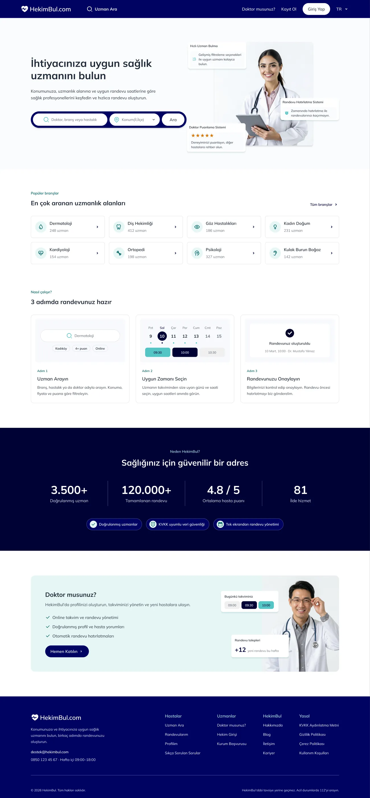
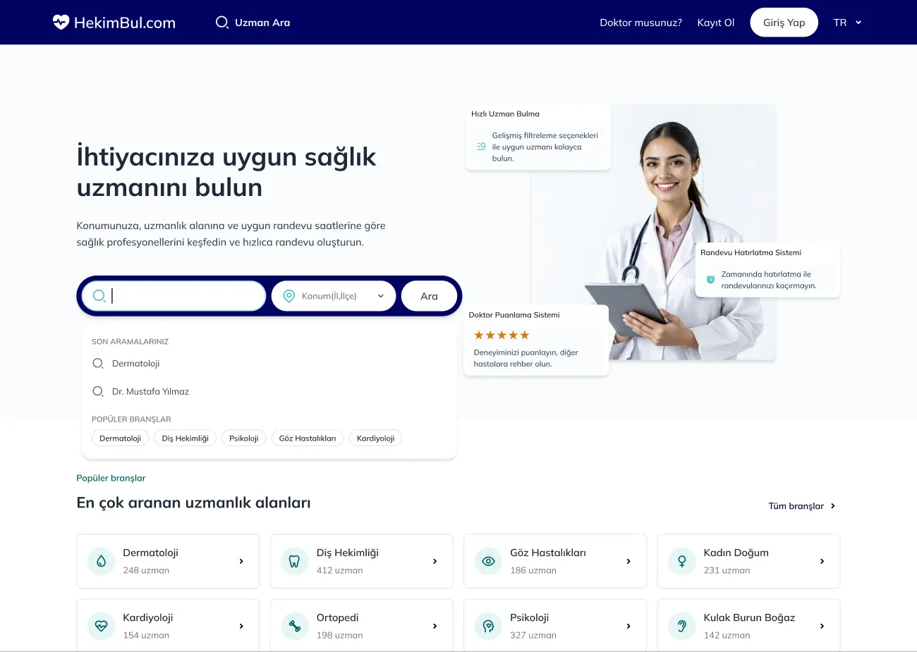
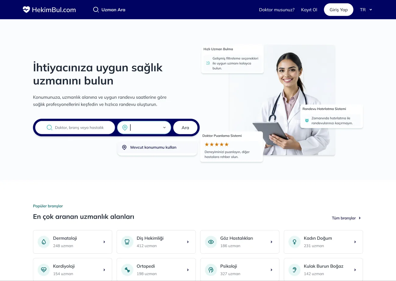
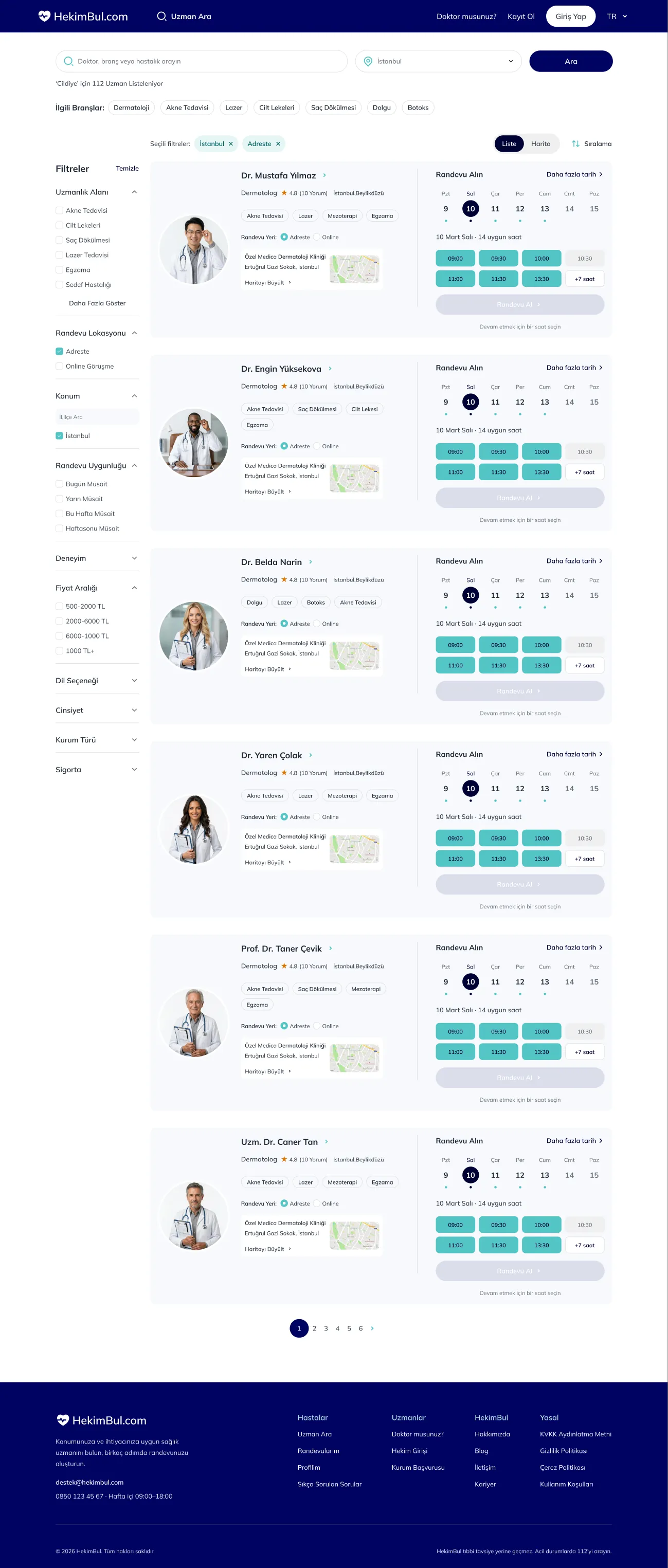
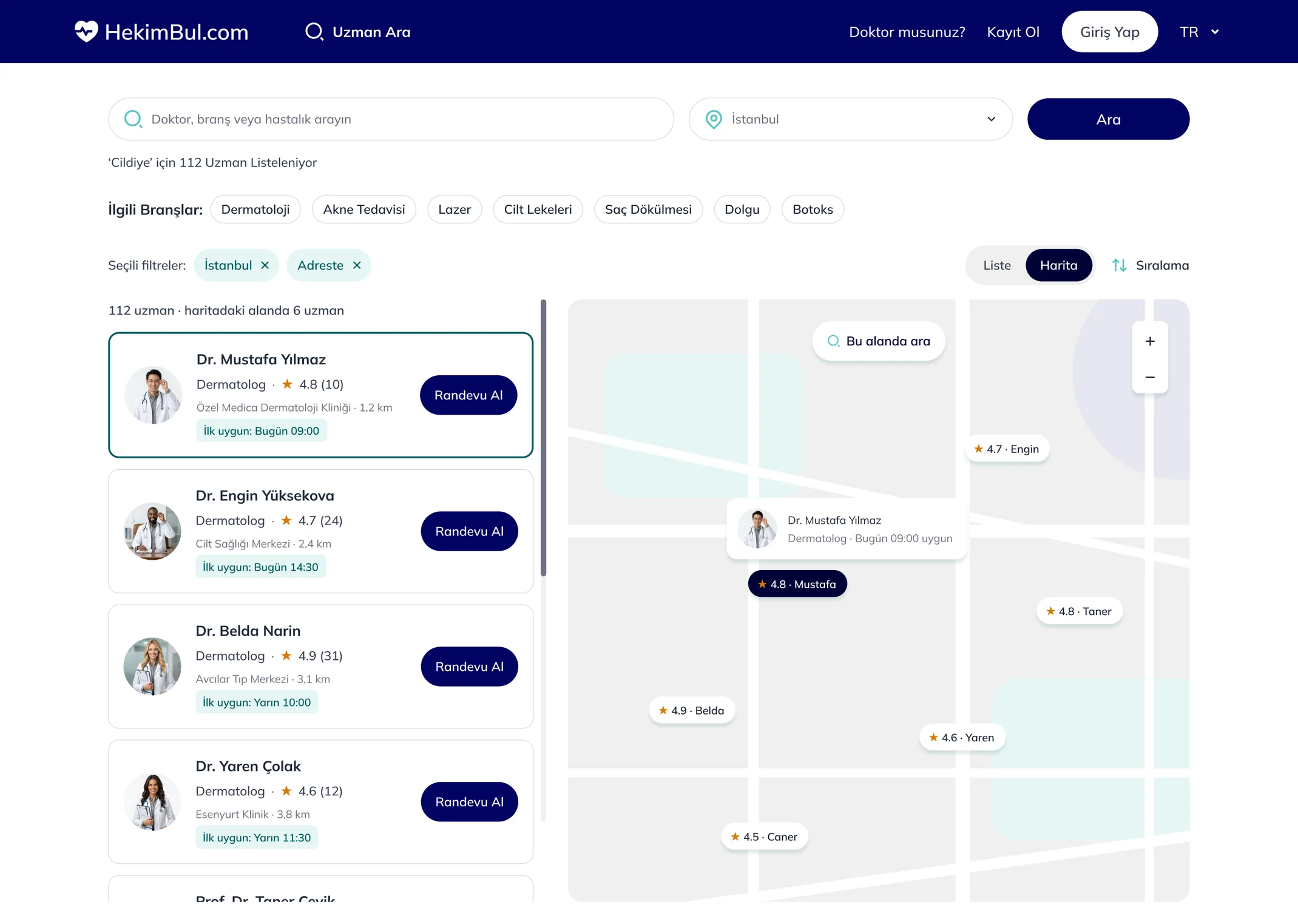
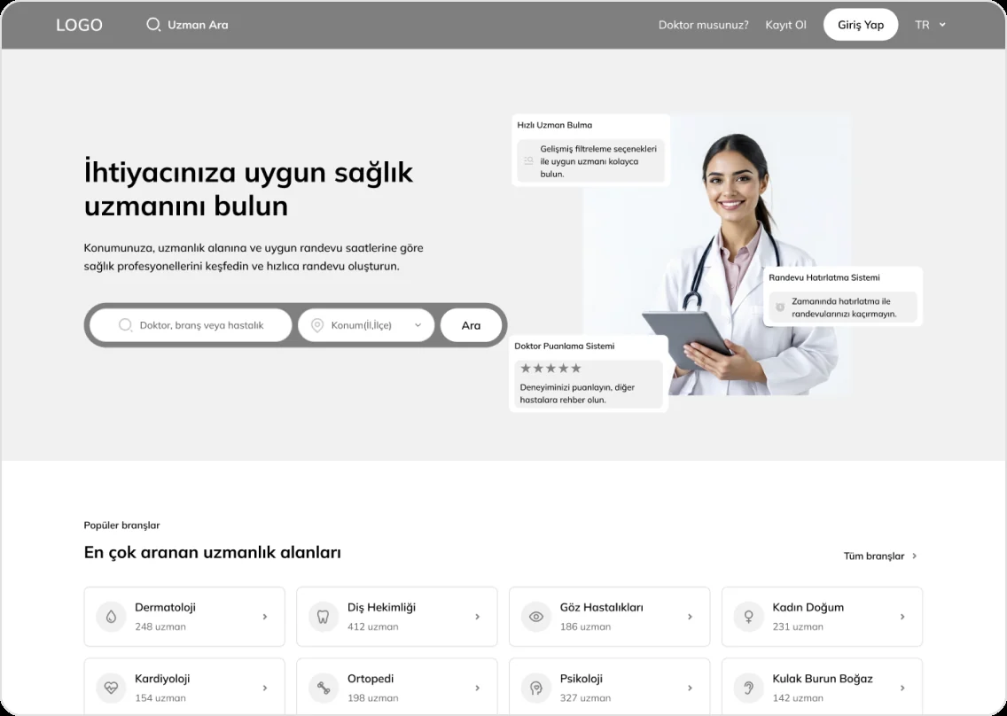
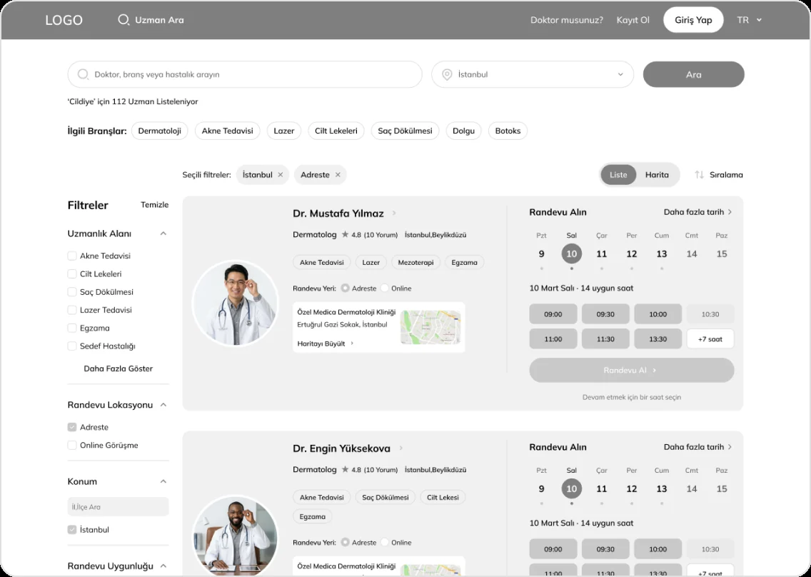
ProcessSüreçSearch by specialty or doctor and location, then compare available times right in the list. The same results can be seen on a map.Branş ya da doktor adı ve konumla arama, sonra uygun saatleri doğrudan listede karşılaştırma. Aynı sonuçlar haritada da görülebiliyor.
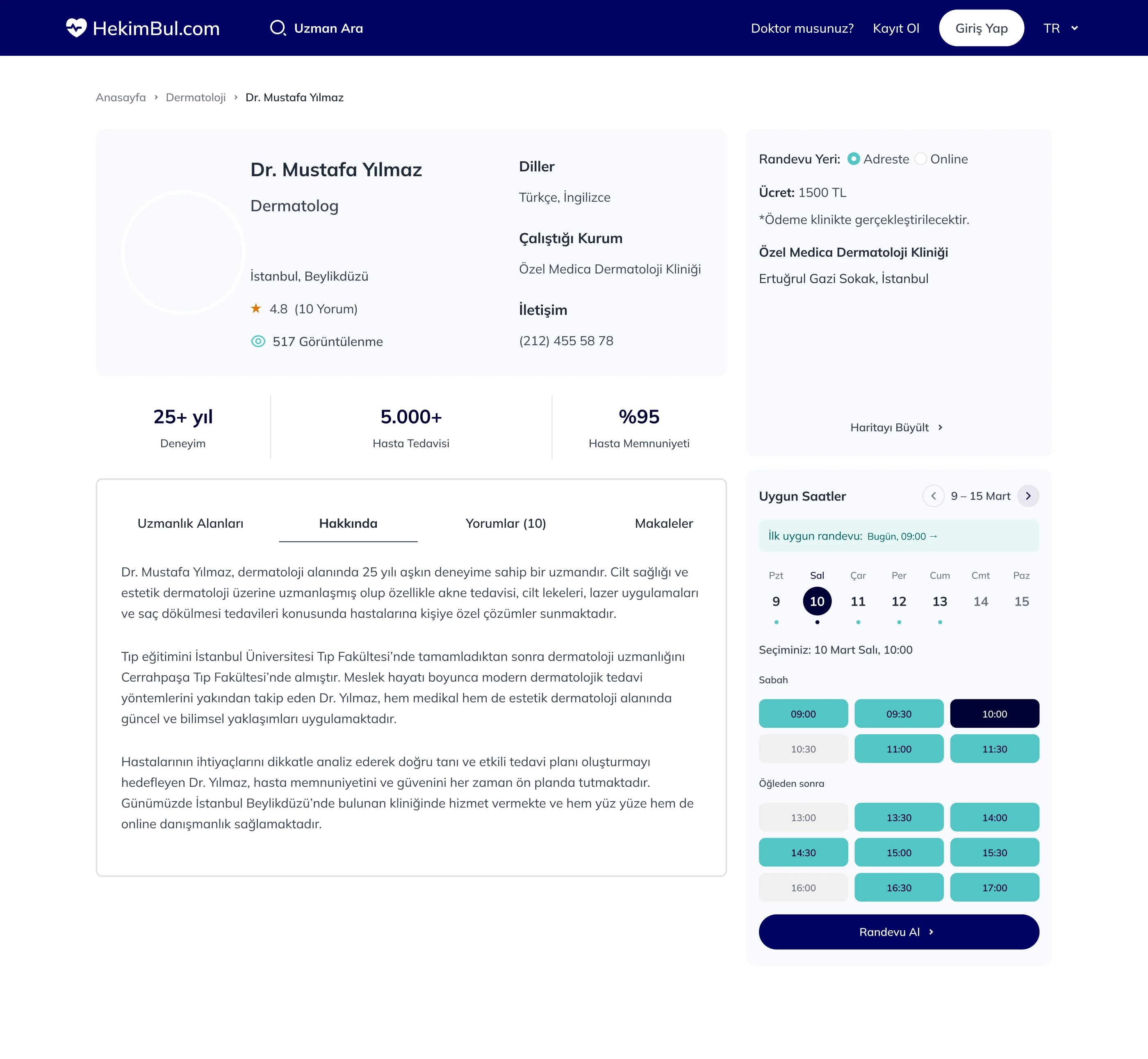
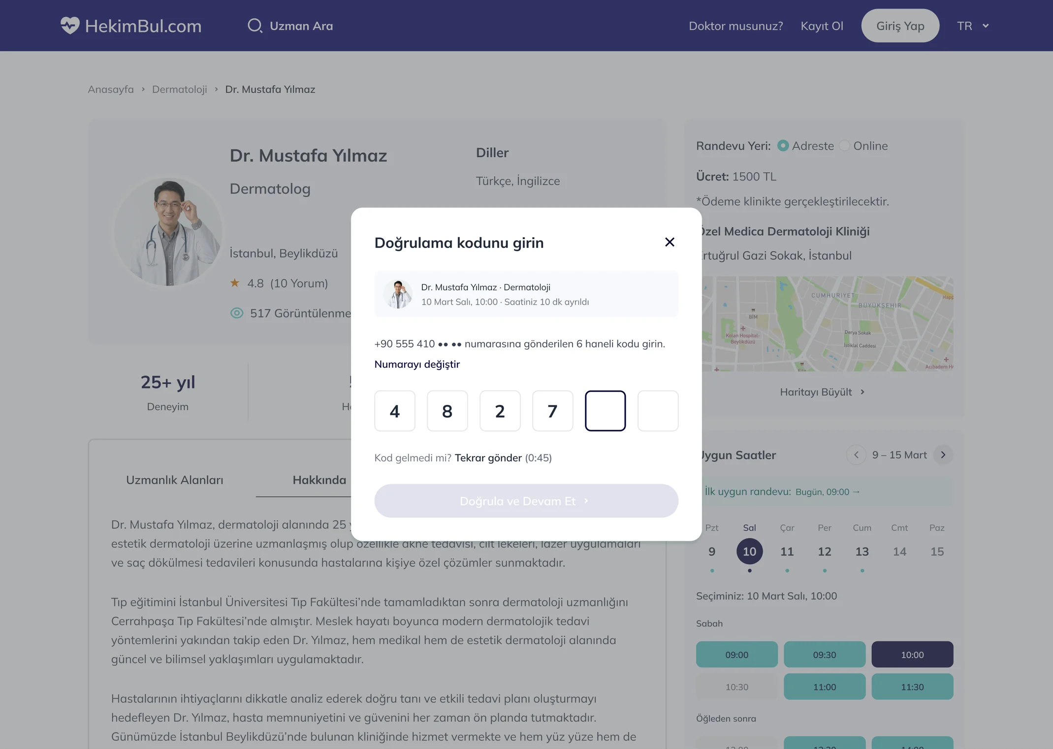
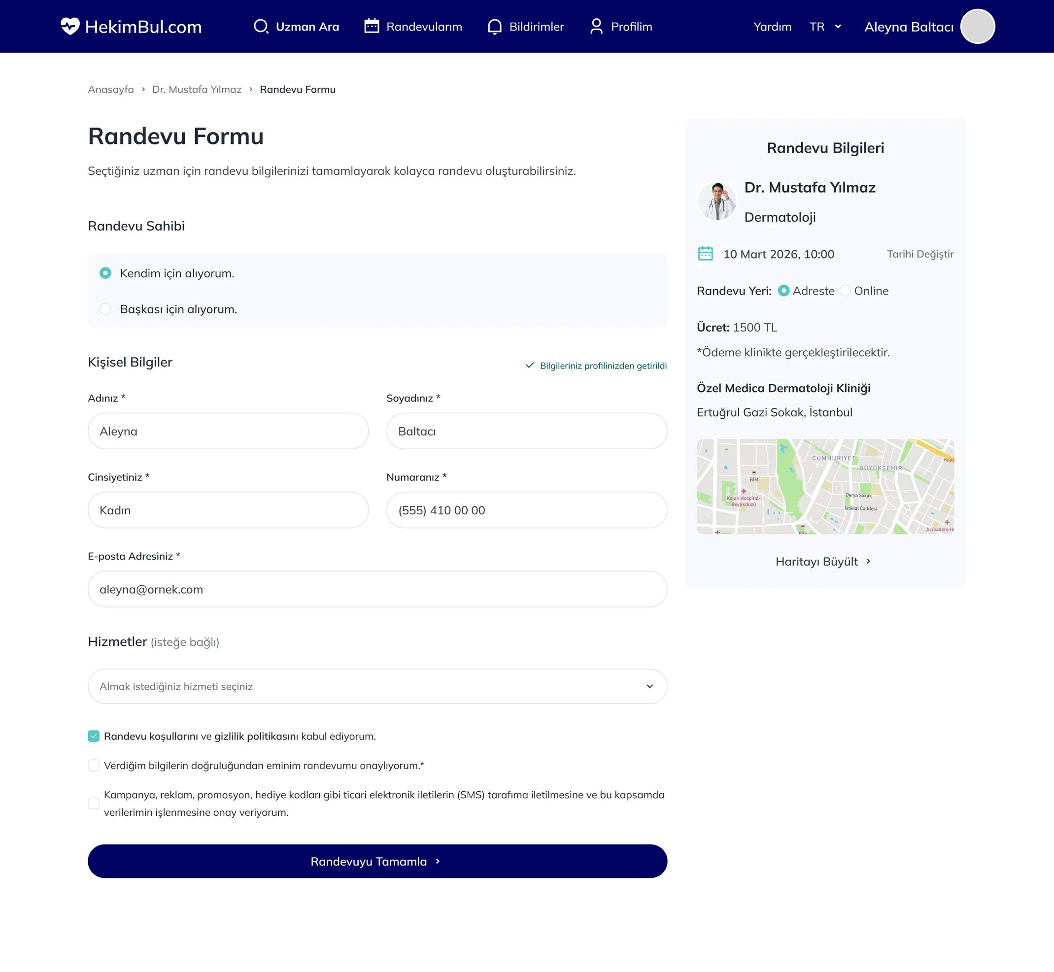
Pick a time on the doctor page, sign in with an SMS code without leaving the flow, and fill in the form for yourself or someone else.Doktor sayfasında saat seçiliyor, akıştan çıkmadan SMS koduyla giriş yapılıyor ve form kendin ya da başkası için dolduruluyor.
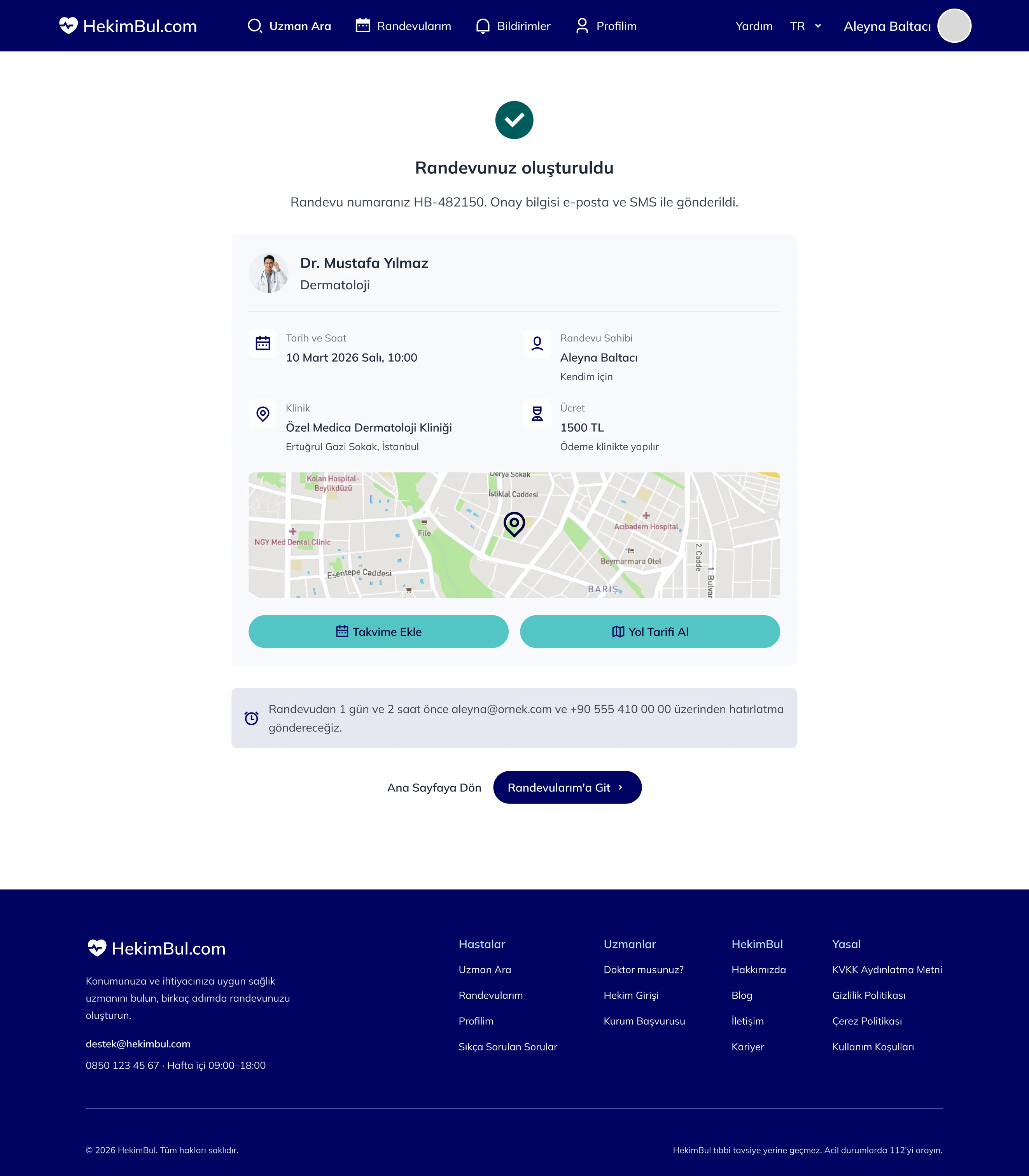
A clear confirmation screen: appointment number, date, clinic, fee and map, with add to calendar and directions.Net bir onay ekranı: randevu numarası, tarih, klinik, ücret ve harita; takvime ekleme ve yol tarifi.
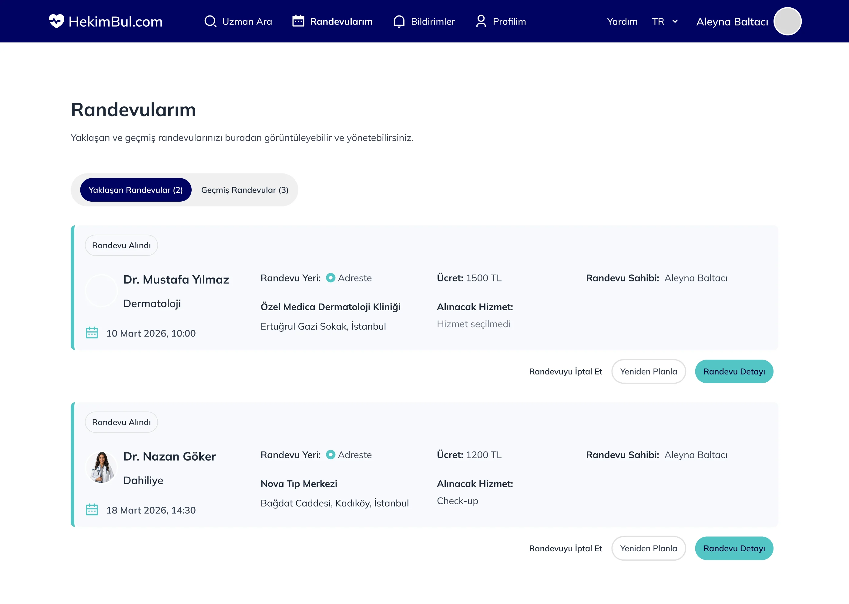
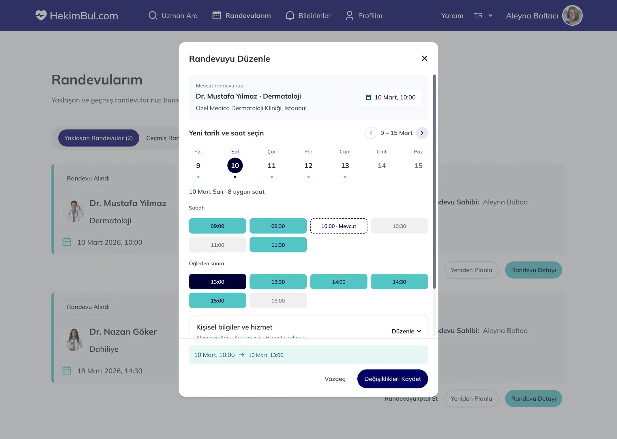
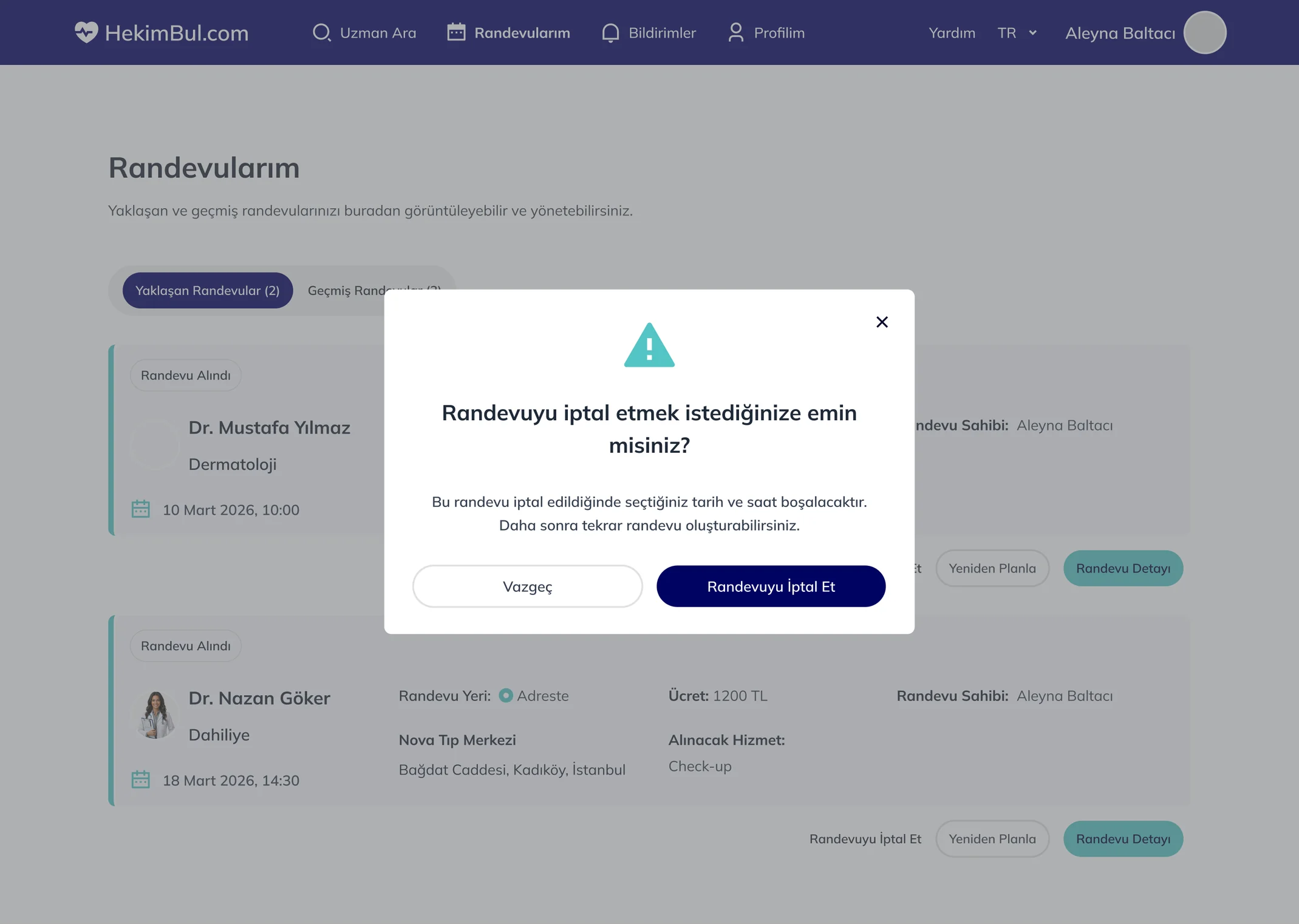
Upcoming and past appointments in one place. Rescheduling keeps the current time visible, and cancelling is a separate, confirmed step.Yaklaşan ve geçmiş randevular tek yerde. Yeniden planlarken mevcut saat görünür kalıyor, iptal ise ayrı ve onaylı bir adım.
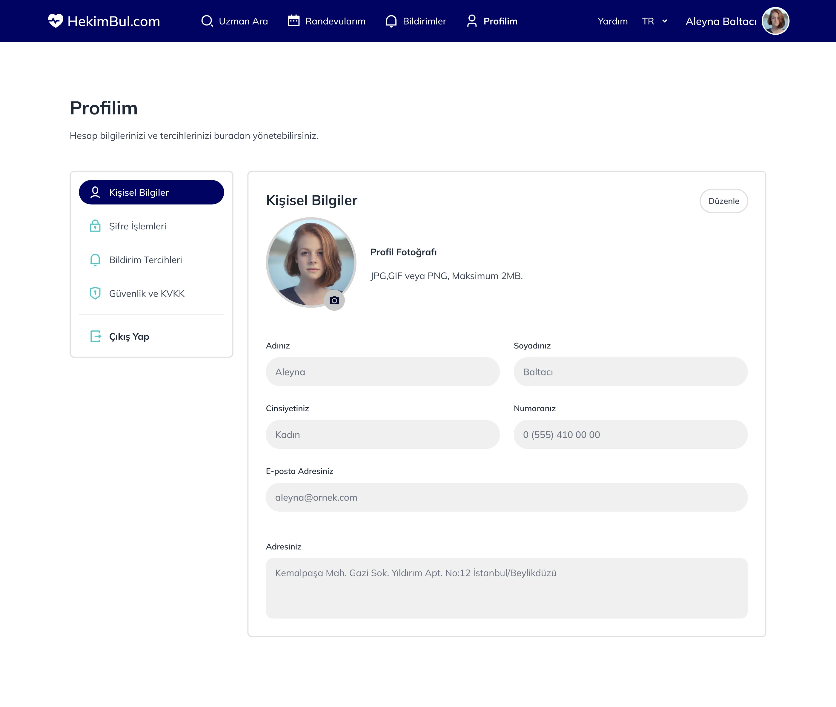
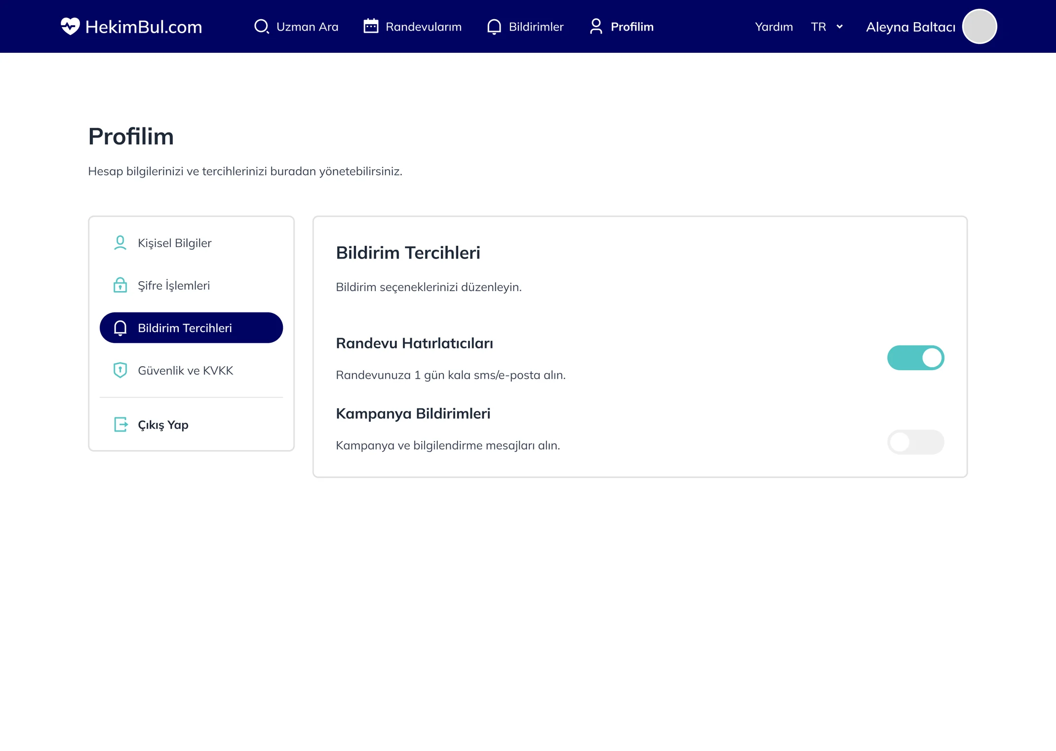
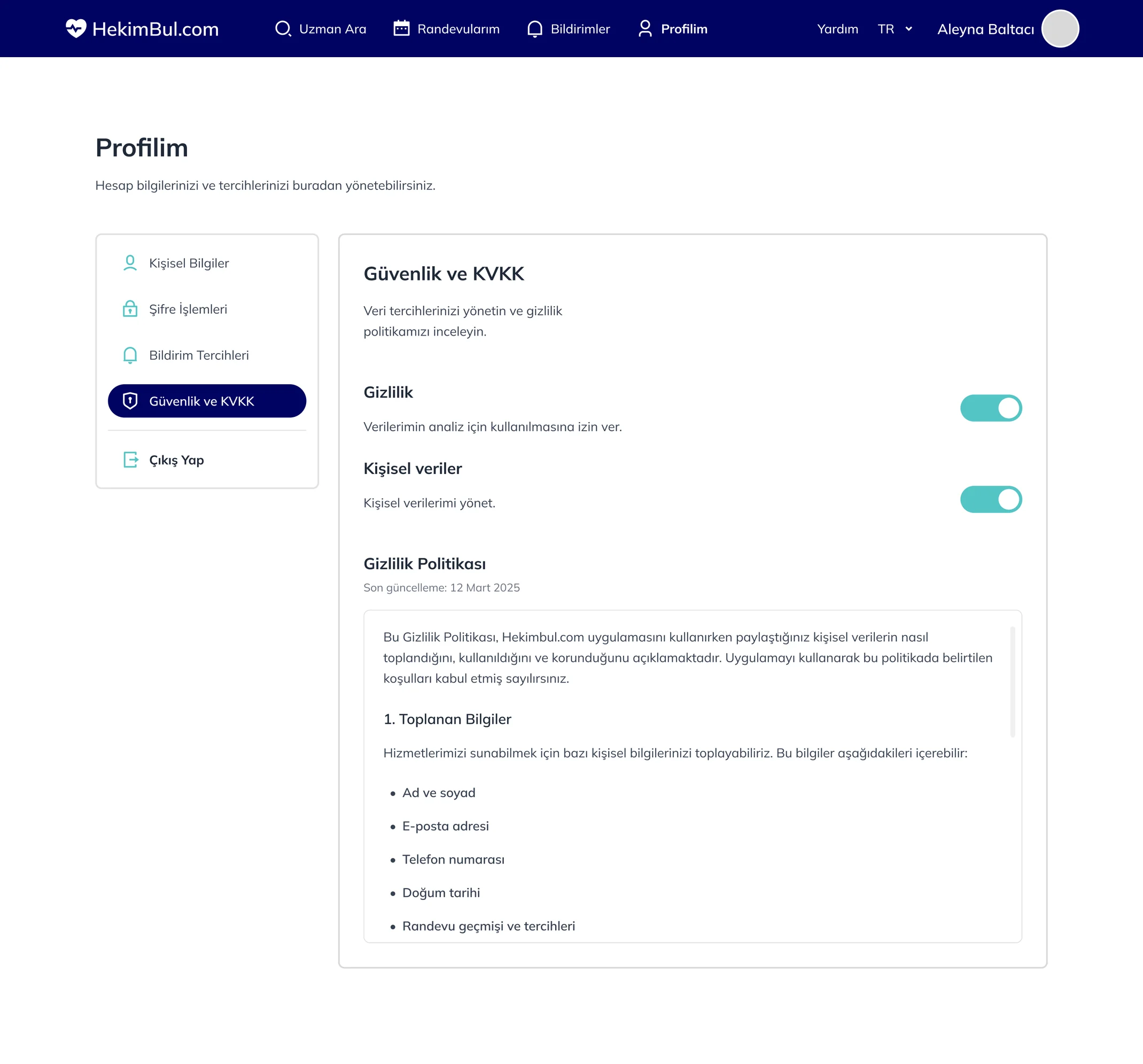
Viewing and editing are separate. Notification preferences save instantly, and data and privacy settings are open to the user.Okuma ve düzenleme ayrı. Bildirim tercihleri anında kaydediliyor, veri ve gizlilik ayarları kullanıcıya açık.
Every flow works on a 390px screen with a 4 column grid. Detail sections become accordions, times sit in a 3 column grid and actions stack.Tüm akışlar 390px ekranda, 4 kolon grid ile çalışıyor. Detaydaki bölümler akordeona dönüşüyor, saatler 3’lü ızgarada, aksiyonlar alt alta.



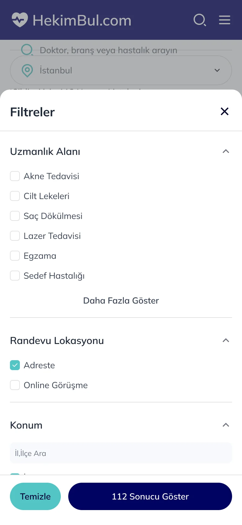
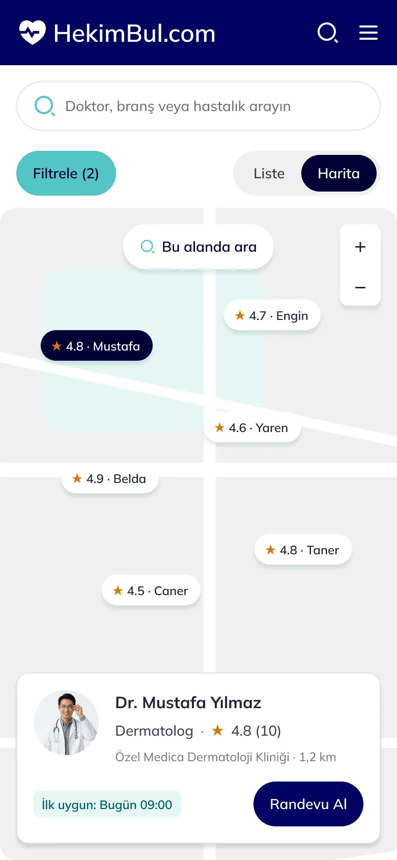
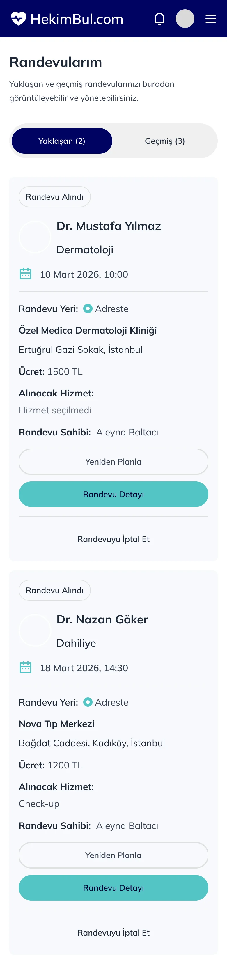
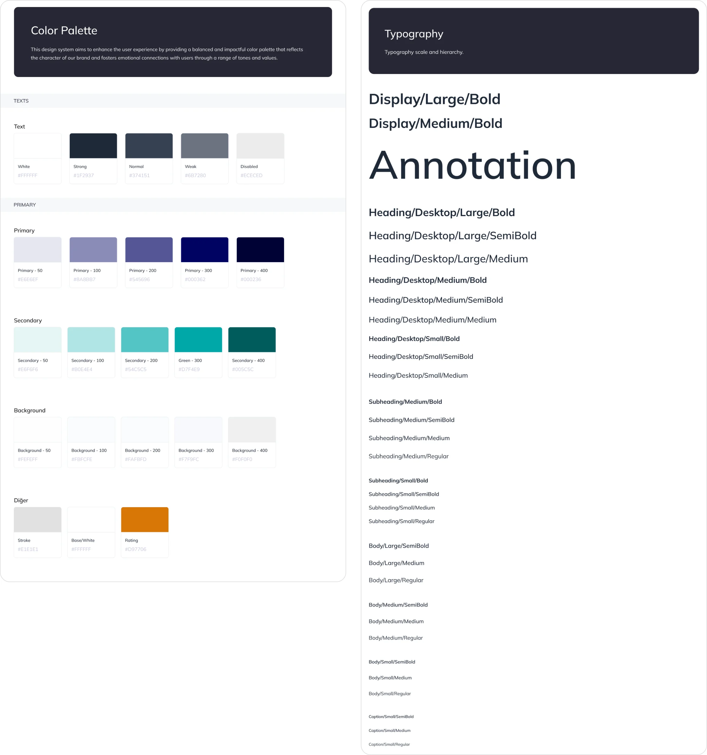
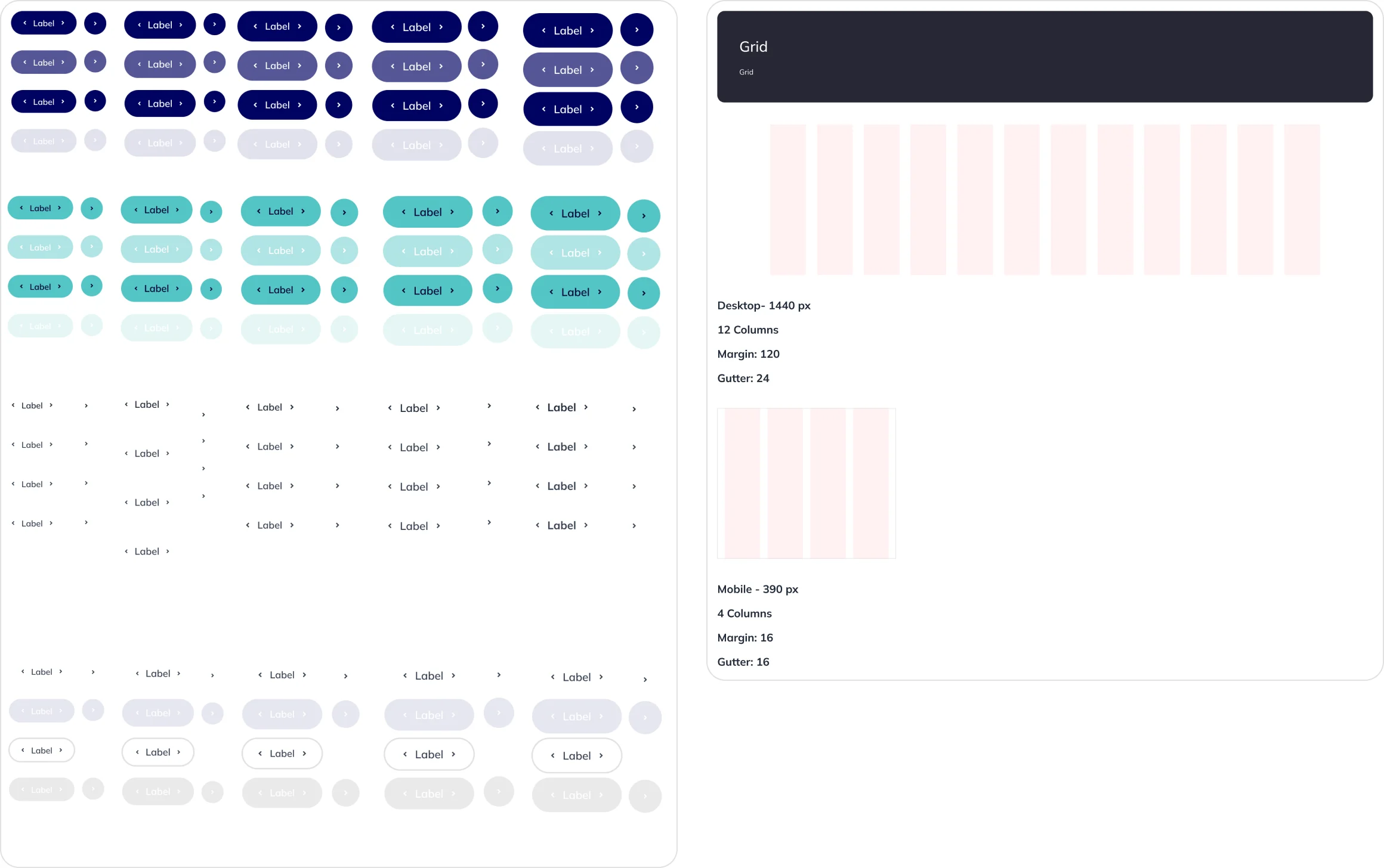
Navy and turquoise colors, Mulish typography, buttons and a 12 column desktop / 4 column mobile grid.Lacivert ve turkuaz renkler, Mulish tipografi, butonlar ve 12 kolon desktop / 4 kolon mobil grid.
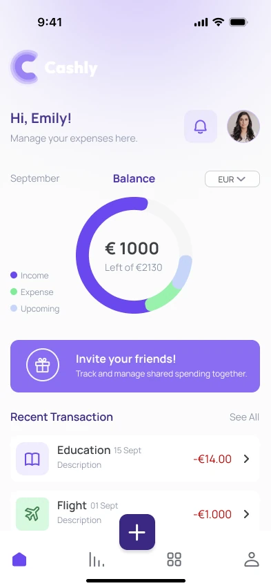
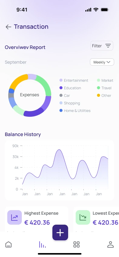
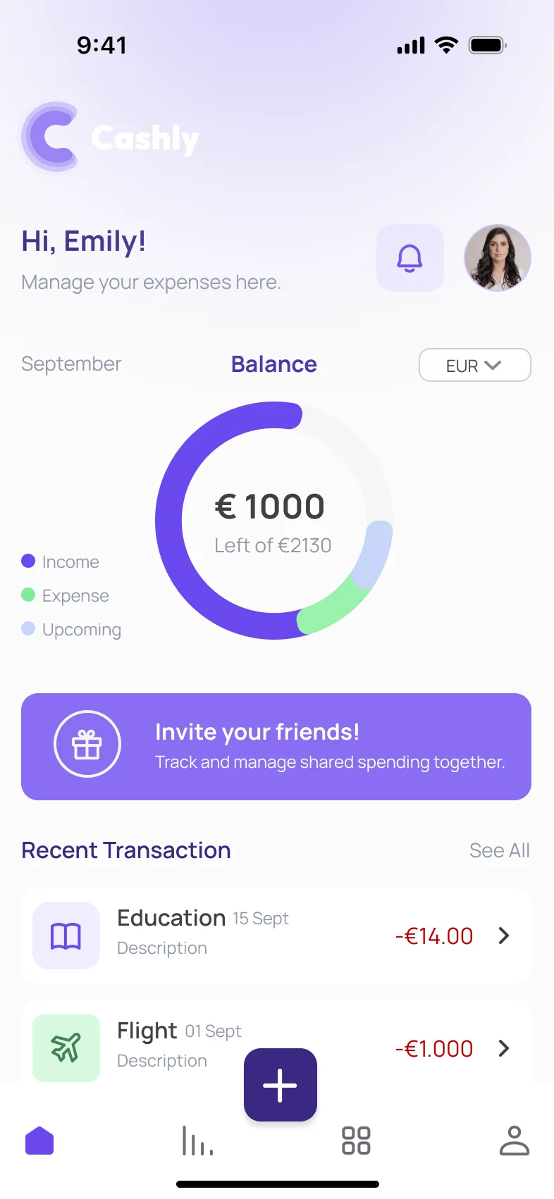
Cashly is an expense management app designed to support smarter budgeting and provide clear financial insights.Cashly, daha akıllı bütçe yönetimi ve net finansal içgörüler sunmak için tasarlanmış bir harcama takibi uygulaması.
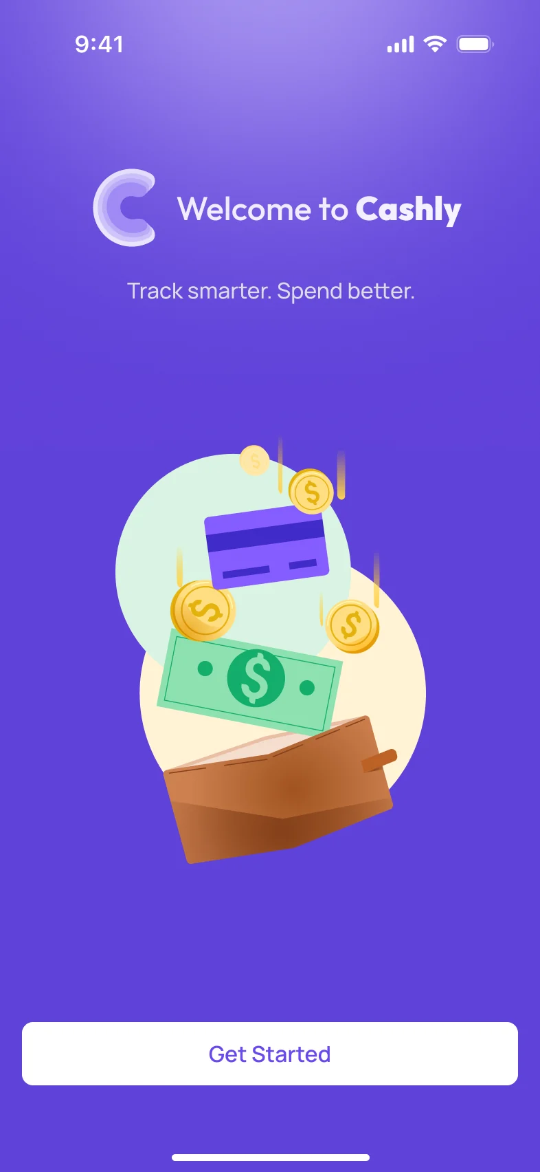
“Track smarter. Spend better.”“Track smarter. Spend better.”
The goal was a simple, intuitive and trustworthy experience for people who want to understand where their money goes without being overwhelmed by complex financial data.Amaç, karmaşık finansal verilerle boğulmadan paranın nereye gittiğini anlamak isteyenler için sade, sezgisel ve güvenilir bir deneyim oluşturmaktı.
What I worked onNeler yaptım“Clarity helps me stay in control of my spending.”“Netlik, harcamalarımın kontrolünü elimde tutmamı sağlıyor.”
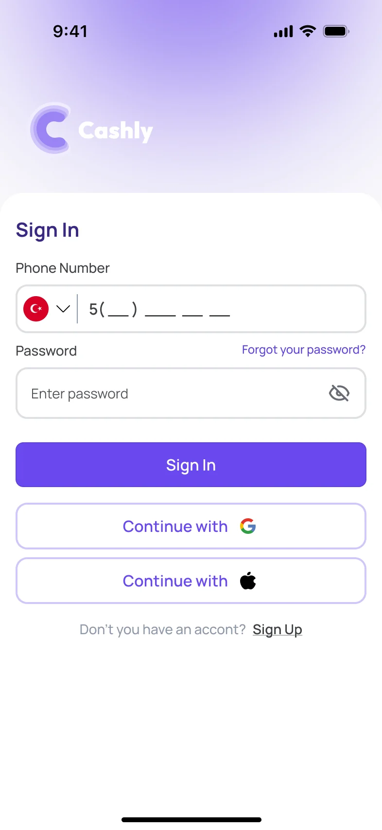
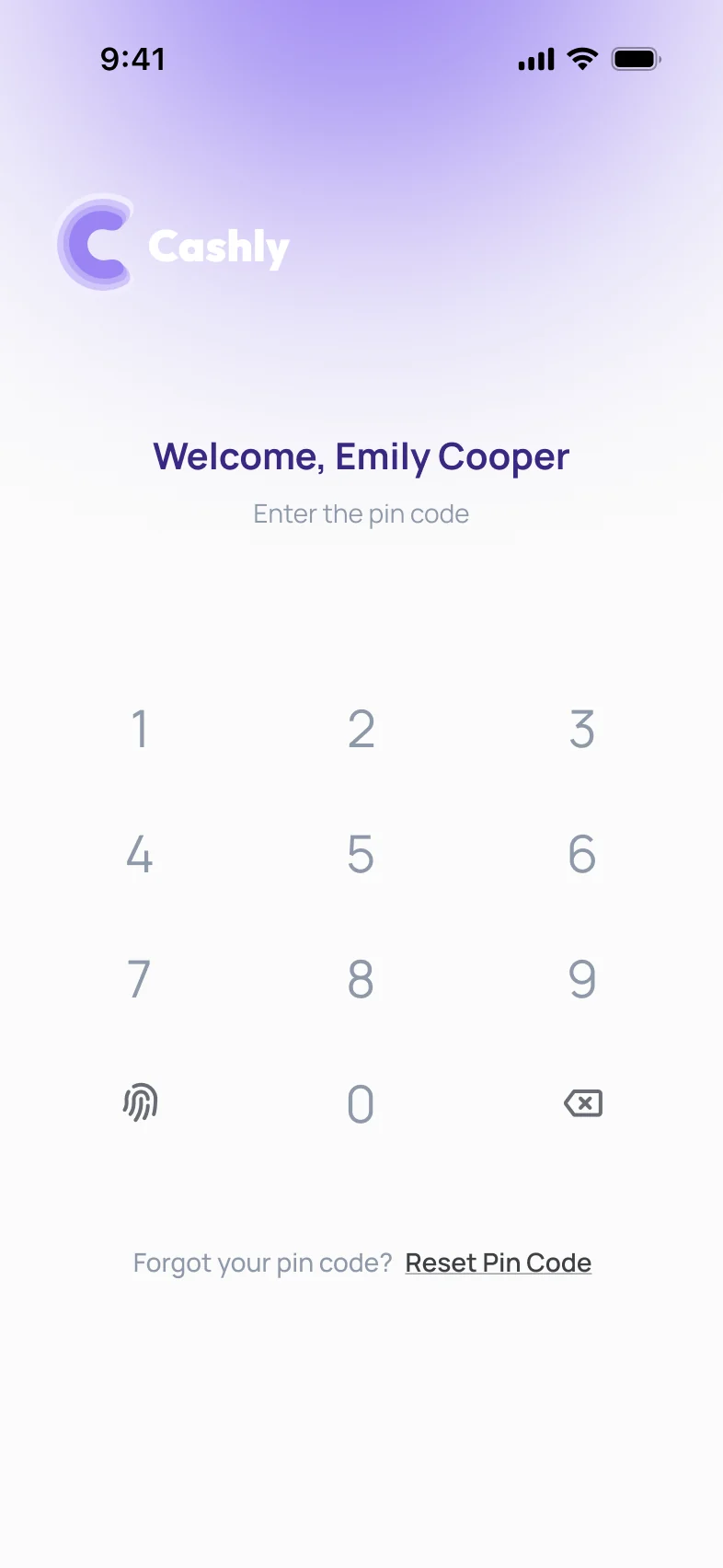
Cashly welcomes the user, then sign in. For a secure experience, a PIN code protects the account.Cashly kullanıcıyı karşılıyor, ardından giriş geliyor. Güvenli bir deneyim için hesap PIN koduyla korunuyor.
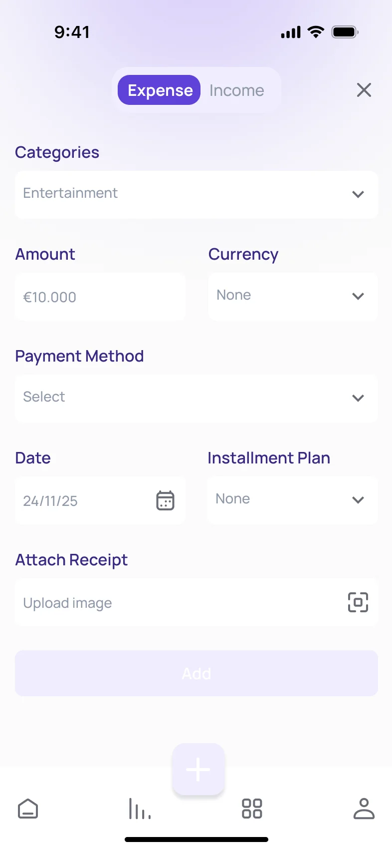
The home screen shows the financial status at a glance. Adding an expense is one short form with a single button in the middle of the tab bar.Ana sayfa finansal durumu tek bakışta gösteriyor. Harcama eklemek, tab bar’ın ortasındaki tek butondan açılan kısa bir form.
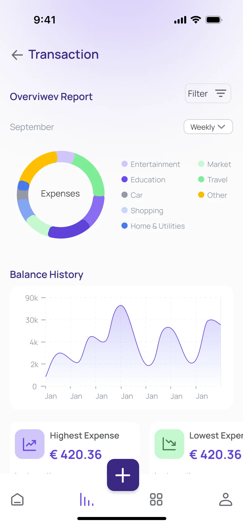
Clear visual reports, filtered by date and category, to see spending behaviour better.Tarih ve kategoriye göre filtrelenen net görsel raporlar; harcama alışkanlıkları daha iyi görülüyor.
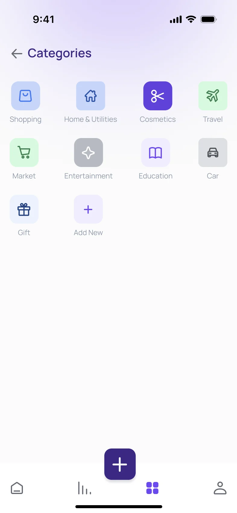
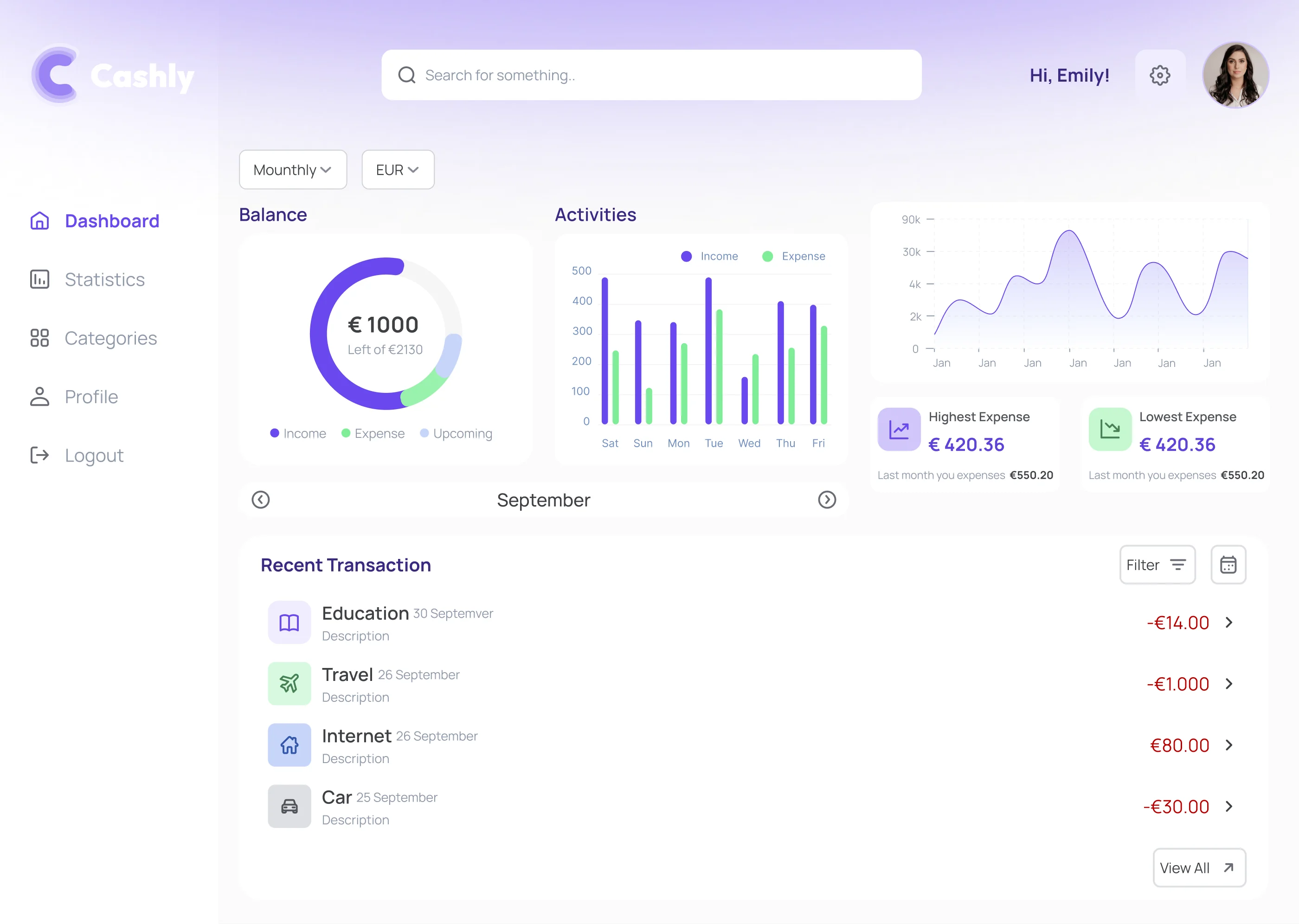
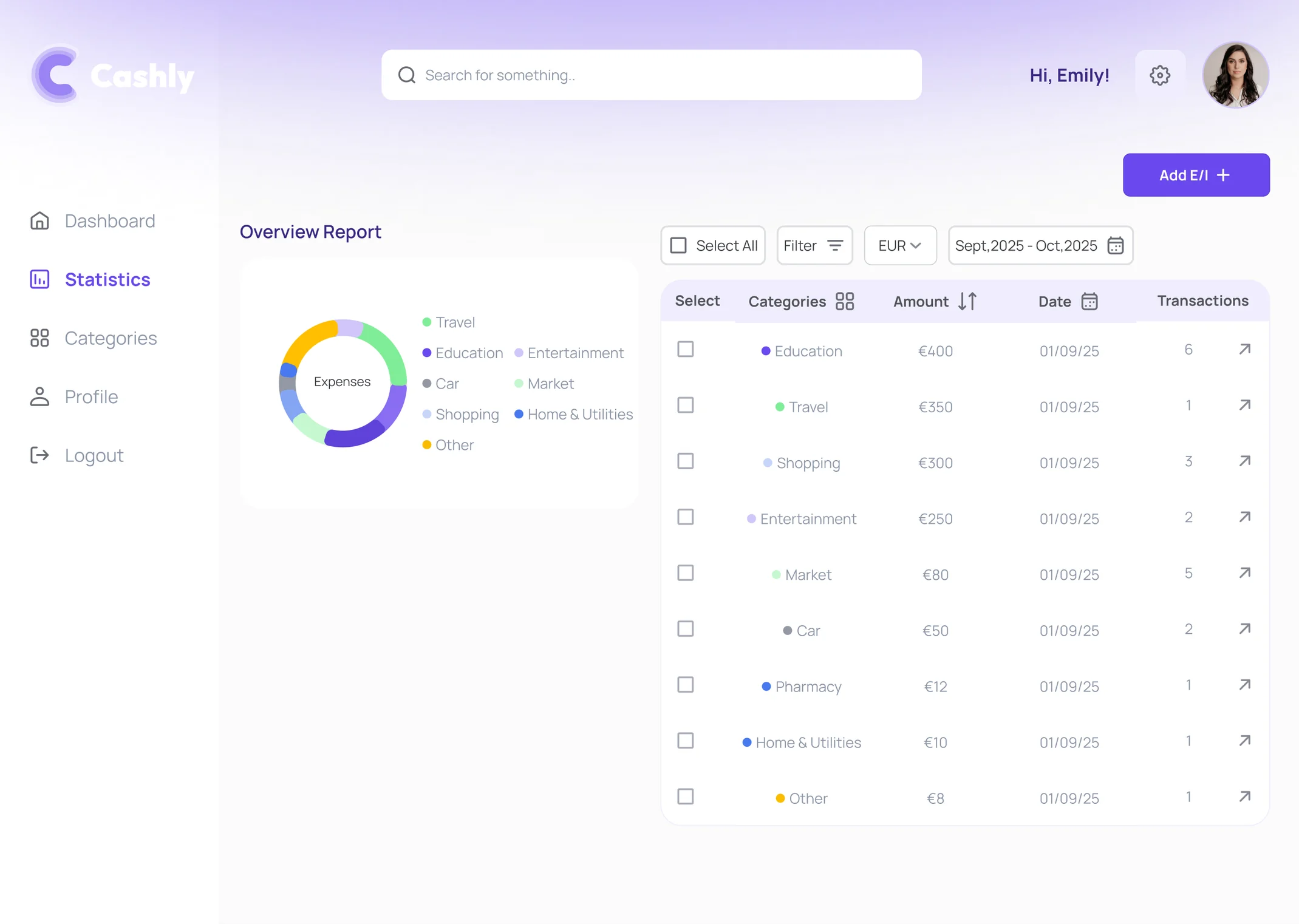
The web dashboard gives a clear overview of expenses and recent transactions, with statistics and category management.Web dashboard harcamalara ve son işlemlere net bir genel bakış sunuyor; istatistikler ve kategori yönetimi de burada.
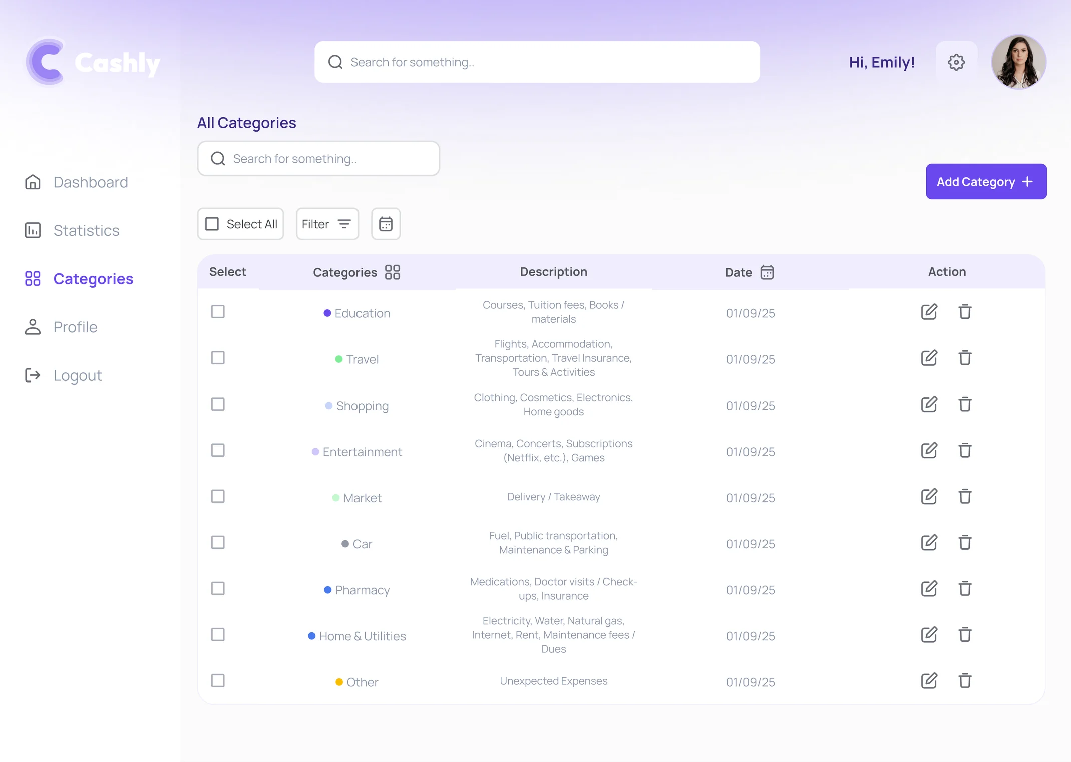
A soft, balanced palette and Manrope typography for a calm, trustworthy and approachable financial experience.Sakin, güvenilir ve yakın bir finans deneyimi için yumuşak, dengeli bir palet ve Manrope tipografi.
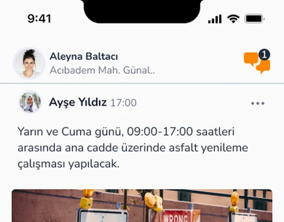
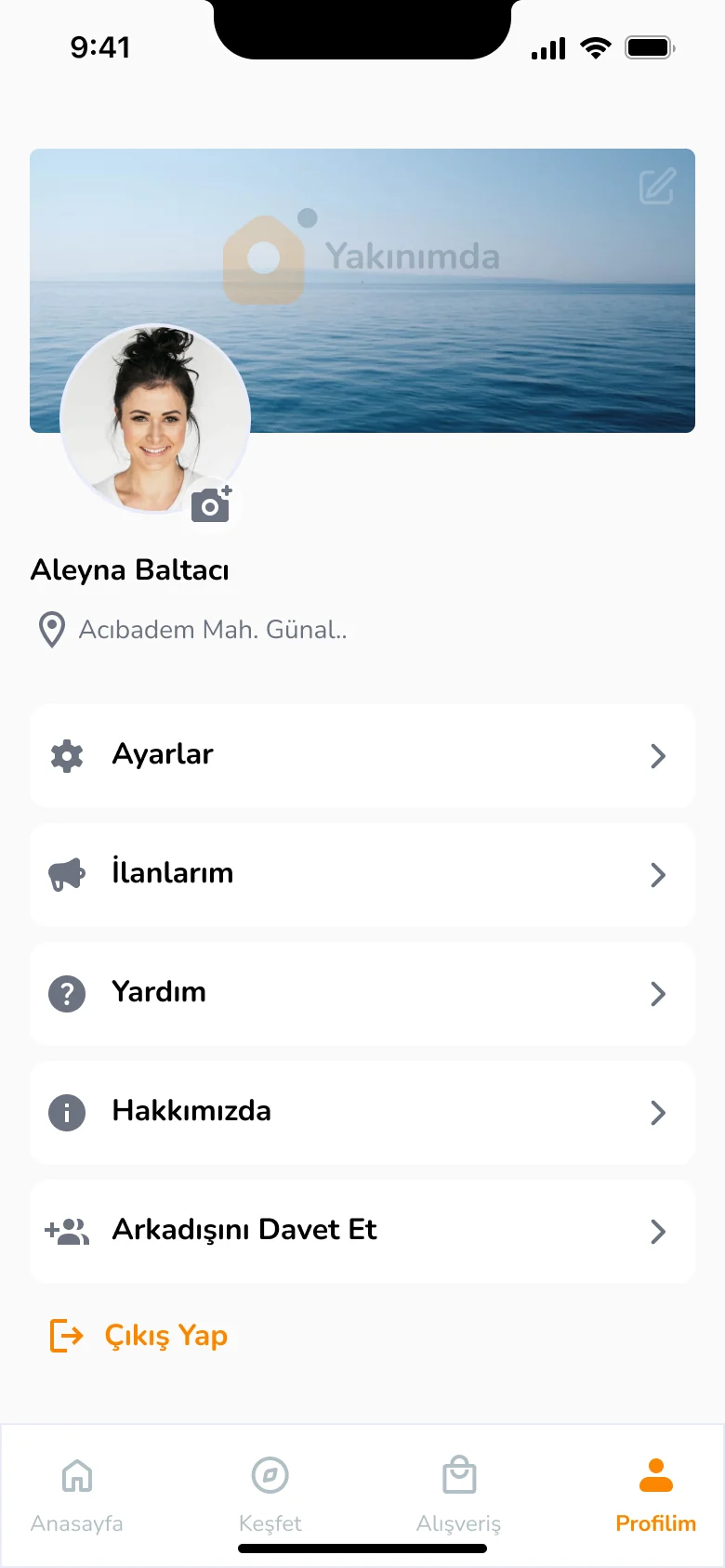
Yakınımda is a mobile app that brings neighbours together. People join local events, discover local businesses and talk to their neighbours easily, which helps keep neighbourhood culture alive.Yakınımda, mahalle sakinleri arasında iletişimi ve etkileşimi artırmayı amaçlayan bir mobil uygulama. Kullanıcılar etkinliklere katılıyor, yerel işletmeleri keşfediyor ve komşularıyla kolayca iletişim kuruyor; böylece mahalle kültürü güçleniyor.
My UX School final project, and my first end to end project.UX Okulu final projem ve uçtan uca yaptığım ilk proje.
Communication between neighbours keeps decreasing. Local events and businesses are not announced well enough, and this weakens neighbourhood culture and community ties.Günümüzde mahalle sakinleri arasında iletişim giderek azalıyor. Yerel etkinlikler ve işletmeler yeterince duyurulamıyor. Bu durum mahalle kültürünün zayıflamasına ve topluluk bağlılığının azalmasına yol açıyor.
I learned the process by doing it: from interviews to the final UI, every step is mine.Süreci yaparak öğrendim: görüşmelerden son arayüze kadar her adımı ben yaptım.
Design processTasarım süreci1 pilot interview and 6 participants: people with high digital literacy who care about neighbourhood culture.1 pilot görüşme ve 6 katılımcı: dijital okuryazarlığı yüksek, mahalle kültürüne önem veren ve topluluk bağı kurmaya hevesli bireyler.
“People only notice what they’re looking for. I share announcements on my Instagram, but people don’t see them.” Neighbourhood headman“Algıda seçicilik yaşıyoruz; duyuruları Instagram hesabımda paylaşıyorum ama insanlar görmüyor.” Mahalle Muhtarı
“The municipality and the headman invite their own circle to events. We never hear about them.”“Belediye ve muhtarlık yaptıkları etkinliklere kendi yakınlarını çağırıyorlar, bizim haberimiz olmuyor.”
“I want to give my extra things to people in need, but the municipality won’t take them because its storage is full.”“Evimdeki fazla eşyaları ihtiyaç sahiplerine vermek istiyorum, belediye depoları dolu olduğu için almıyor.”
“Neighbourly ties have faded because people don’t trust each other as they used to.”“Komşuluk ilişkileri azaldı çünkü insanlara eskisi kadar güvenilmiyor.”
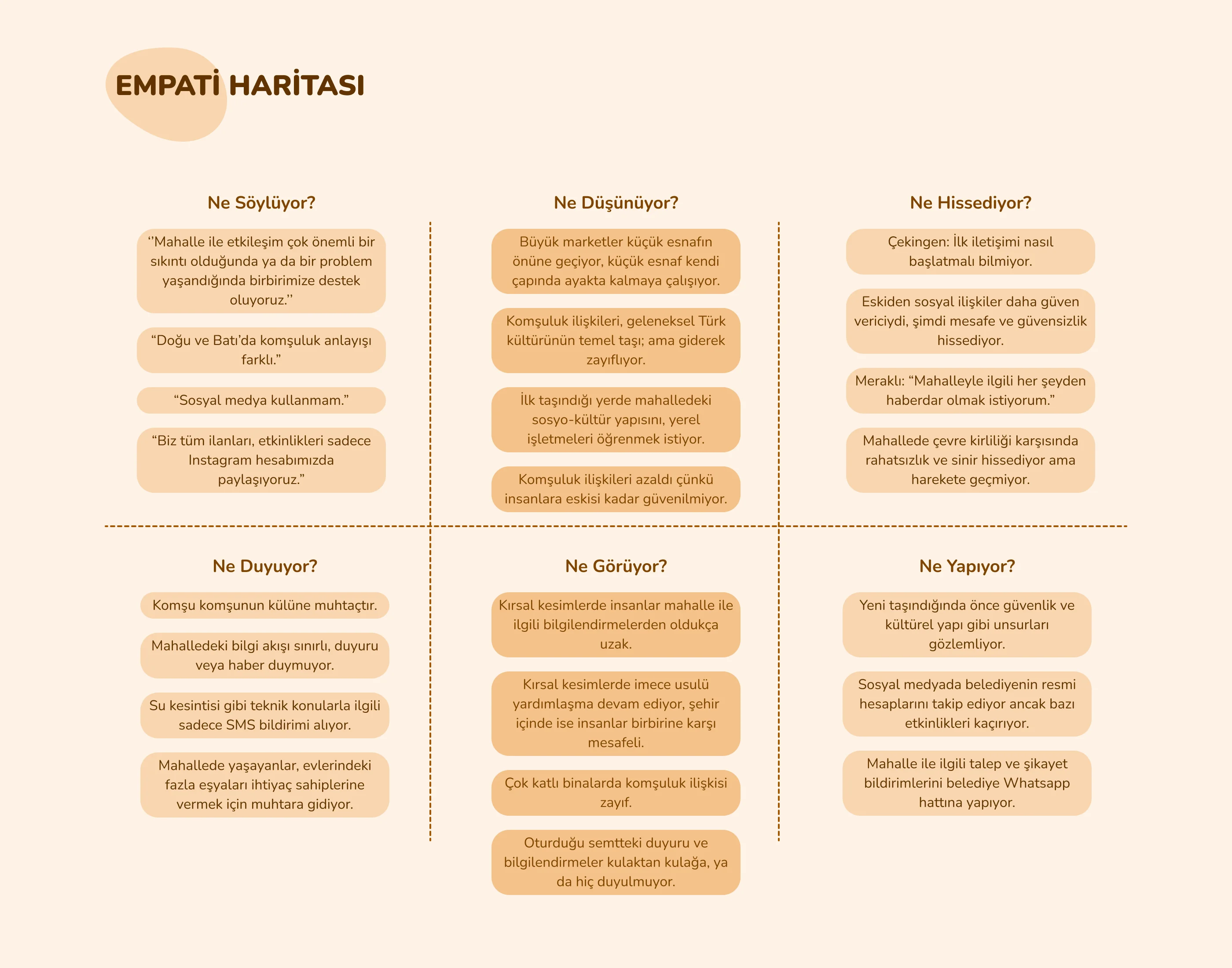
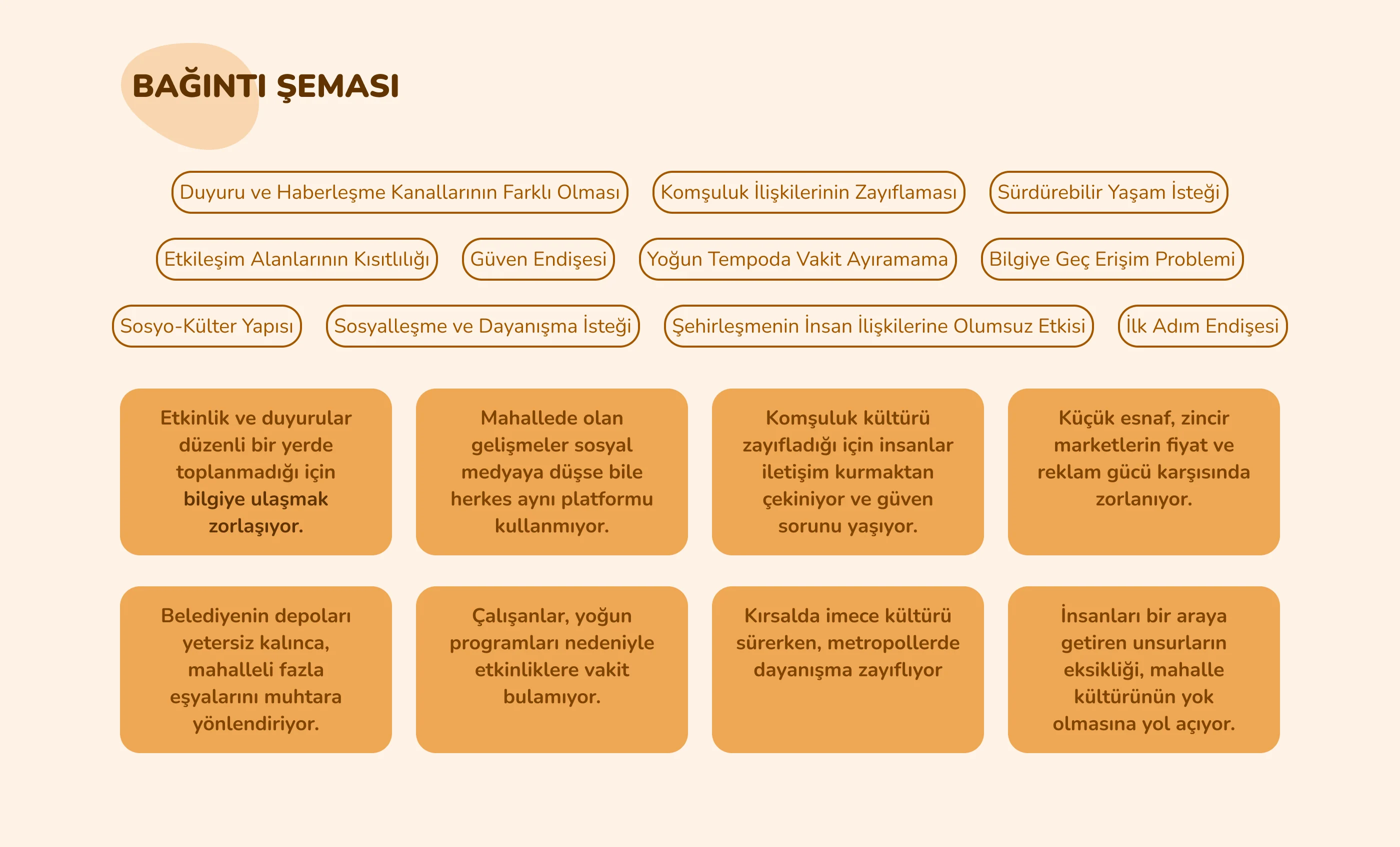
Interview notes grouped into what people say, think, feel and do, then clustered into themes: different announcement channels, weaker neighbour ties, trust, and late access to information.Görüşme notlarını ne söylüyor, düşünüyor, hissediyor ve yapıyor diye ayırdım, sonra temalara topladım: farklı duyuru kanalları, zayıflayan komşuluk, güven endişesi ve bilgiye geç erişim.
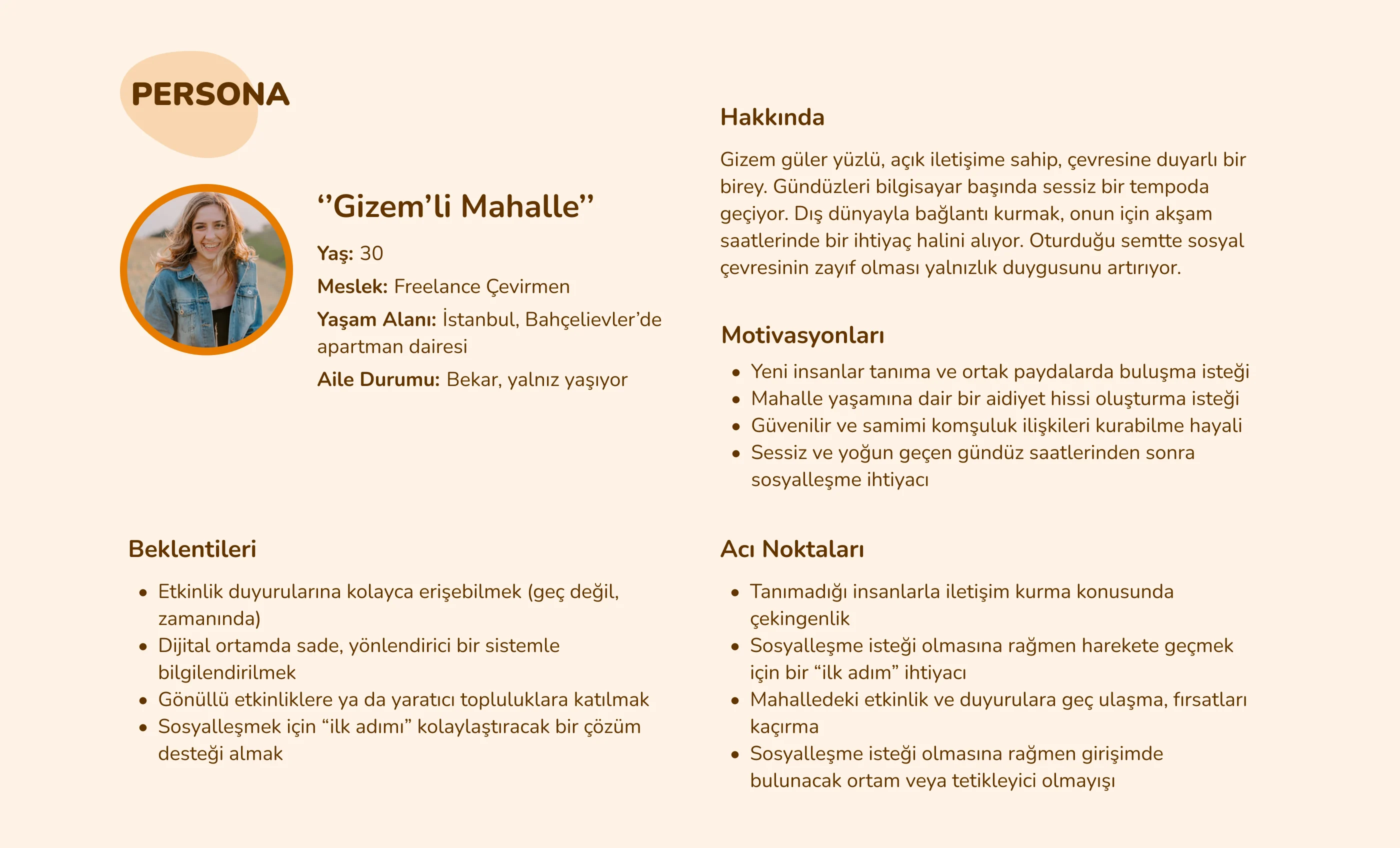
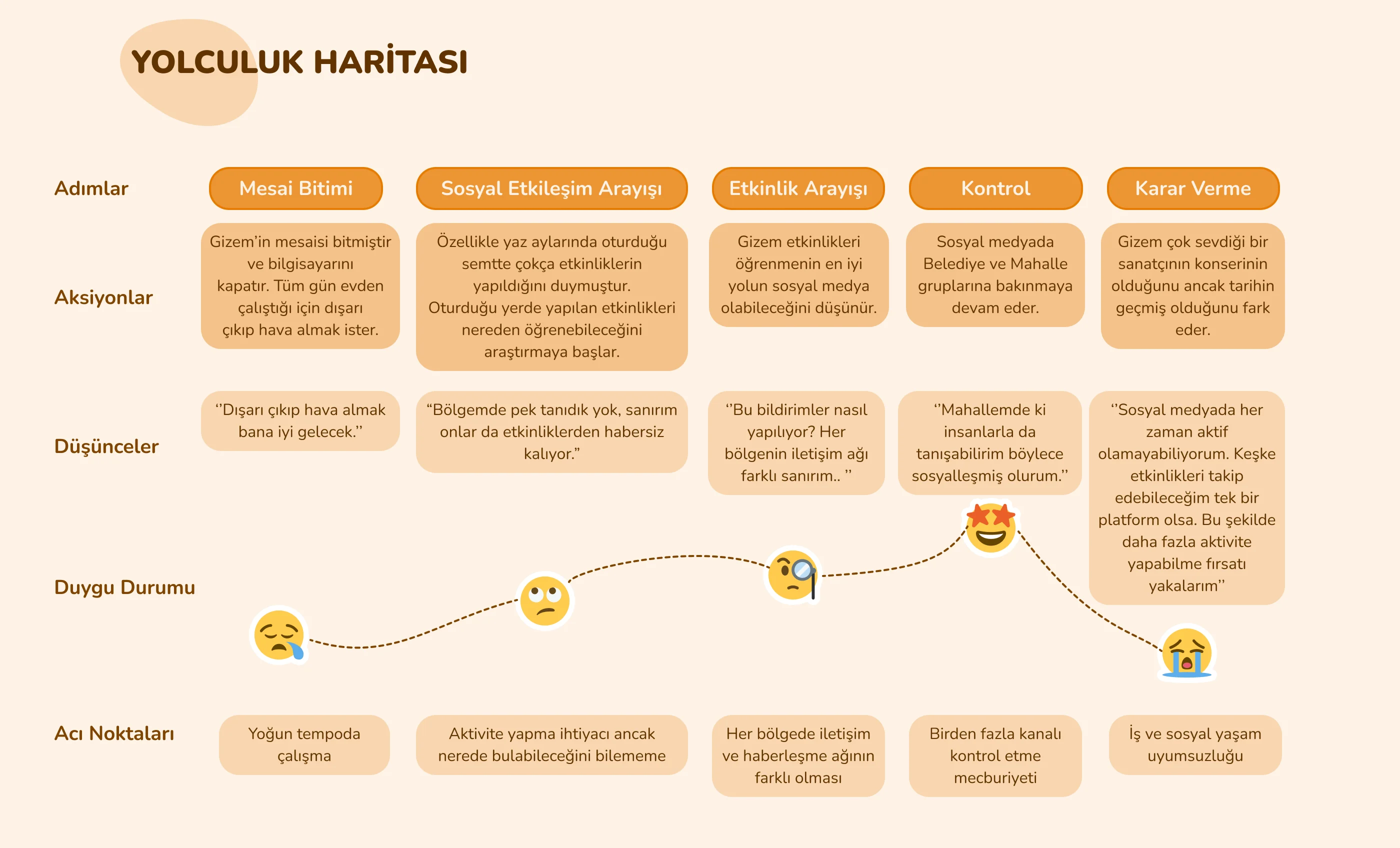
Gizem, 30, a freelance translator living alone. She wants to socialise after quiet work days, but hears about events too late and has to check many channels.Gizem, 30 yaşında, yalnız yaşayan freelance çevirmen. Sessiz geçen iş günlerinden sonra sosyalleşmek istiyor ama etkinlikleri geç duyuyor ve birçok kanalı kontrol etmek zorunda kalıyor.
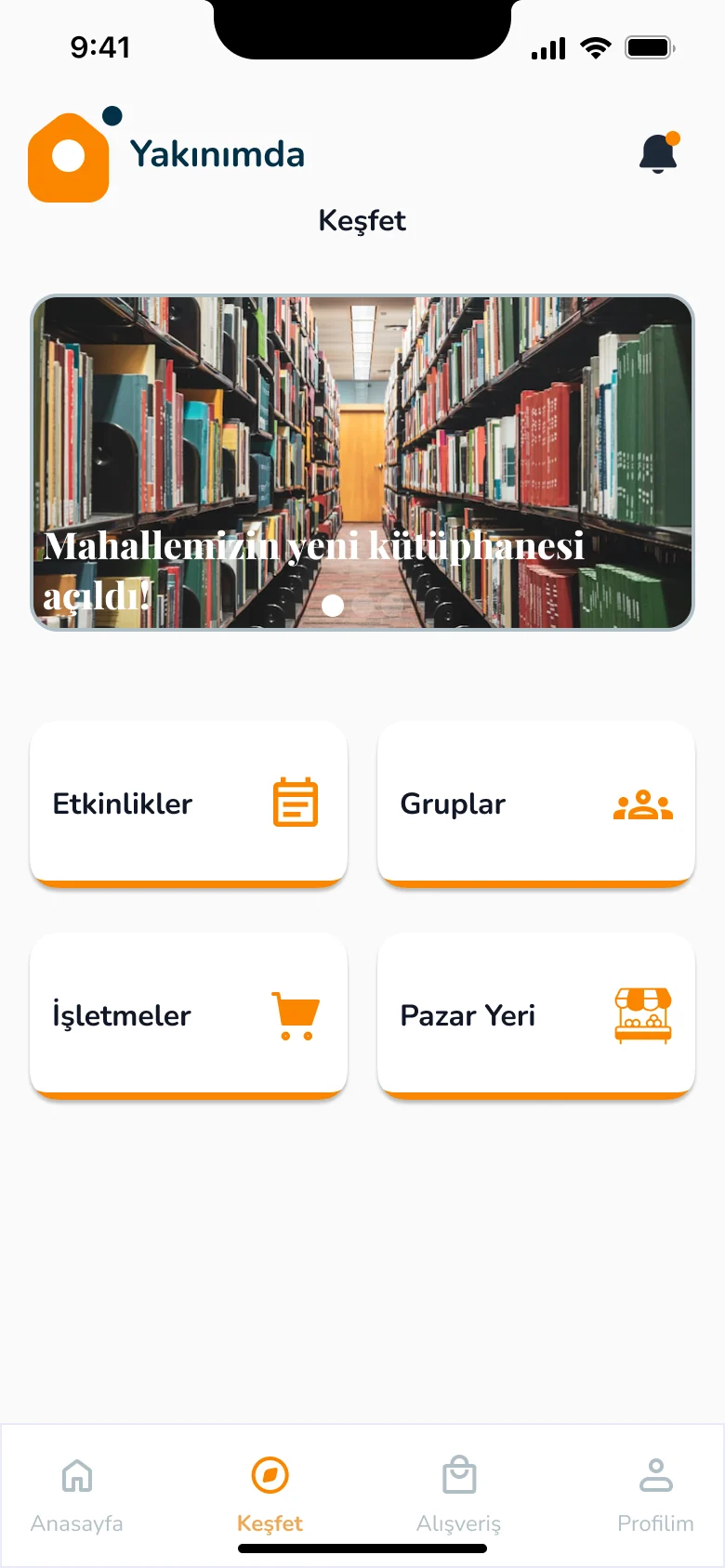
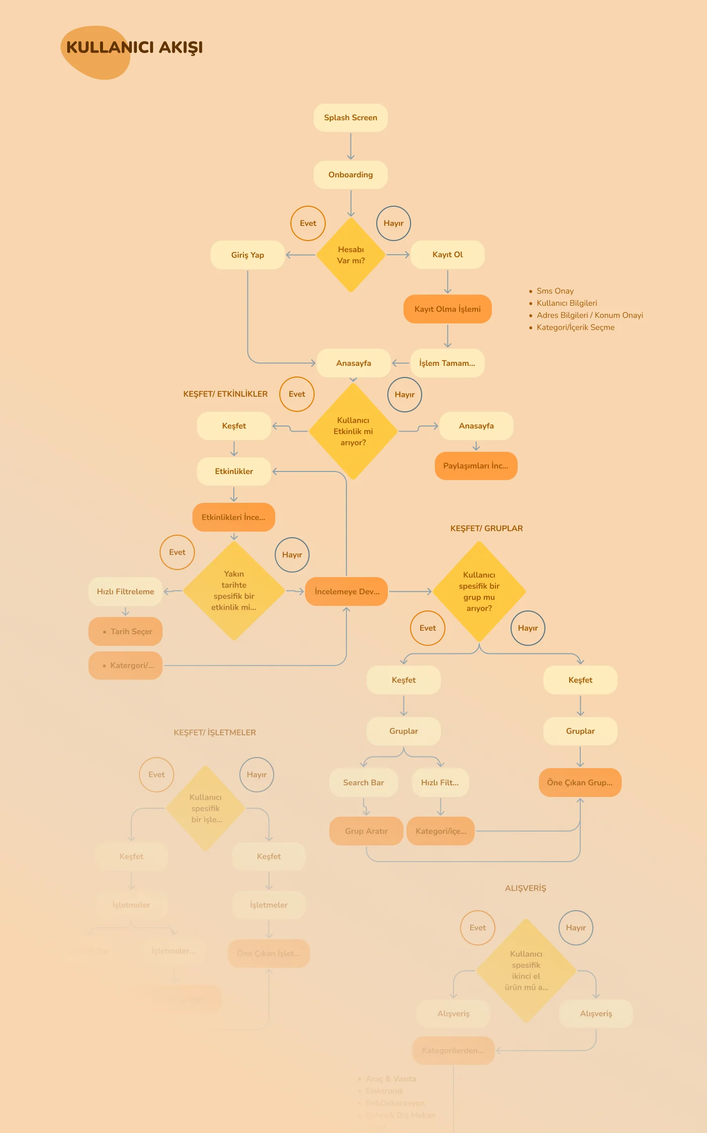
The user flow covers sign up, events, groups, businesses and second hand shopping. The app has four main tabs: Home, Discover, Shopping and Profile.Kullanıcı akışı kayıt, etkinlikler, gruplar, işletmeler ve ikinci el alışverişi kapsıyor. Uygulamanın dört ana sekmesi var: Anasayfa, Keşfet, Alışveriş ve Profil.
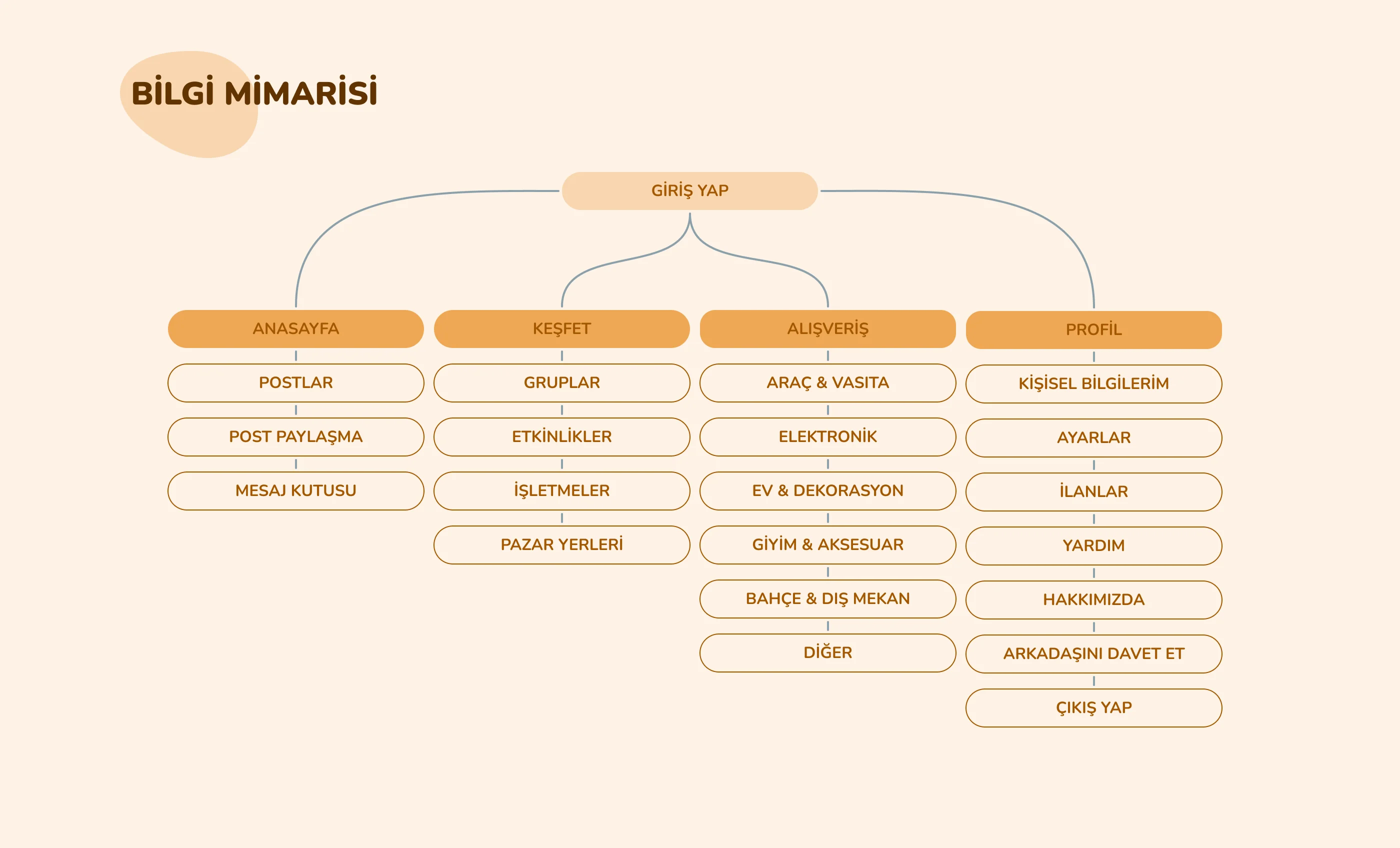
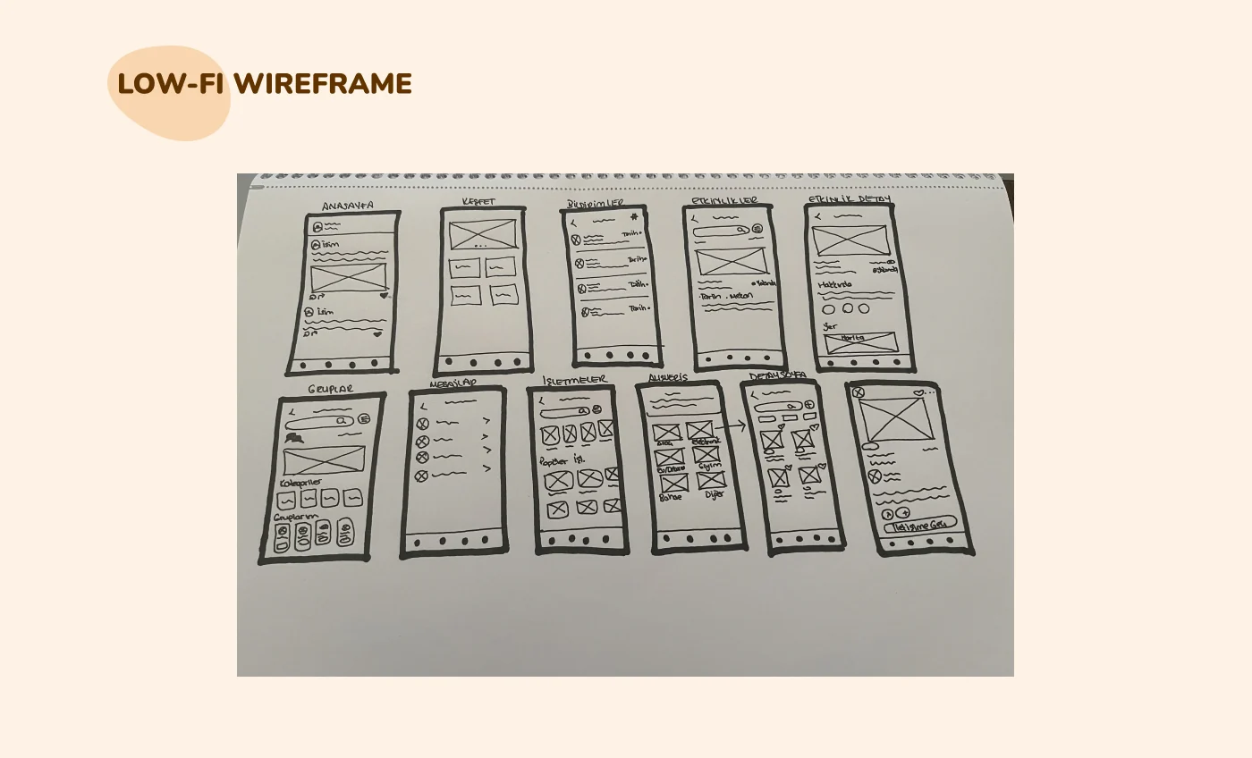
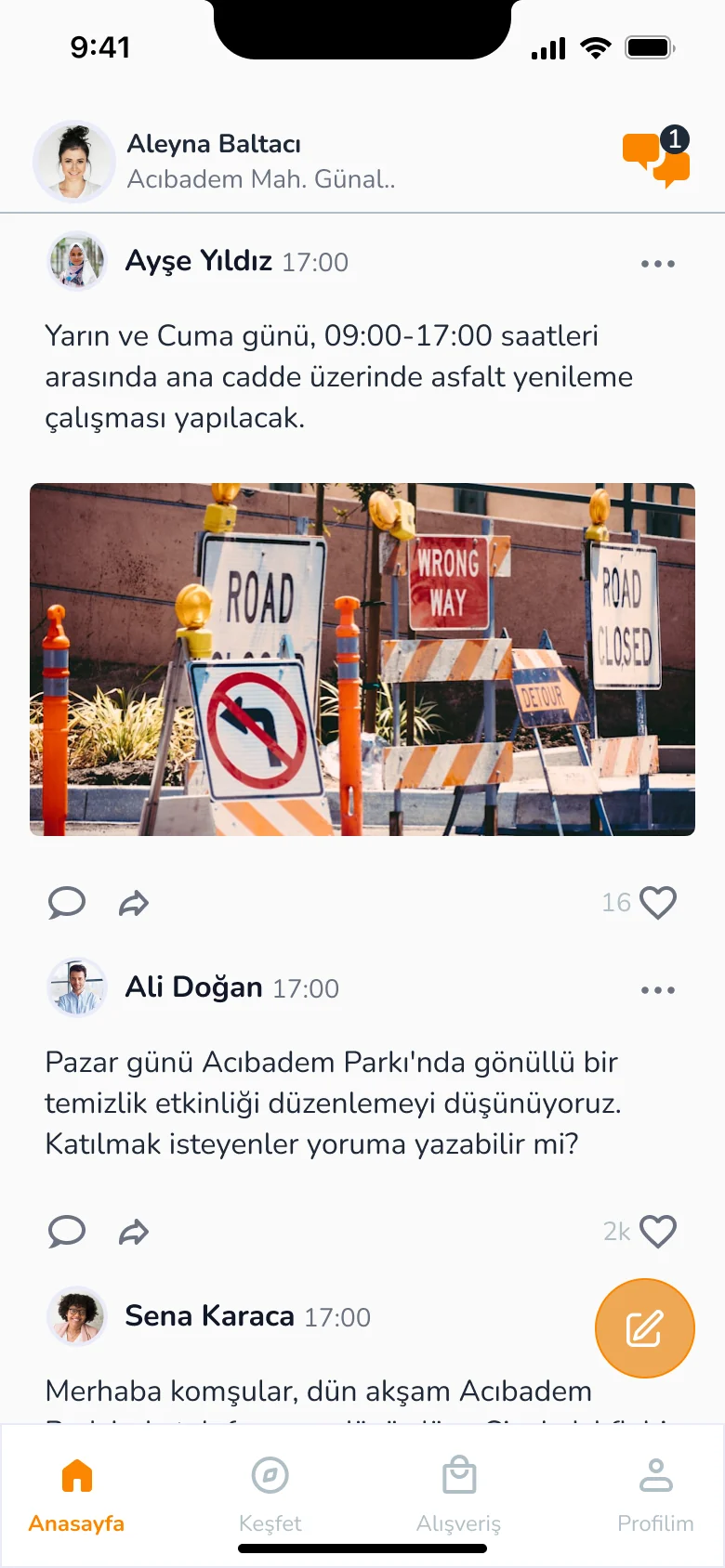
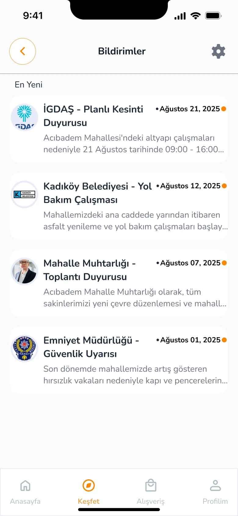
Neighbours share posts and announcements on the home feed. Discover gathers events, groups, businesses and the marketplace in one place. Official announcements arrive as notifications.Komşular anasayfada gönderi ve duyuru paylaşıyor. Keşfet; etkinlikleri, grupları, işletmeleri ve pazar yerini tek yerde topluyor. Resmi duyurular bildirim olarak geliyor.
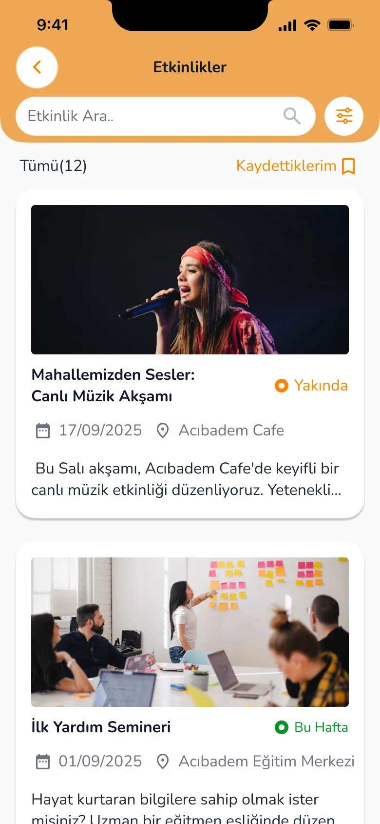
Concerts, seminars, volunteer activities and celebrations in the area. Quick filters, popular searches and an event detail with the location on a map.Bölgedeki konser, seminer, gönüllü faaliyet ve kutlamalar. Hızlı filtreleme, popüler aramalar ve konumu haritada gösteren etkinlik detayı.
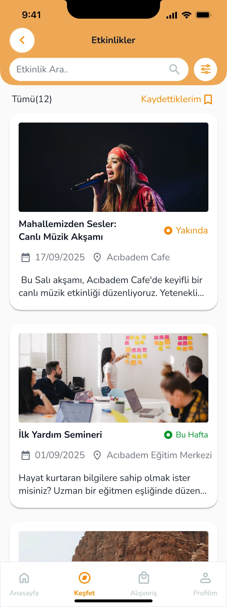
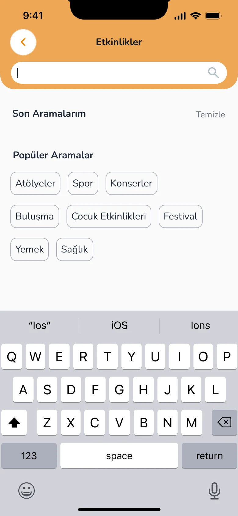
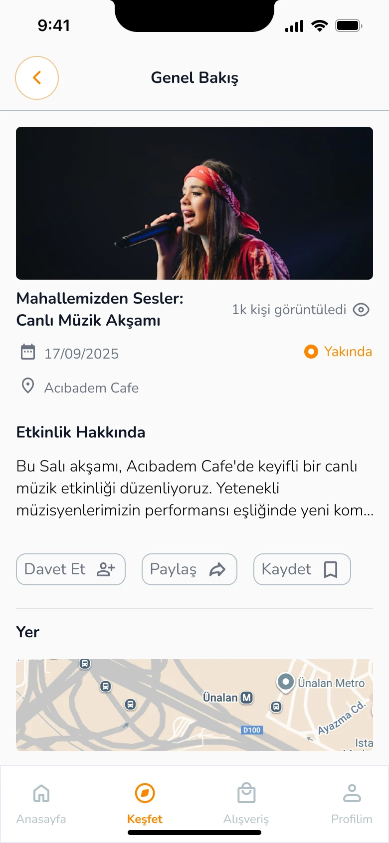
Groups bring together neighbours with shared interests, with group messages. Local businesses are listed, and highly rated ones earn a badge.Gruplar ortak ilgi alanlarına sahip komşuları bir araya getiriyor, grup mesajlarıyla konuşuluyor. Mahalledeki işletmeler listeleniyor, yüksek puan alanlar rozet kazanıyor.
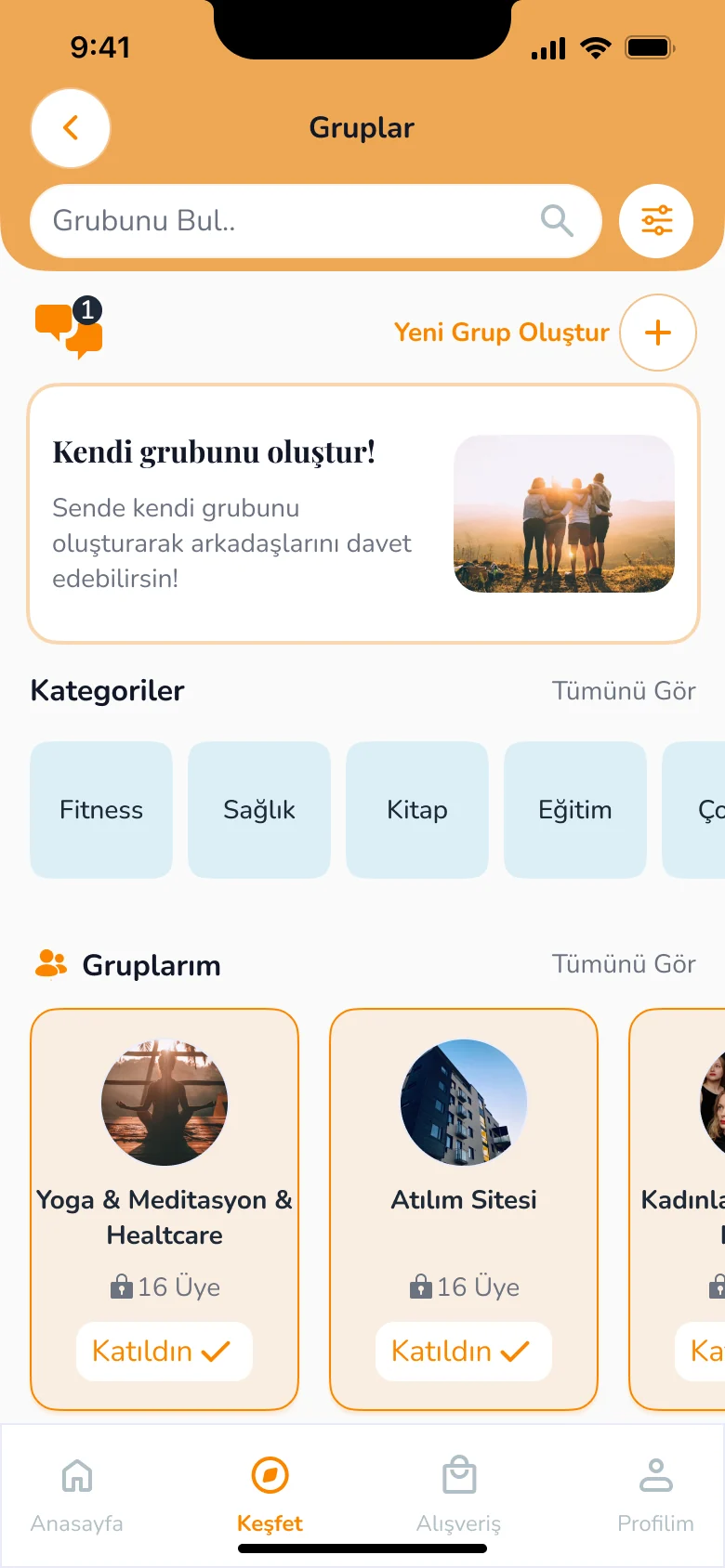
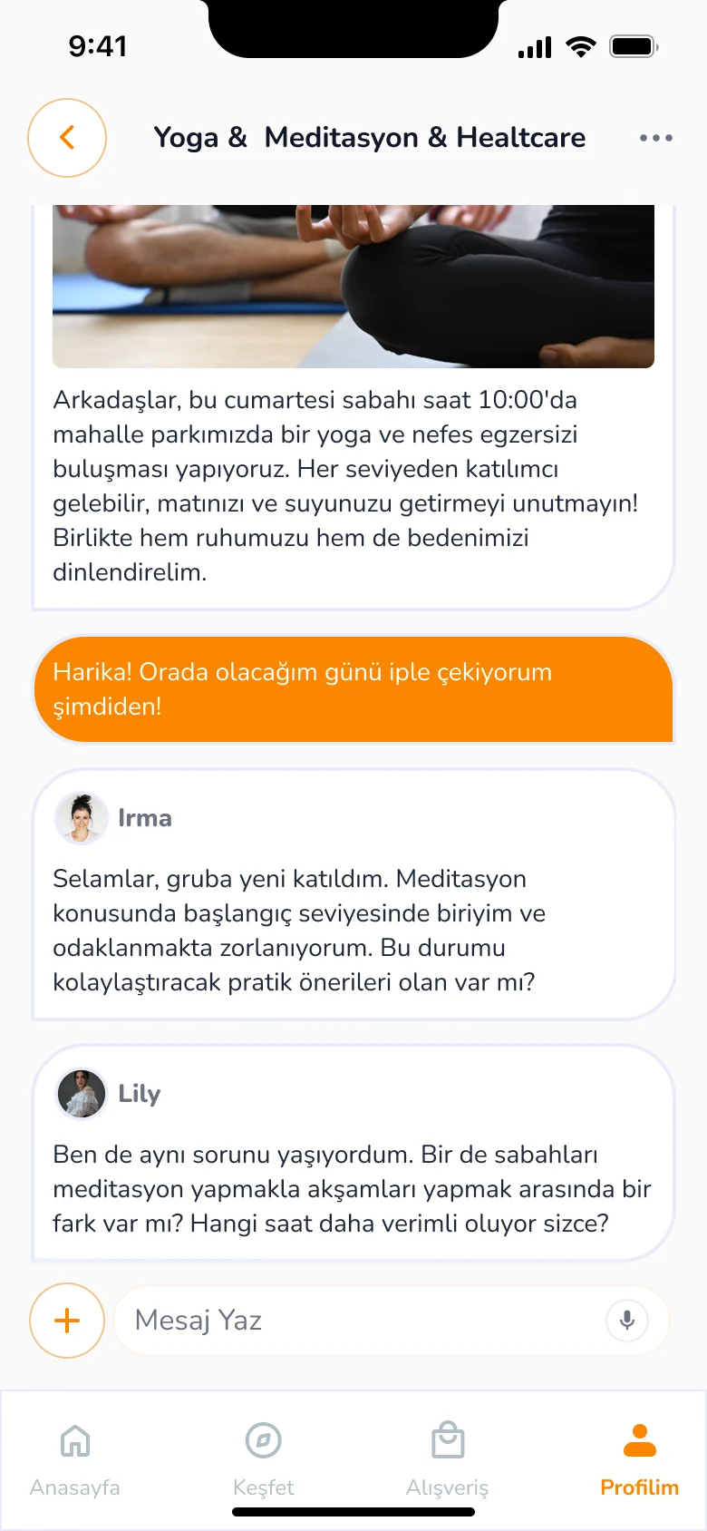
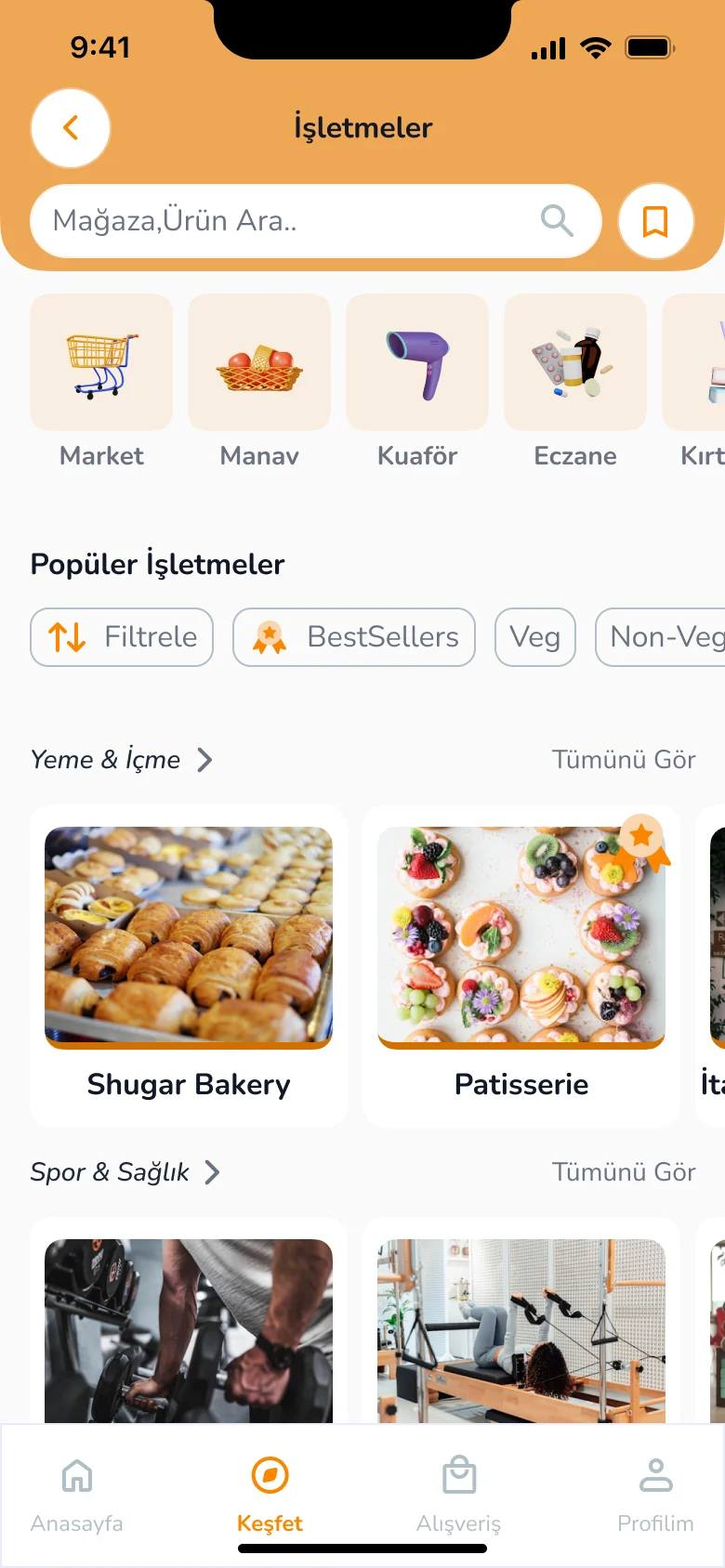
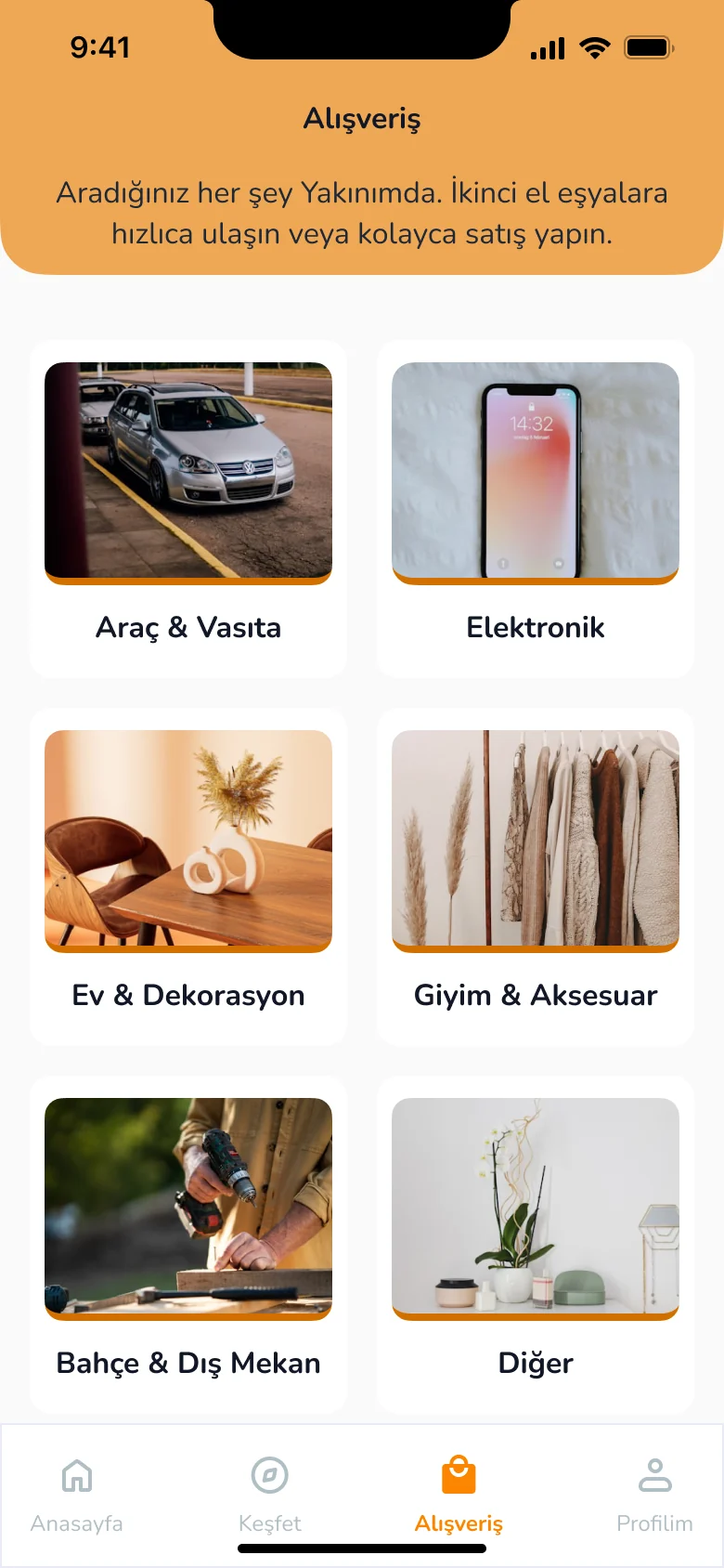
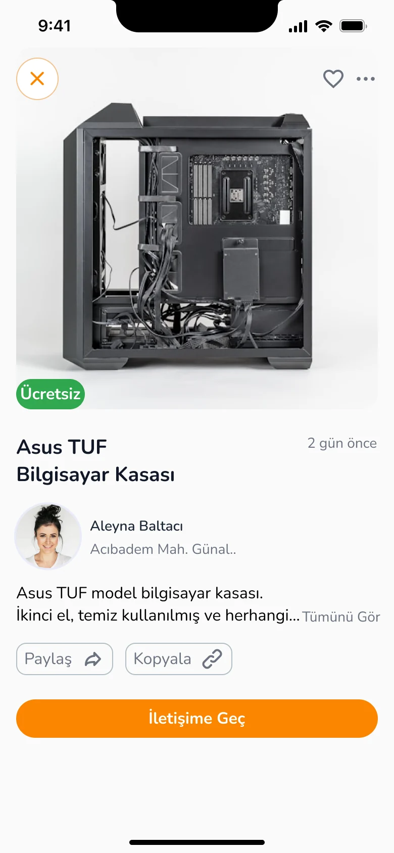
Second hand items by category, so extra things find a neighbour who needs them. Profile holds personal details, listings, settings and invites.Kategorilere ayrılmış ikinci el ürünler; fazla eşyalar ihtiyacı olan bir komşuya ulaşıyor. Profilde kişisel bilgiler, ilanlar, ayarlar ve arkadaş daveti var.
A UX research study on n11.com.tr. I ran a heuristic analysis, turned it into a usability test, watched real people try to buy a watch, and suggested fixes backed by benchmark examples.n11.com.tr üzerine bir UX araştırması. Sezgisel analiz yaptım, bunu bir kullanılabilirlik testine dönüştürdüm, gerçek kullanıcıların saat satın almaya çalışmasını izledim ve benchmark örnekleriyle çözüm önerileri sundum.
A UX School project I did while learning research by practising it. Every step, from the analysis to the report, is mine.Araştırmayı uygulayarak öğrendiğim bir UX Okulu projesi. Analizden rapora kadar her adımı ben yaptım.
First I reviewed n11.com.tr against Jakob Nielsen’s 10 heuristics. I built the usability test questions from that analysis, ran a pilot with 2 people, then tested with 5 participants in 30 to 40 minute online sessions. For each finding I offered a solution based on a benchmark from another site.Önce n11.com.tr’yi Jakob Nielsen’in 10 sezgisel ilkesine göre inceledim. Kullanılabilirlik testi sorularını bu analizden oluşturdum, 2 kişiyle pilot test yaptım, ardından 5 katılımcıyla 30–40 dakikalık online oturumlar gerçekleştirdim. Her bulgu için başka bir siteden benchmark örneğiyle çözüm önerdim.
Areas examinedİncelenen alanlarEvery participant got the same task, so I could compare where each of them got stuck.Her katılımcıya aynı görevi verdim; böylece kimin nerede takıldığını karşılaştırabildim.
“You decided to buy a watch for your sister’s birthday. You have a 3,000 TL budget.”“Kız kardeşinin doğum günü için ona saat almaya karar verdin. 3000 TL limitin var.”
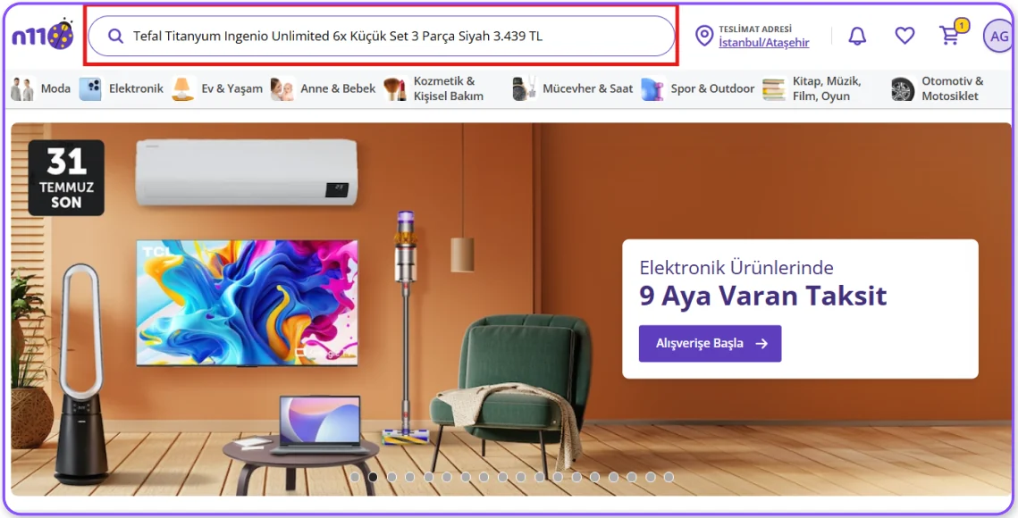
The search box shows a suggested product as its placeholder. It looks like a search the user made before, and that confuses people.Arama kutusunda önerilen ürün yazısı, kullanıcıya daha önce arama yapmış gibi bir izlenim veriyor ve kafa karışıklığına neden oluyor.
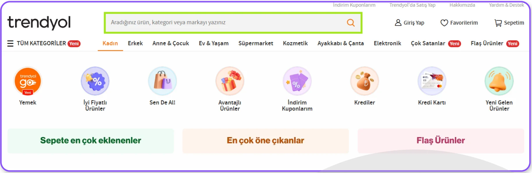
A plain placeholder that guides the user to search, as Trendyol does.Trendyol örneğindeki gibi kullanıcıyı aramaya yönlendiren sade bir placeholder.
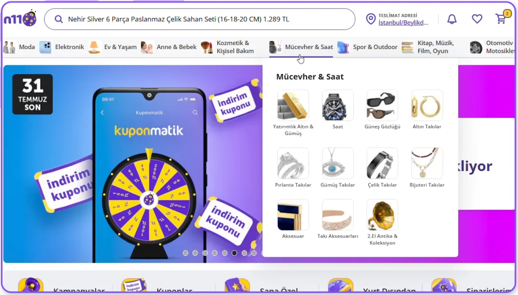
People link wrist watches with Fashion, so they start there. The watches sit under a different category, so users can’t reach them.Kullanıcılar kol saatlerini genellikle Moda ile ilişkilendiriyor ve ilk aramalarını burada yapıyor. Ancak ürün farklı bir kategoride olduğu için erişilemiyor.
“This is so hard! They made it like a university entrance exam.”“Çok zor ya! ALES sınavı gibi yapmışlar.”
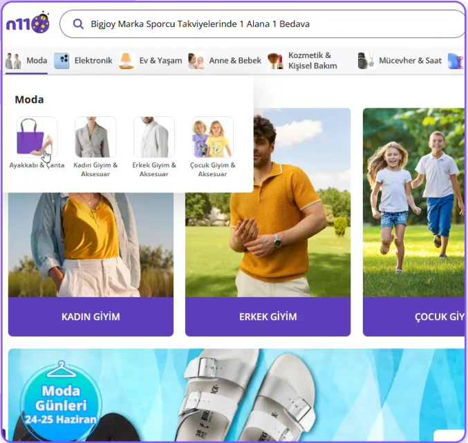
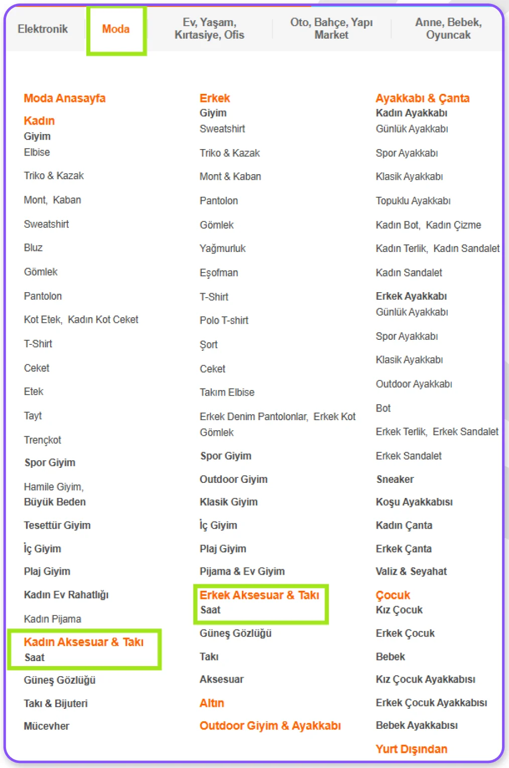
Reorder the menu using Hepsiburada’s structure as a reference, and check it with card sorting and tree testing.Menüyü Hepsiburada’nın sıralama yapısını referans alarak yeniden düzenlemek; kart gruplama ve ağaç testiyle doğrulamak.
Reviews can’t be filtered by rating, and positive and negative ones are mixed. Users feel limited while they decide.Satıcı puanlamalarına göre filtreleme yok, olumlu ve olumsuz yorumlar karışık sıralanıyor. Kullanıcılar seçim sürecinde kendilerini kısıtlanmış hissediyor.
“I want to see the bad reviews first, but there is no filter.”“Önce kötü yorumları görmek istiyorum ama filtreleme çıkmıyor.”
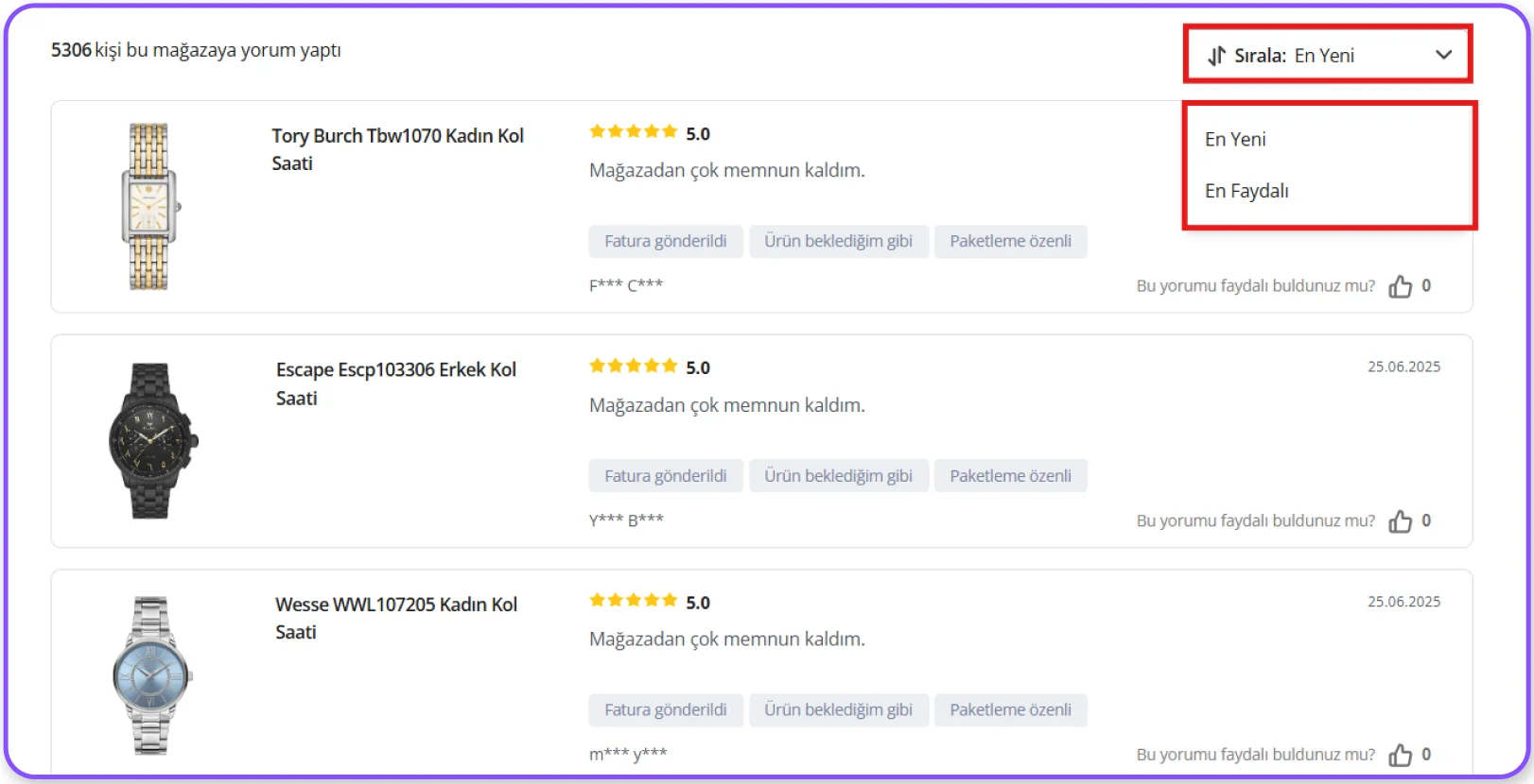
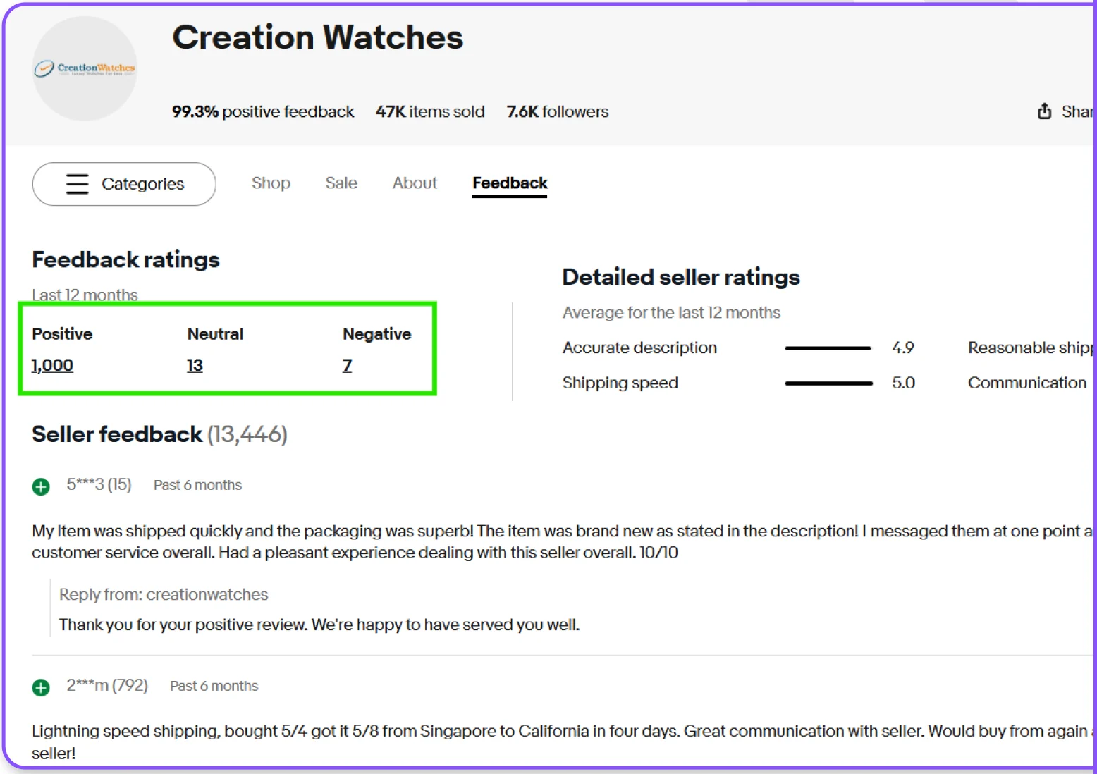
Filter reviews by rating (1–2 stars negative, 4–5 positive), as eBay does.eBay’deki gibi yorumları puana göre filtrelemek (1–2 yıldız olumsuz, 4–5 yıldız olumlu).
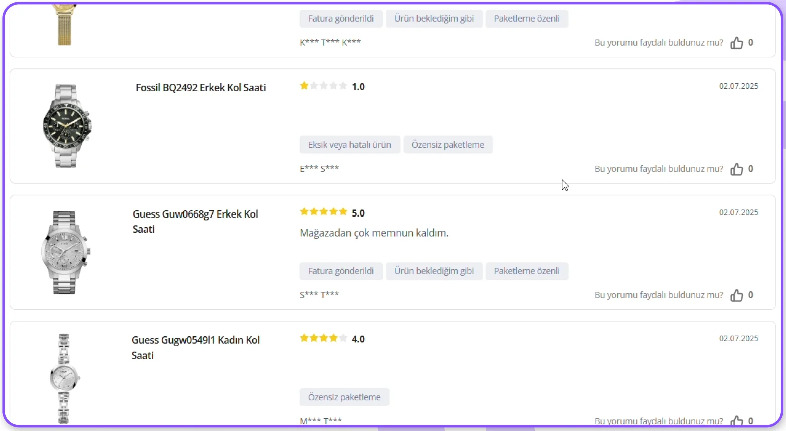
Preset phrases like “Very happy with the store” feel shallow and users don’t trust them, so they go to other sites to check.“Mağazadan çok memnun kaldım” gibi seçmeli, yüzeysel ifadeler güvenilir bulunmuyor; kullanıcılar başka sitelere yöneliyor ve süreç uzuyor.
“These reviews are picked automatically, so they mean nothing to me.”“Bu yorumları otomatik seçiyorlar. Bu yüzden benim için hiçbir şey ifade etmiyor.”
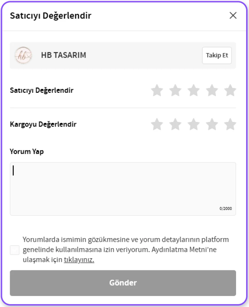
A free text review field like Trendyol’s, with UX microcopy that guides people while they write.Trendyol’daki gibi serbest yazılabilen bir yorum alanı ve kullanıcıyı yönlendiren UX microcopy.
Women’s and men’s watches are listed together. To see only women’s watches users pick two sub categories, and the page reloads three times.Kadın ve erkek saatleri birlikte listeleniyor. Sadece kadın saatlerini görmek için iki alt kategori seçmek gerekiyor ve sayfa üç kez yeniden yükleniyor.
“I don’t think I can choose the gender?”
“I’d be happier if the page didn’t reload every time I pick something.”“Sanırım cinsiyeti seçemiyorum?”
“Her seçtiğimde sayfayı yenilemese daha mutlu olurum.”
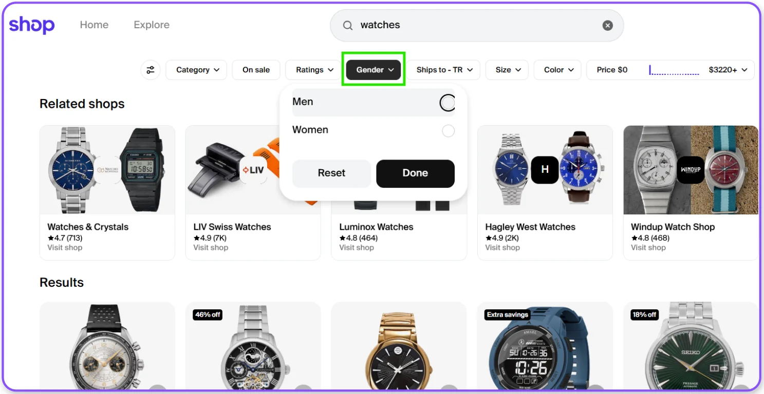
A dropdown filter for gender and other attributes, so users get there with fewer clicks.Cinsiyet ve diğer özelliklerin seçilebildiği bir dropdown filtre; hedefe daha az tıklamayla ulaşmak.
People don’t understand the “Add to my lists” button. They think adding to favourites makes a list, and they can’t share it.“Listelerime ekle” butonunun işlevi anlaşılmıyor. Kullanıcılar favorilere ekleyerek liste oluşturduklarını düşünüyor ve paylaşılabilir link oluşamıyor.
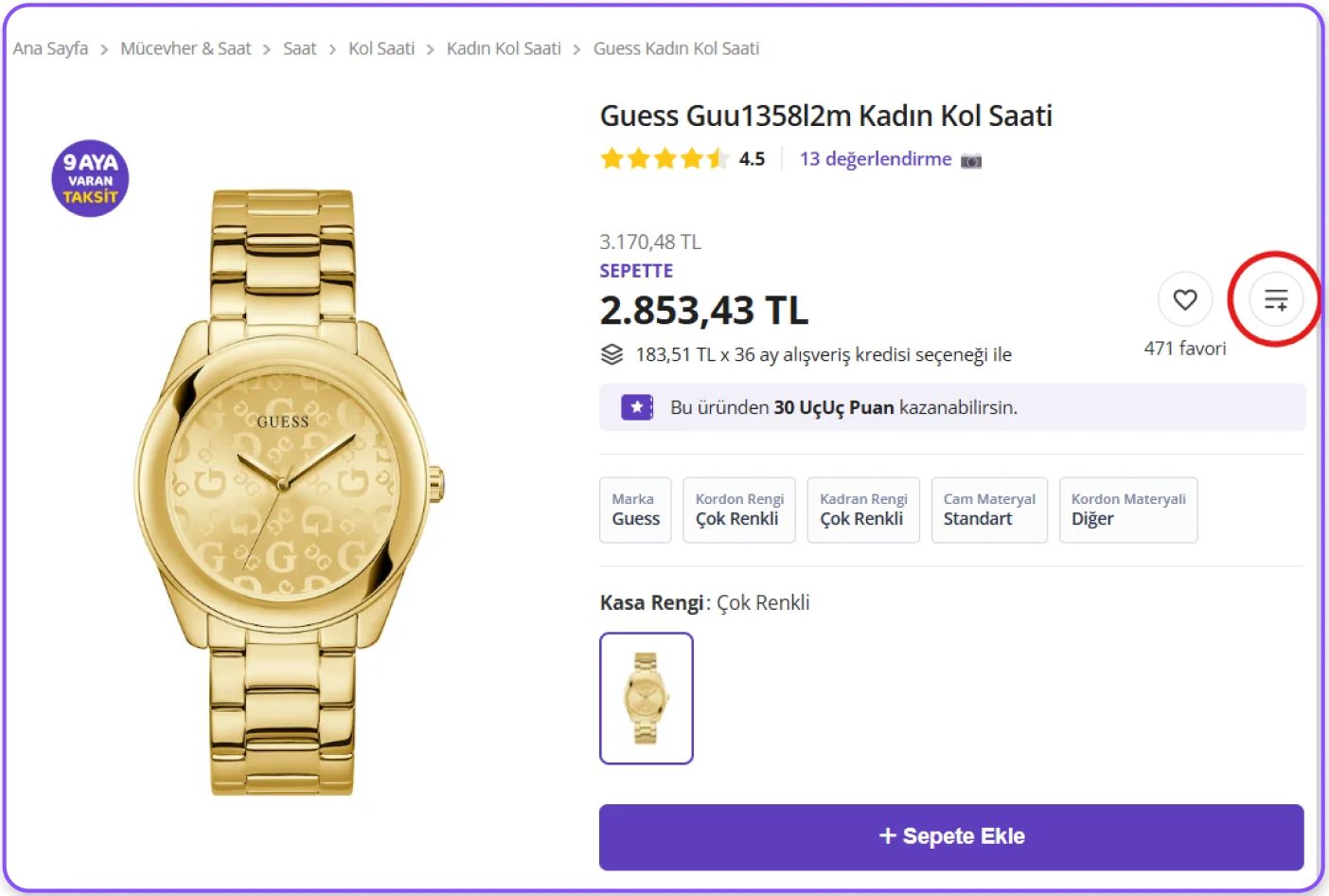
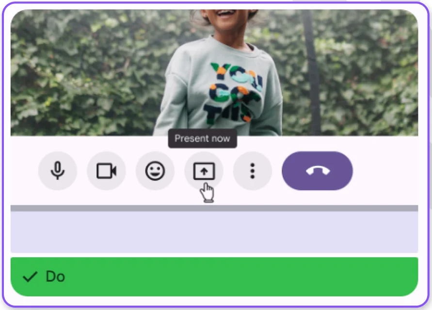
Add a tooltip that explains what the button does.Butonun ne yaptığını anlatan bir tooltip eklemek.
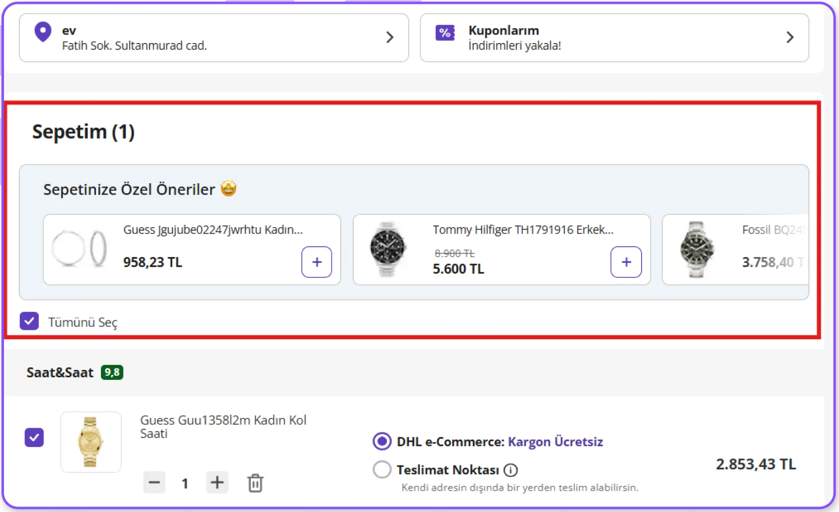
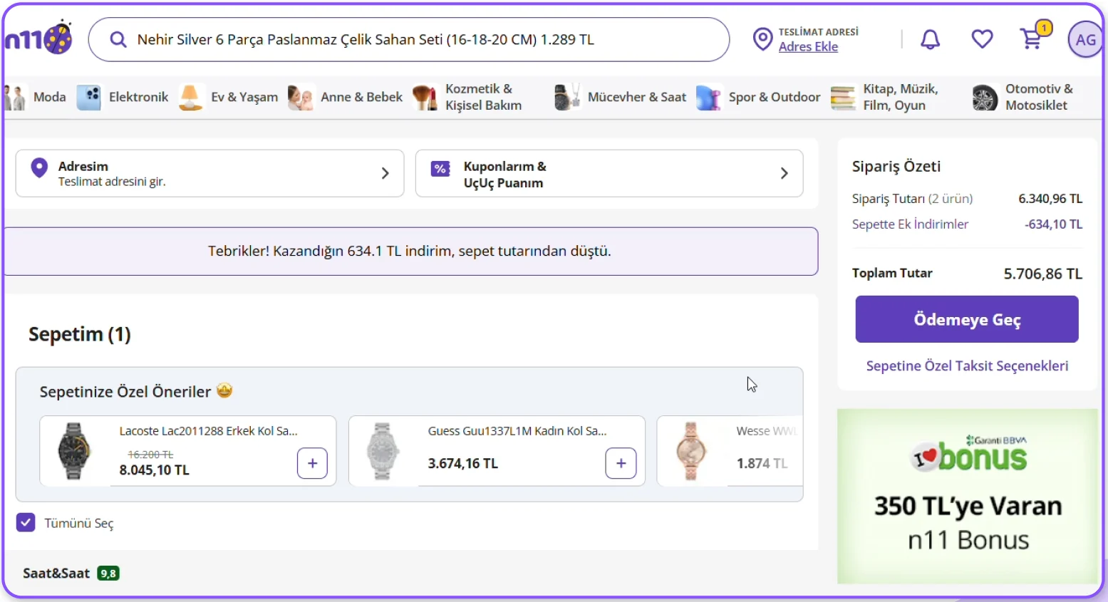
Suggested products sit at the top of the cart. Users expect to see what they are buying, and lose track of their own cart.Sepette önerilen ürünler sayfanın üstünde yer alıyor. Kullanıcı satın alacağı ürüne odaklanmak isterken kendi sepetini kaybediyor.
“Where is my cart?”“Benim sepetim nerede?”
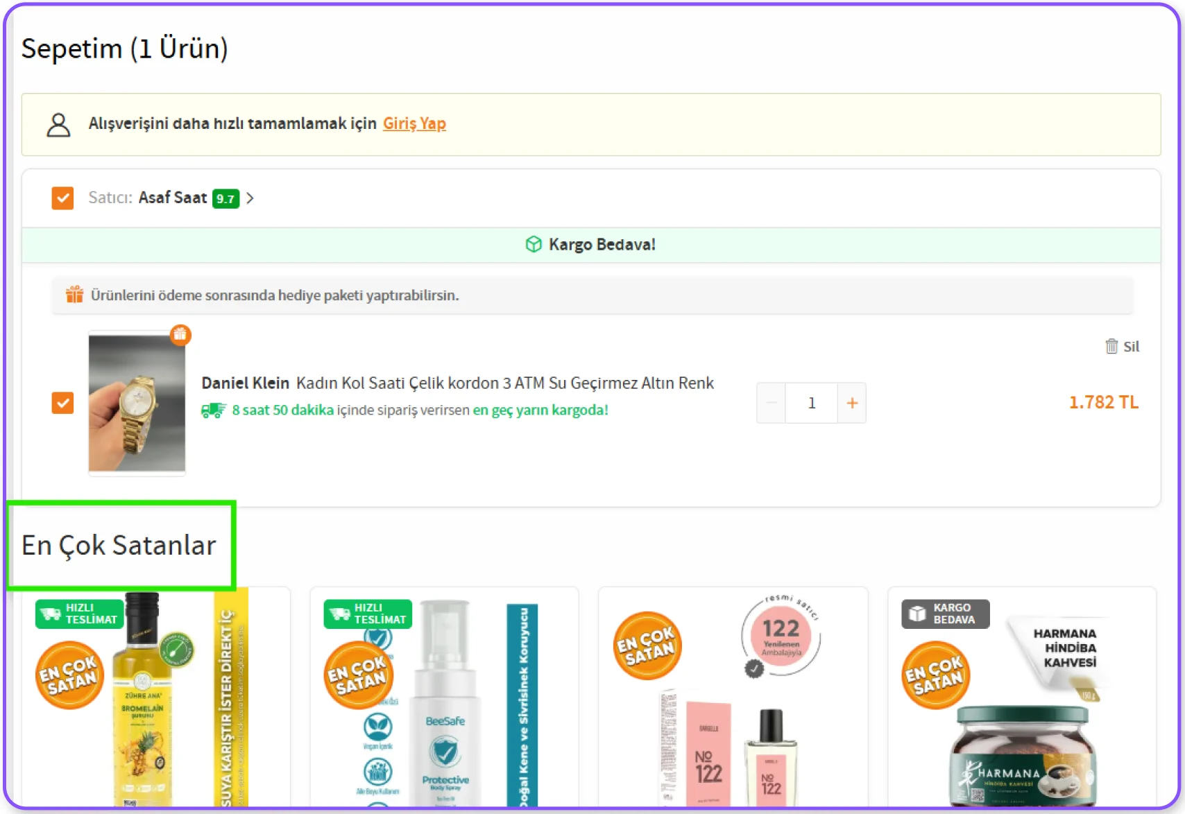
Move the suggestions to the bottom of the page, as Trendyol does.Trendyol’daki gibi önerileri sayfanın alt bölümüne taşımak.
First time buyers go straight to the big “Proceed to payment” button, but the address has to come first. The steps aren’t shown anywhere.İlk kez alışveriş yapan kullanıcılar büyük ve dikkat çekici “Ödemeye Geç” butonuna yöneliyor, ancak önce adres girilmesi gerekiyor. Adımlar hiçbir yerde gösterilmiyor.
“Oh, I had to enter my address first.”“Önce adres bilgilerimi girmem gerekiyormuş.”
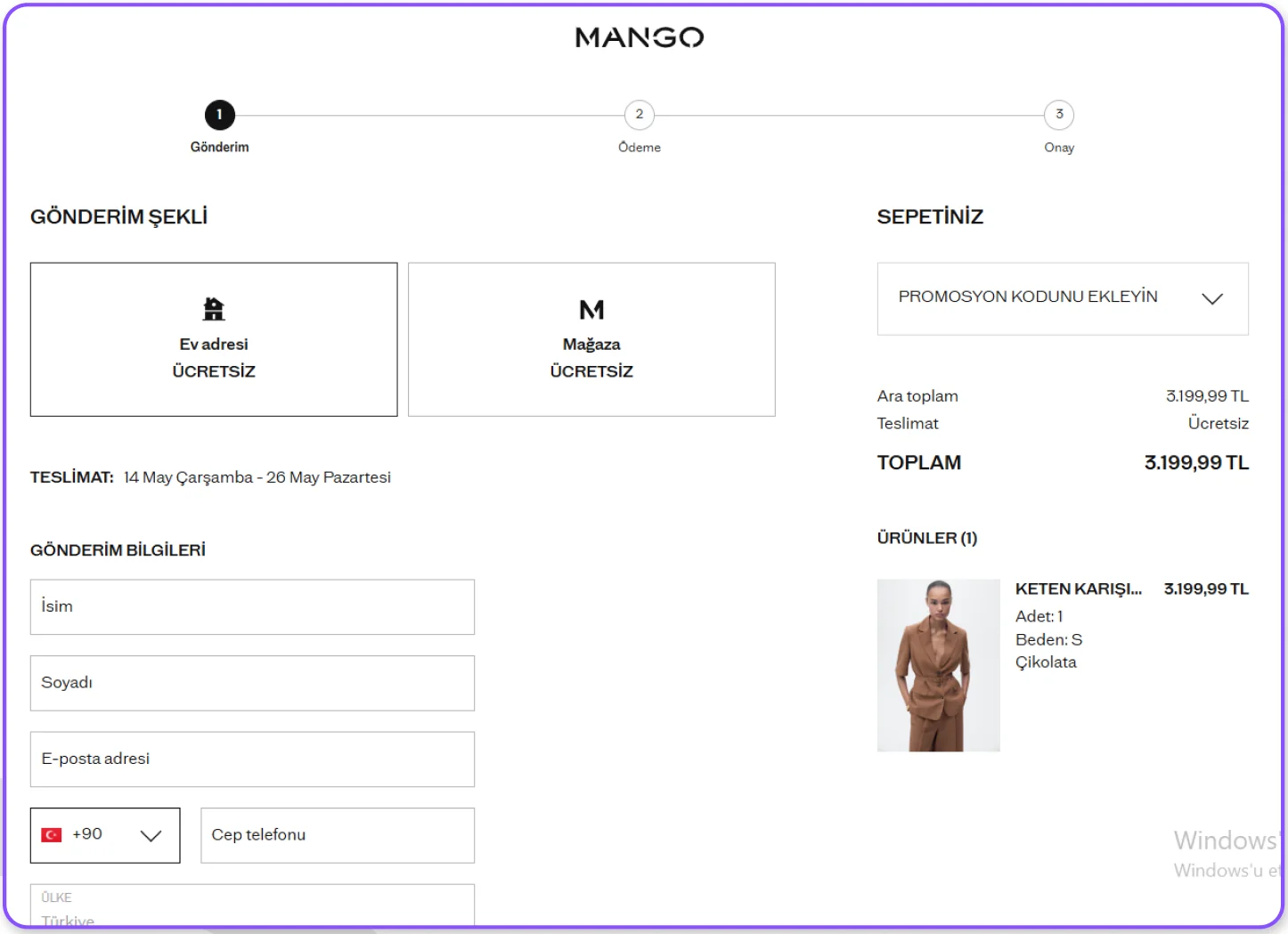
A checkout progress bar that shows every step, so the address comes first naturally.Tüm adımları gösteren bir checkout progress bar; böylece kullanıcı önce adresi tamamlamaya yönleniyor.
An information architecture study on ciceksepeti.com. I rebuilt the site’s menu as a tree, ran a tree test with 22 participants and looked at which menu labels people could actually find.ciceksepeti.com üzerine bir bilgi mimarisi çalışması. Sitenin menüsünü ağaç olarak yeniden kurdum, 22 katılımcıyla ağaç testi yaptım ve kullanıcıların hangi başlıkları gerçekten bulabildiğine baktım.
A UX School project on information architecture. I set up the tree, wrote the tasks, ran the test and analysed the results.Bilgi mimarisi üzerine bir UX Okulu projesi. Ağacı kurdum, görevleri yazdım, testi yürüttüm ve sonuçları analiz ettim.
Many products on the site appear under several menus at once. I picked 5 labels that looked likely to cause trouble and wrote a real life task for each. Participants chose where they would look in the tree, and I tracked direct and indirect successes and failures.Sitedeki pek çok ürün aynı anda birkaç menüde yer alıyor. Sorunlu olabileceğini düşündüğüm 5 başlık seçtim ve her biri için gerçek hayattan bir görev yazdım. Katılımcılar ağaçta nereye bakacaklarını seçti; ben de doğrudan ve dolaylı başarı ile başarısızlıkları takip ettim.
ProcessSüreç“You want to send your partner something that reminds you both of your favourite song. Where would you look?”The item is listed under four different places. 10 people went to Gift or Personalised, but got lost among too many options and picked other products.“Sevgiline ikinizin de çok sevdiği ortak şarkınızı hatırlatan bir ürün göndermek istiyorsun. Nerede bulurdun?”Ürün dört farklı yerde listeleniyor. 10 katılımcı Hediye ya da Kişiye Özel başlığına gitti ama çok fazla seçenek arasında kaybolup farklı ürünlere tıkladı.
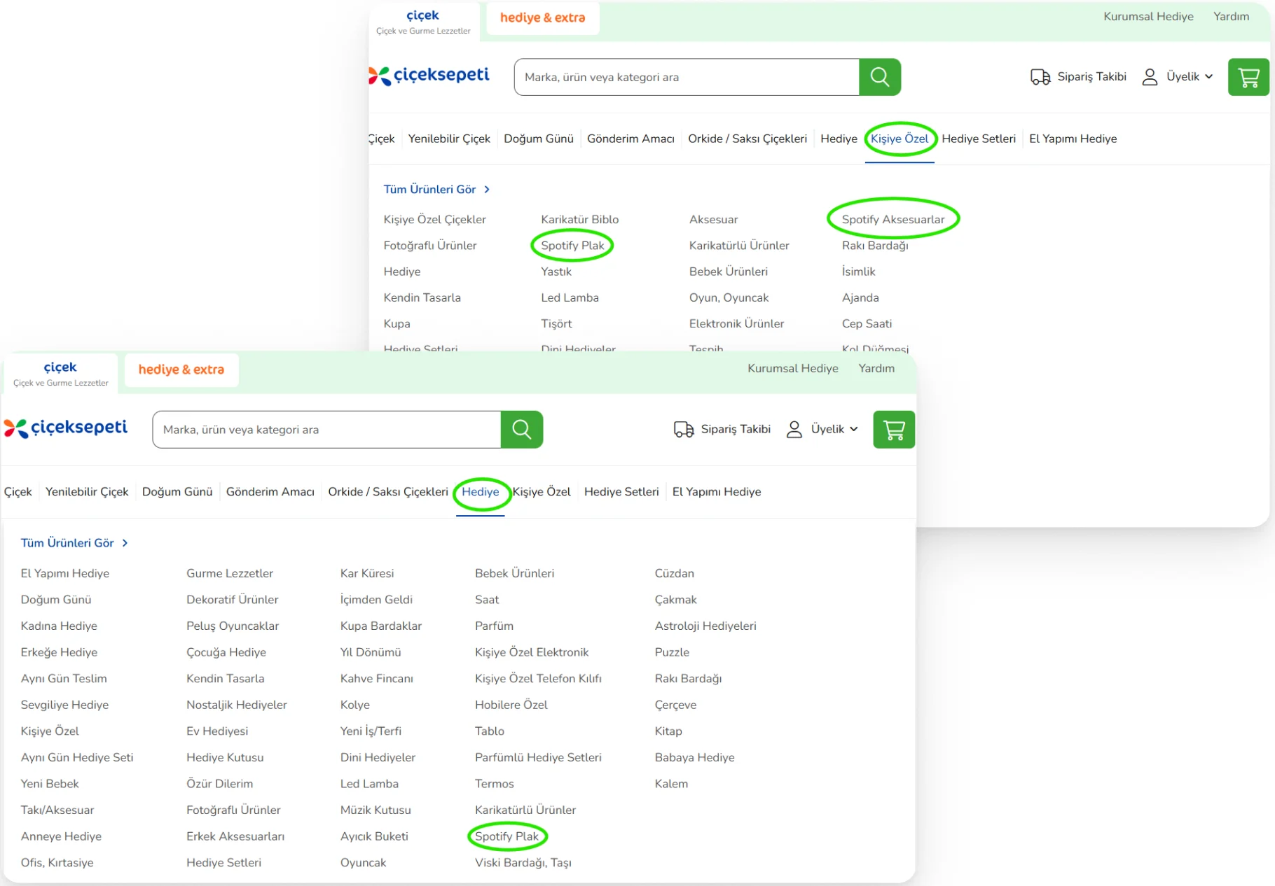
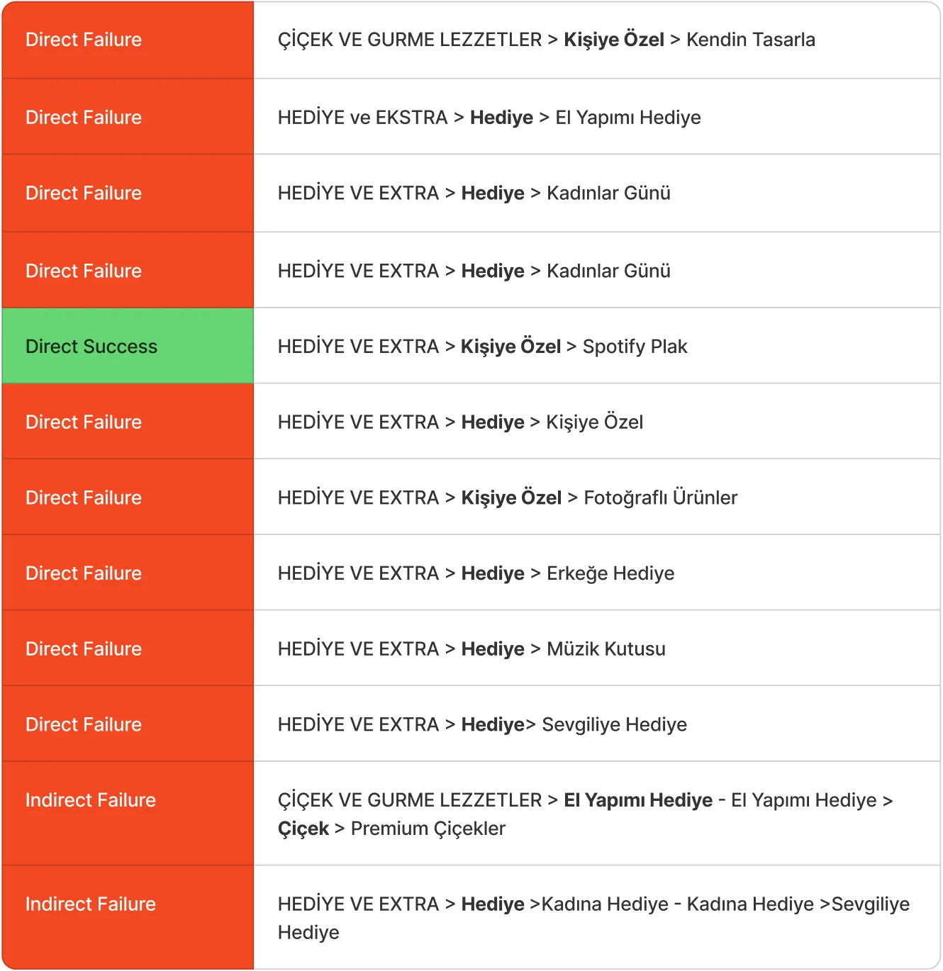
Fewer items under Gift and Personalised. Move Personalised under Gift and add a “Music themed gifts” group, then check the new structure with card sorting.Hediye ve Kişiye Özel başlıklarındaki ürün sayısını azaltmak. Kişiye Özel’i Hediye’nin altına almak ve “Müzik Temalı Hediyeler” başlığı açmak; yeni yapıyı kart gruplama ile doğrulamak.
“Your sibling just got promoted and you want to send something to make them happy. How would you go about it?”People went straight to the kind of product they wanted. Only one used “Occasion”; 5 chose Gift and then picked the wrong item.“Kardeşin kariyerinde bir üst pozisyona yükseldi, onu mutlu edecek bir şey göndermek istiyorsun. Nasıl bir yol izlerdin?”Kullanıcılar doğrudan göndermek istedikleri ürün türüne yöneldi. “Gönderim Amacı”nı yalnızca bir kişi kullandı; 5 kişi Hediye’yi seçip yanlış ürüne gitti.
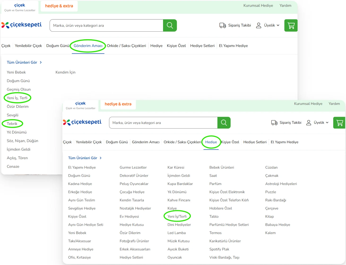
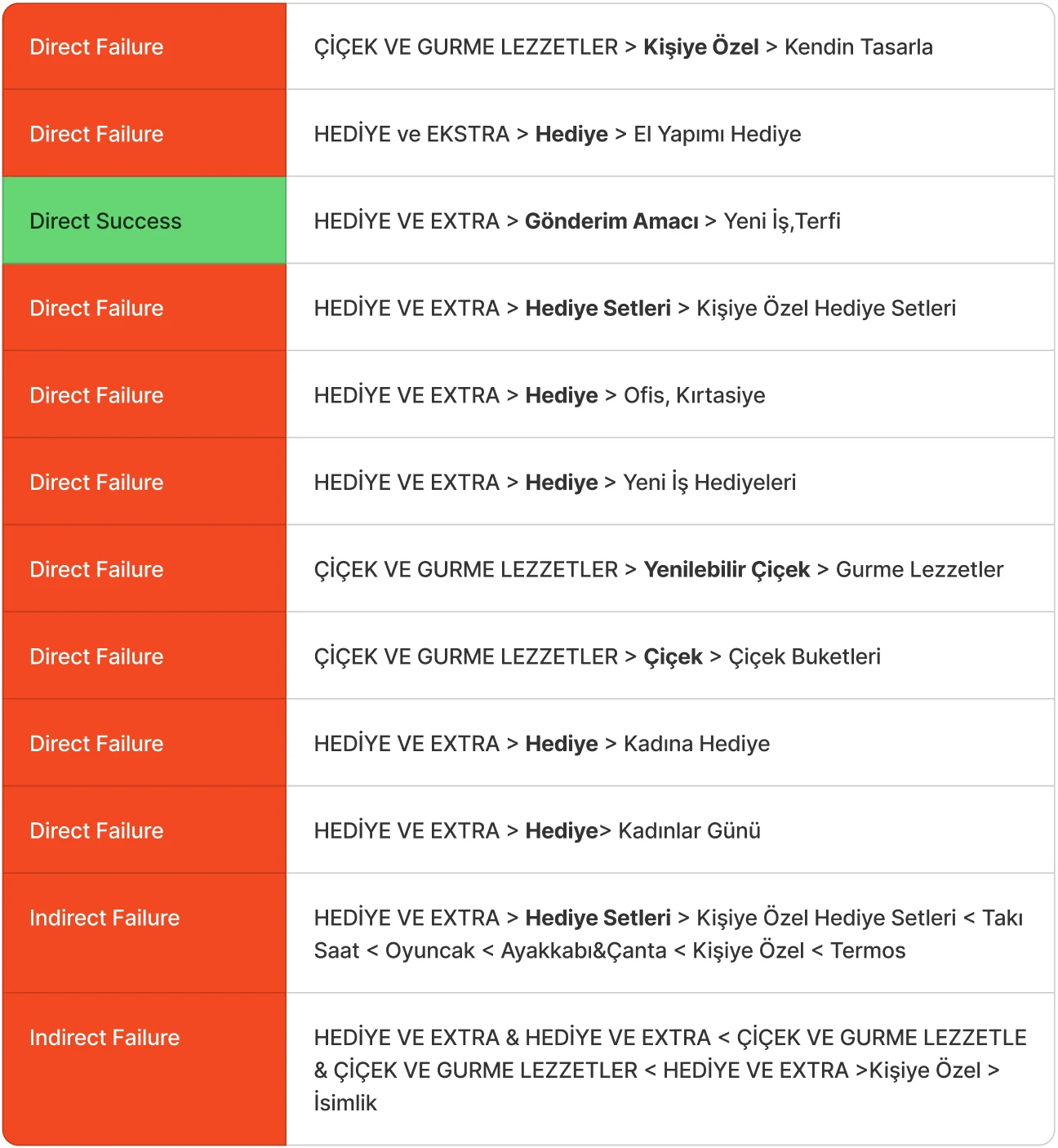
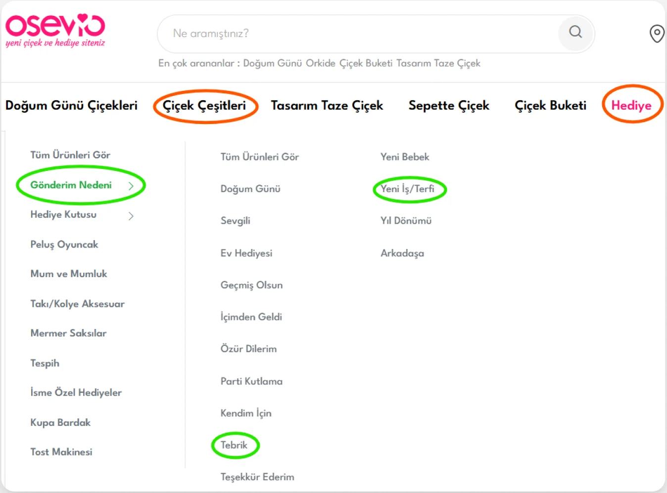
Place “Occasion” inside Gift and Flowers and make it stand out, as Osevio does, so people can shop by reason.Osevio’daki gibi “Gönderim Amacı”nı Hediye ve Çiçek Çeşitleri başlıklarının içine almak ve öne çıkarmak.
“You want to buy incense for your home to clear negative energy. Where would you look?”Nobody clicked “Handmade Gifts”, where the incense also sits. 3 people searched under Gift. Linking incense to handmade gifts confuses people.“Negatif enerjiden arınmak için evine tütsü almak istiyorsun. Nerede bulurdun?”Tütsünün de bulunduğu “El Yapımı Hediye” başlığına hiç tıklanmadı. 3 kişi Hediye altında aradı. Ürünün bu başlıkla ilişkilendirilmesi anlam karmaşası yaratıyor.
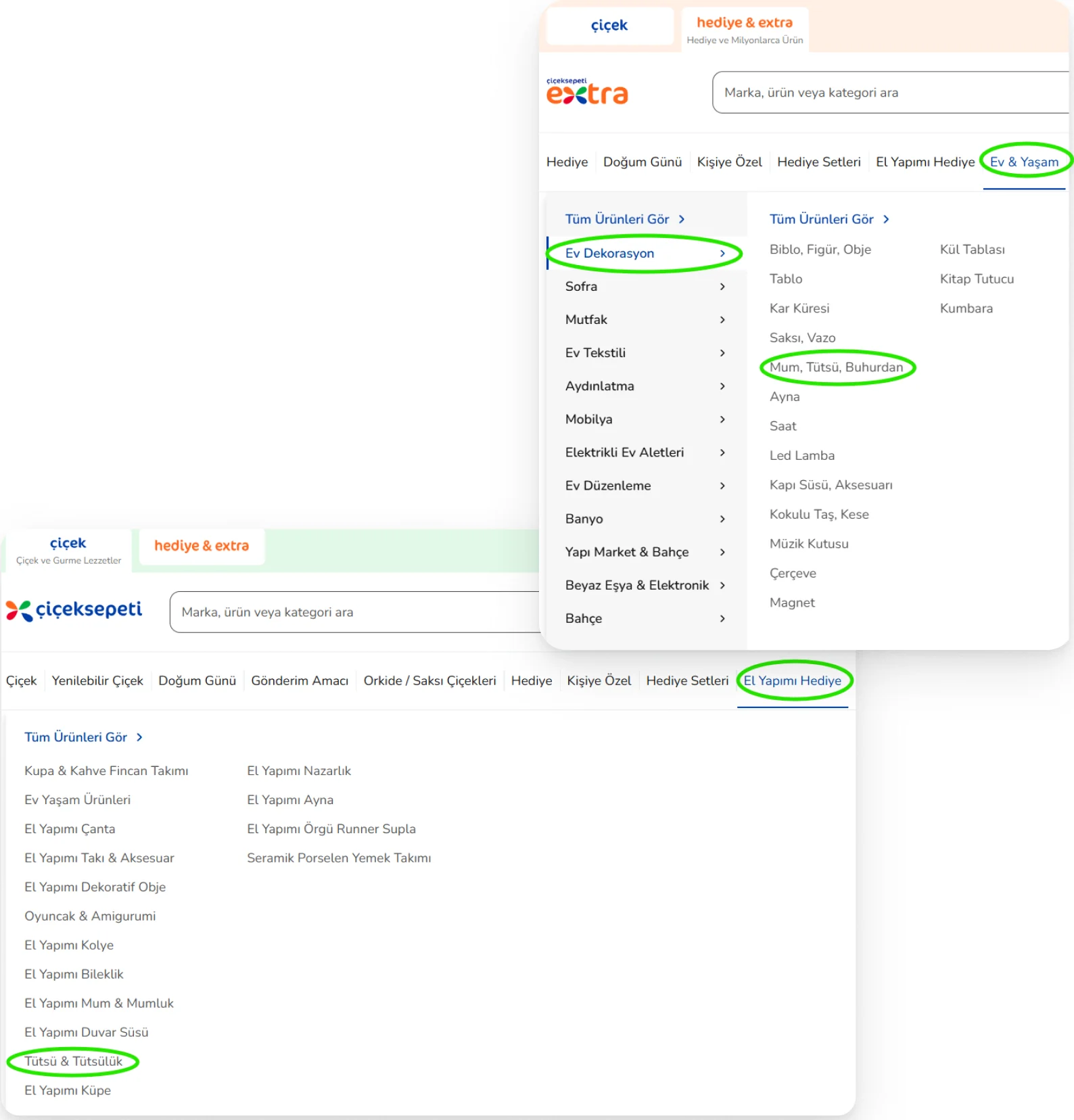
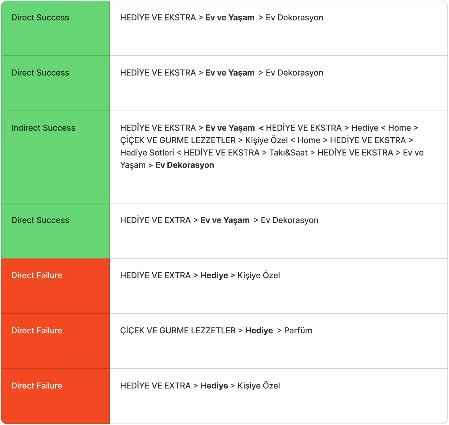
Reorganise the Handmade Gifts category with card sorting, so each item sits where people expect it.El Yapımı Hediye kategorisini kart gruplama ile yeniden düzenleyip her ürünü beklenen yere koymak.
“You’re planning a trip soon and need a suitcase for your things. Where would you look?”Suitcases sit under Sports & Outdoor, but most people linked them with Shoes & Bags and looked there first.“Yakın zamanda seyahate çıkmayı planlıyorsun, eşyalarını koyabileceğin bir valize ihtiyacın var. Nerede bulurdun?”Valizler Spor & Outdoor altında, ama katılımcıların çoğu ürünü Ayakkabı & Çanta ile ilişkilendirip önce oraya baktı.
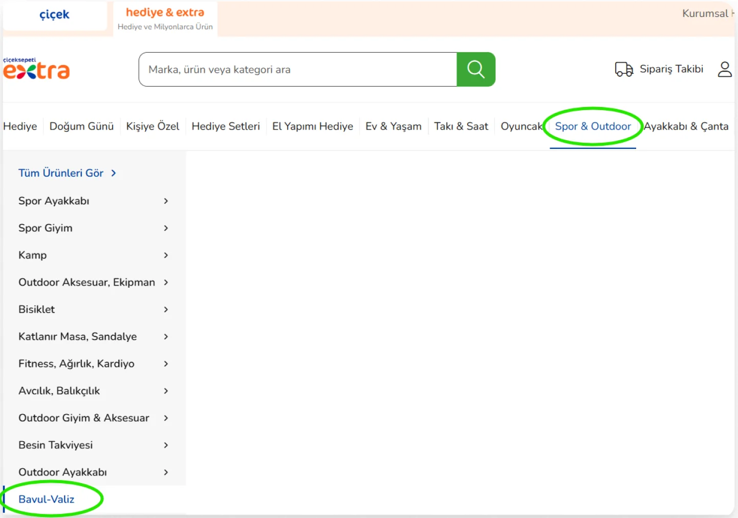
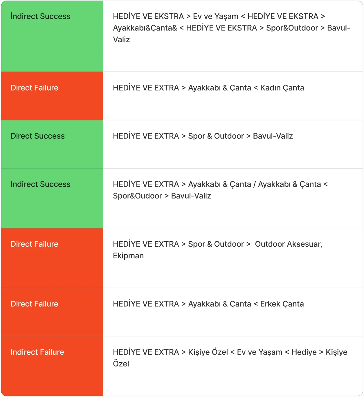
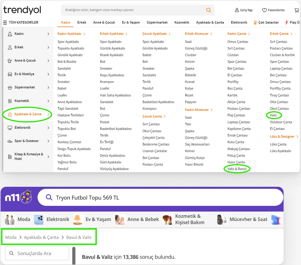
Move suitcases under Shoes & Bags, as Trendyol and n11 do, where people already expect them.Trendyol ve n11’deki gibi valizi kullanıcıların zaten beklediği Ayakkabı & Çanta başlığına taşımak.
“You want to send condolences to someone, but you can’t travel to their city. What would you do?”Everyone reached the right place, directly or indirectly, through Funeral and Funeral Wreaths. This label works as it is.“Bir tanıdığına baş sağlığı dilemek istiyorsun ama şehir dışında olduğu için gidemiyorsun. Nasıl bir yol izlersin?”Katılımcıların hepsi doğrudan ya da dolaylı yoldan Cenaze ve Cenaze Çelenkleri başlıklarına ulaştı. Bu başlık olduğu gibi çalışıyor.
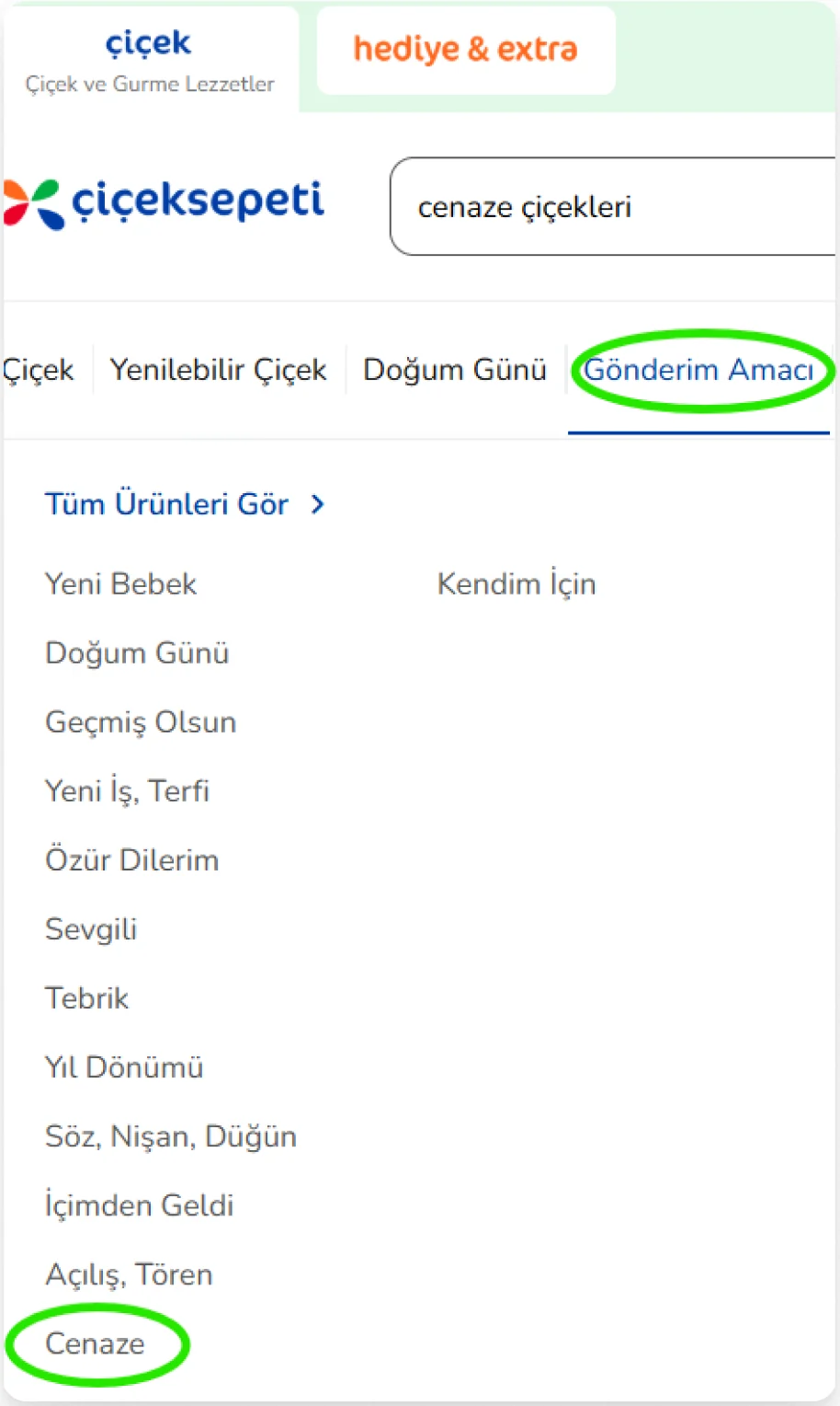
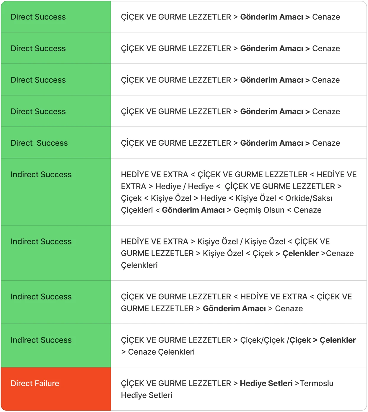
No change needed. This result also showed that clear, purpose based labels work well when they are easy to find.Değişiklik gerekmiyor. Bu sonuç, kolay bulunan ve amaca yönelik başlıkların iyi çalıştığını da gösterdi.